Fyxer got to know me (but I never got to know Fyxer)
7 min read · about Fyxer ·
Fyxer got to know me (but I never got to know Fyxer)
Before the card, it read my inbox and described my tone. After the card: a webinar, my bills and a spinner.
1 / 22

Written by
Eddy Bogomolov
Growth PM for SaaS
Published
What you'll learn
- A profile proves you read. A draft proves you can help. Fyxer’s best screen before the card described my work and my tone. The job the plan page sells, “replies drafted in your tone”, never showed up while I watched.
- Once you have my emails, stop showing fake ones. It had read my inbox, yet setup showed Acme Co., Sarah Chen and a fake Slack chat. My real inbox came after the card, after a 94-second wait.
- The more you know about me, the closer the controls. The profile named my clients and the people I meet every week. The only control: “You can edit it once you’re in, under Settings.”
Two minutes in, Fyxer had read my inbox and written a page about me. Then it asked for my card. In the next four minutes, I didn’t see one draft.
Fyxer got to know me (but I never got to know Fyxer), chapter by chapter
In this story, I run a small design business on my own. My inbox is full of clients, bills, newsletters and alerts from apps I use. I'd like a helper that sorts it and writes the boring replies for me.
Fyxer says it does just that. Its Pro plan starts with "Emails sorted and replies drafted in your tone."
So I signed up for Fyxer's 14-day trial with my Google account and recorded everything from the homepage to the app.
Two minutes in, before it asked for my card, Fyxer showed me a profile of myself. It had read my inbox and written a page about my work, my clients and how I write. It was impressive.
Then it asked for my card. And in the next four minutes, I didn't see one draft: a reply it wrote for me.
In my teardowns, I take a close look at a product's free trial. This one is different from my last few. Opal and Melius showed their best screen only after I paid. Fyxer shows it before. The question is what that screen shows.
So I'm asking three things. What makes an AI helper useful? Why did a product that had my real inbox show me a fake one? And what should a product give back once it knows that much about you?
Let's get into it.
1. The homepage, part by part
I open the Fyxer homepage.
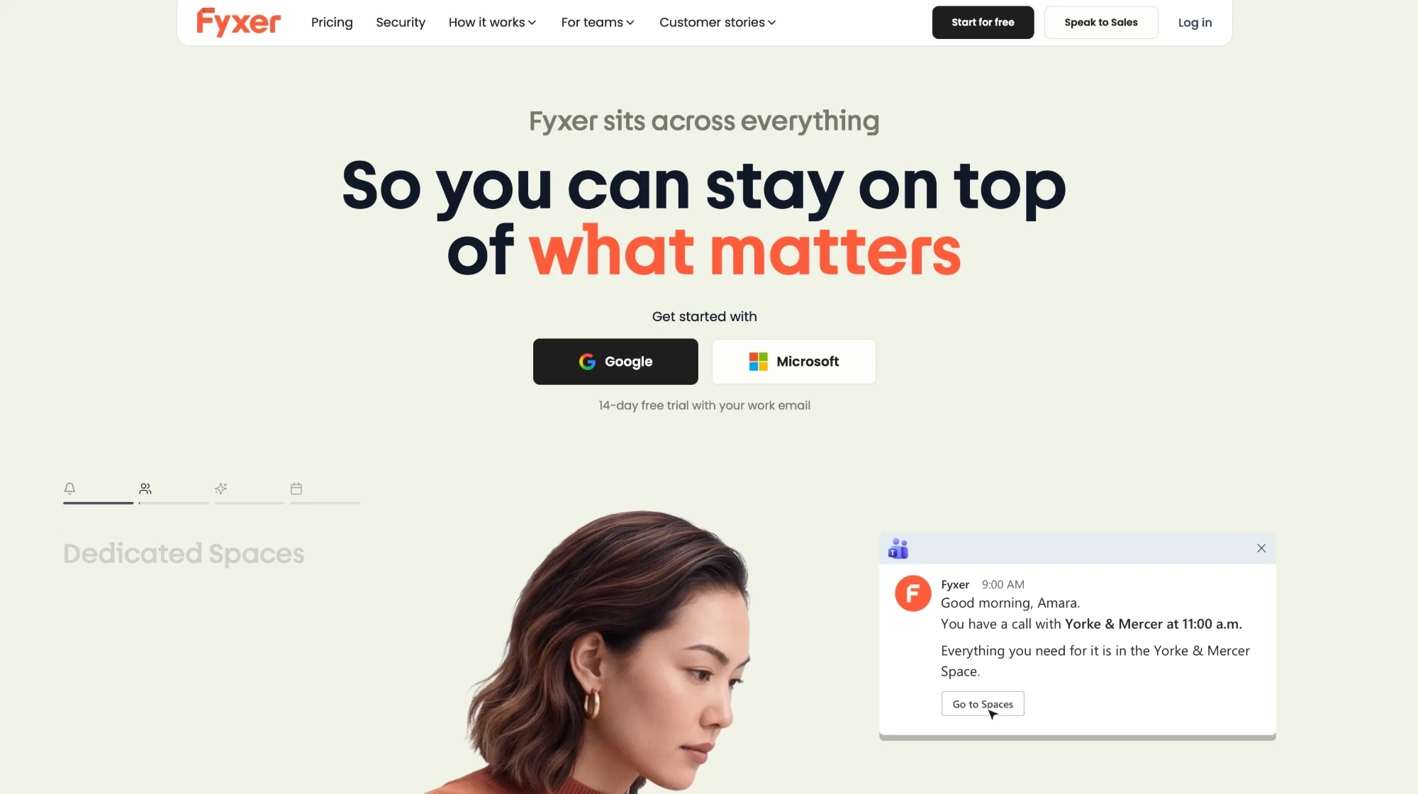
The big line
"So you can stay on top of what matters."
Does that tell me what Fyxer sells? Not really. It could be a calendar, a to-do list or a news app.
The small line
Above the big line, a smaller one says:
"Fyxer sits across everything."
This is where I'd expect to learn how Fyxer works. Across what? It doesn't say.
The pictures
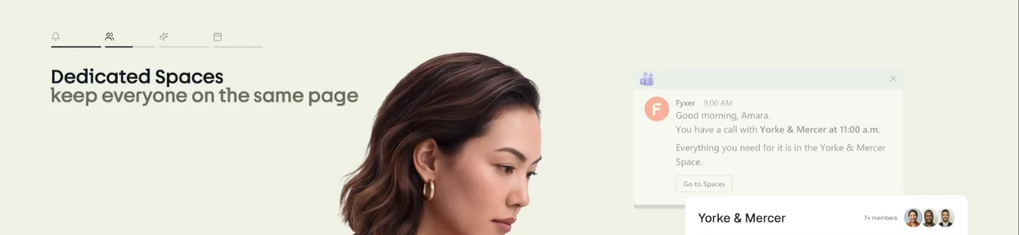
Lower down, tabs play one after another. The first is a Teams message: "Good morning, Amara. You have a call with Yorke & Mercer at 11:00 a.m."
Then "Dedicated Spaces keep everyone on the same page," with a space for a client and "7+ members."
Then "Automate routine tasks": "@Fyxer Help me prepare an agenda for my next meeting."
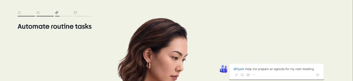
A call, a shared space, a meeting agenda. Three different things. Which one is Fyxer?
And every tab is about a team. My problem is a full inbox, and replies I keep putting off. I work alone, so I don't see myself here.
The button
Back at the top, under the big line: "Get started with" Google or Microsoft. "14-day free trial with your work email."
Started with what? The big line hasn't told me yet.
Four parts, and none of them tells me what Fyxer does.
❌ The homepage never says what Fyxer does.
Each part at the top of a homepage has a job. The big line says what you sell. The small line says how it works. The pictures show what you get. The button is the next step. On Fyxer's homepage, none of them does its job.
After the whole page, I still can't say what Fyxer does in one line. The plan page can: "Emails sorted and replies drafted in your tone." That line on the homepage, next to one email and the reply Fyxer wrote for it, would do the job of every part at once.
Compare it with homepages from my other teardowns. Each big line told me what they sell before I scrolled.
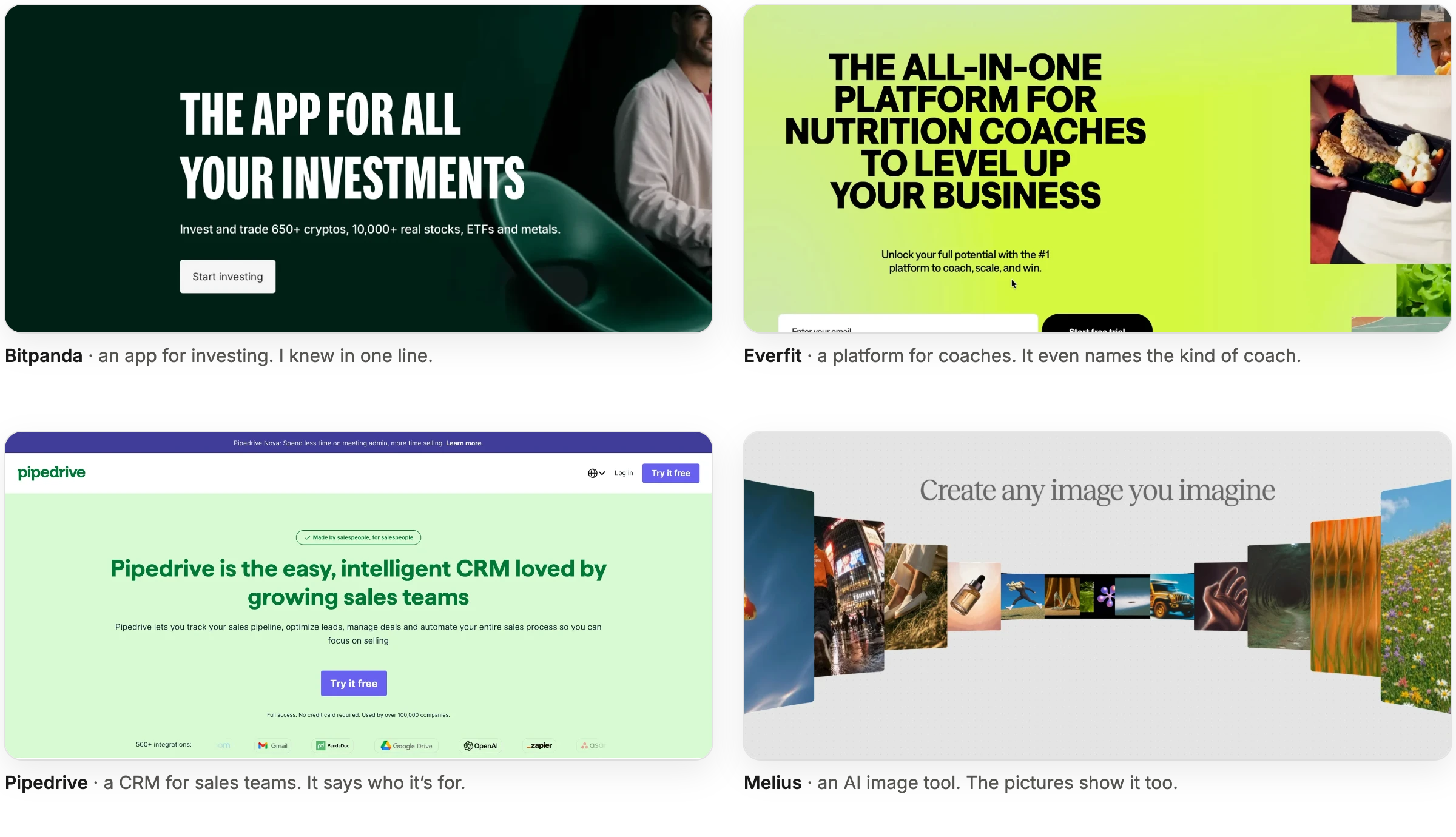
Fyxer's line, "So you can stay on top of what matters," could sit on any of them.
In my Everfit teardown, the headline changed for four kinds of coach, so I could find myself in it. Fyxer's tabs change too, and every one I saw is about a team.
Keep that in mind. The "teams" part comes back on the plan page.
2. One click to connect, and the scariest screen
I click Google. Fyxer's page asks me to connect my inbox and calendar.
Under the buttons, one line:
"Fyxer never sends or deletes emails for you."
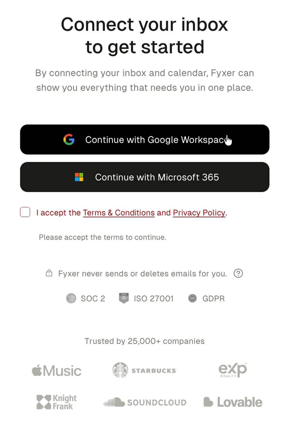
Good. That's my first worry, answered.
Twelve seconds later, Google's own screen opens:
"Read, compose and send emails from your Gmail account."
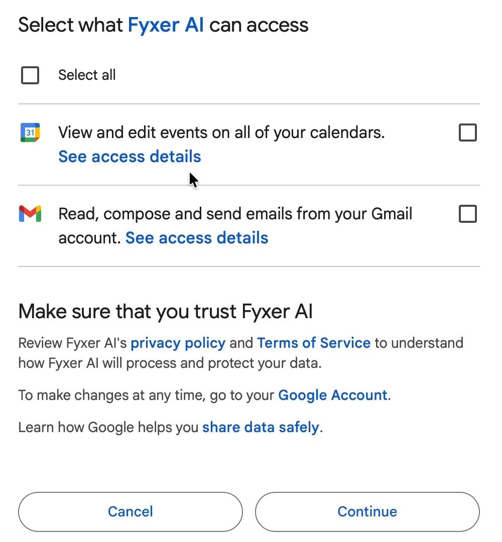
Wait. Send? Fyxer just told me it never sends.

❌ Fyxer says one thing. Google's screen says the opposite.
Both can be true. Google's box lets Fyxer send. Fyxer chooses not to. But at that moment, Fyxer's line is gone, and only Google's words are on screen. They're the scary ones.
Both boxes start unticked, too. I tick "Select all" and continue.
There's a gentler way to ask. Think of a new human assistant. First you let them see your calendar. Then you let them read your email. Only later do you let them write replies, and much later, send them. Fyxer asks for all of it on the first click.
I covered this screen in my Attio teardown, so I'll leave it there.
3. 36 seconds of "Still working"
Then a white screen with an orange "F."
"Getting things ready…" "Setting up your assistant…" Then:
"Still working. This is taking longer than usual…"
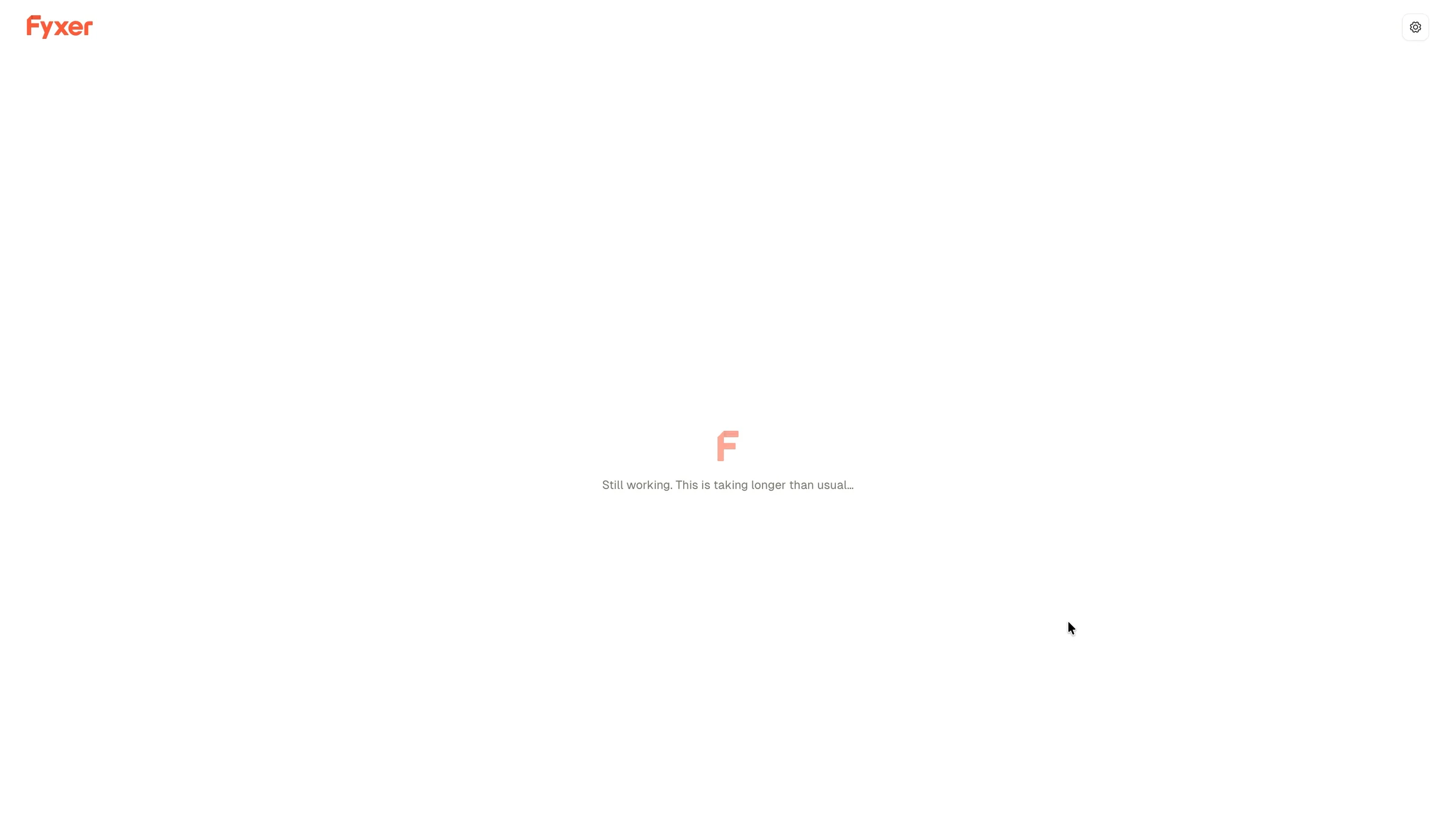
36 seconds. Long enough that I switched to another window.

Fyxer gave me nothing to do during this wait. The next screens show it knows how to fill one.
4. Questions while it builds, over someone else's inbox
"Thanks Edijs. Fyxer is creating your profile, which takes a minute."
"While that works away in the background, tell us how you work."
How do I work? Solo.
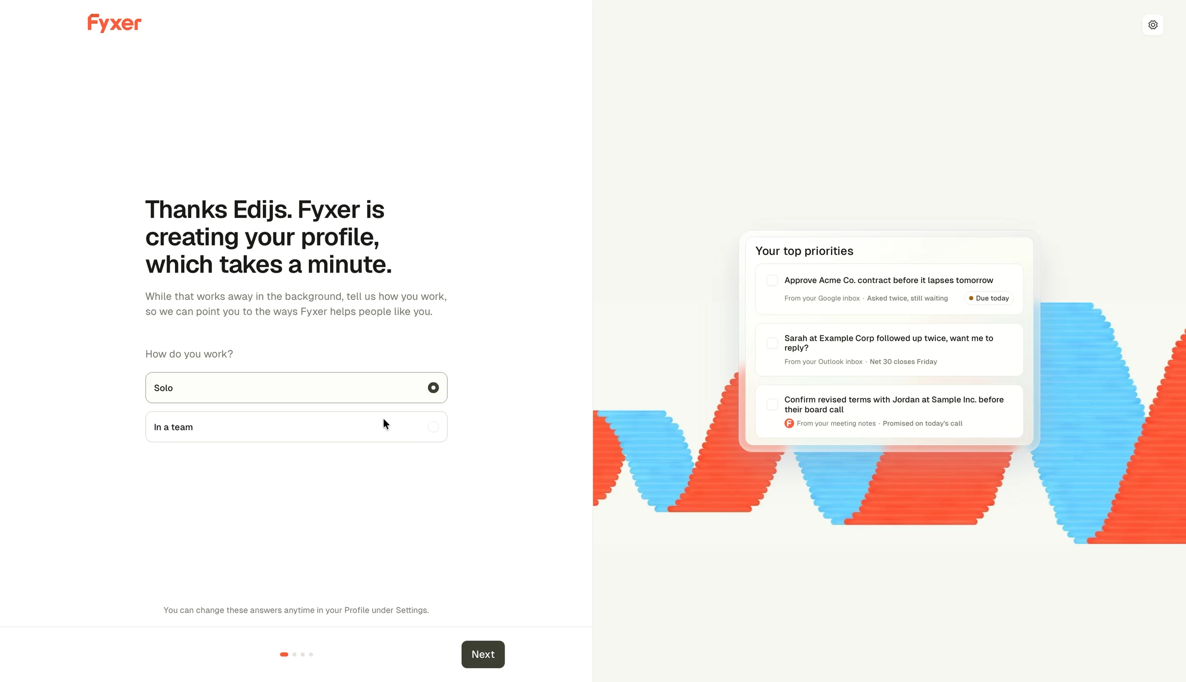
✅ Ask while you work.
The questions run while Fyxer reads my inbox. I'm not waiting, and it's not waiting for me. I praised the same idea in my Adomate teardown.
Look at the right side of the screen, though.
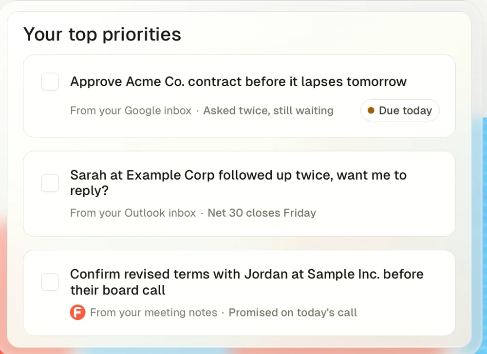
"Approve Acme Co. contract before it lapses tomorrow."
"Sarah at Example Corp followed up twice, want me to reply?"
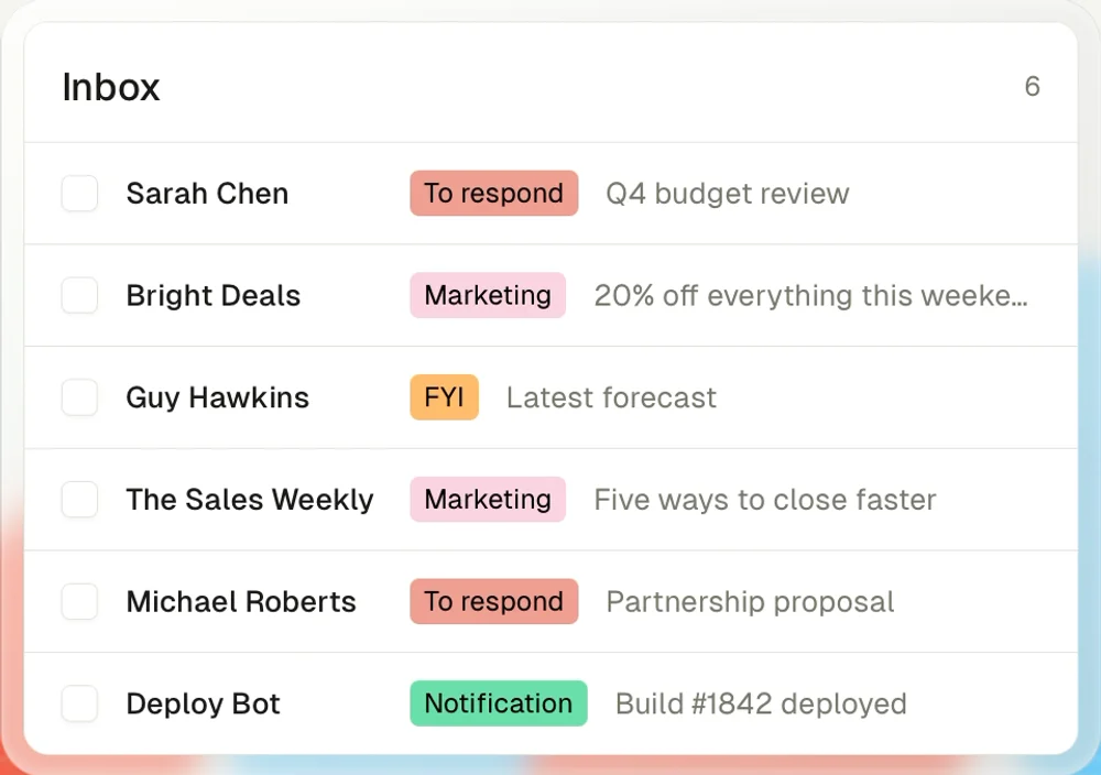
Next screen: choose a clean view or full visibility. The picture shows an inbox with Sarah Chen, Guy Hawkins and "The Sales Weekly."
Then: which tools do I use? Beside it, a fake Slack chat: "Tom hasn't yet. Shall I draft a follow-up for you?"
That's the closest I get to a draft before the card. It's for someone called Tom.
❌ Once you have my emails, stop showing fake ones.
Fake examples make sense when a product has nothing of yours yet. Fyxer has my whole inbox. The next screen proves it.
But for three screens, the best spot on the page goes to a made-up company, Acme Co.
My inbox has real emails. Even one of them, sorted by Fyxer, would have hit harder than anything about Acme.
The lesson: Fake examples are for empty accounts. Once people connect their data, every fake example is a missed chance to show them their own.
5. A page about me, before the card
"Edijs, here's your unique profile."
"This is what Fyxer knows about you so far."
On the right, a page about me.
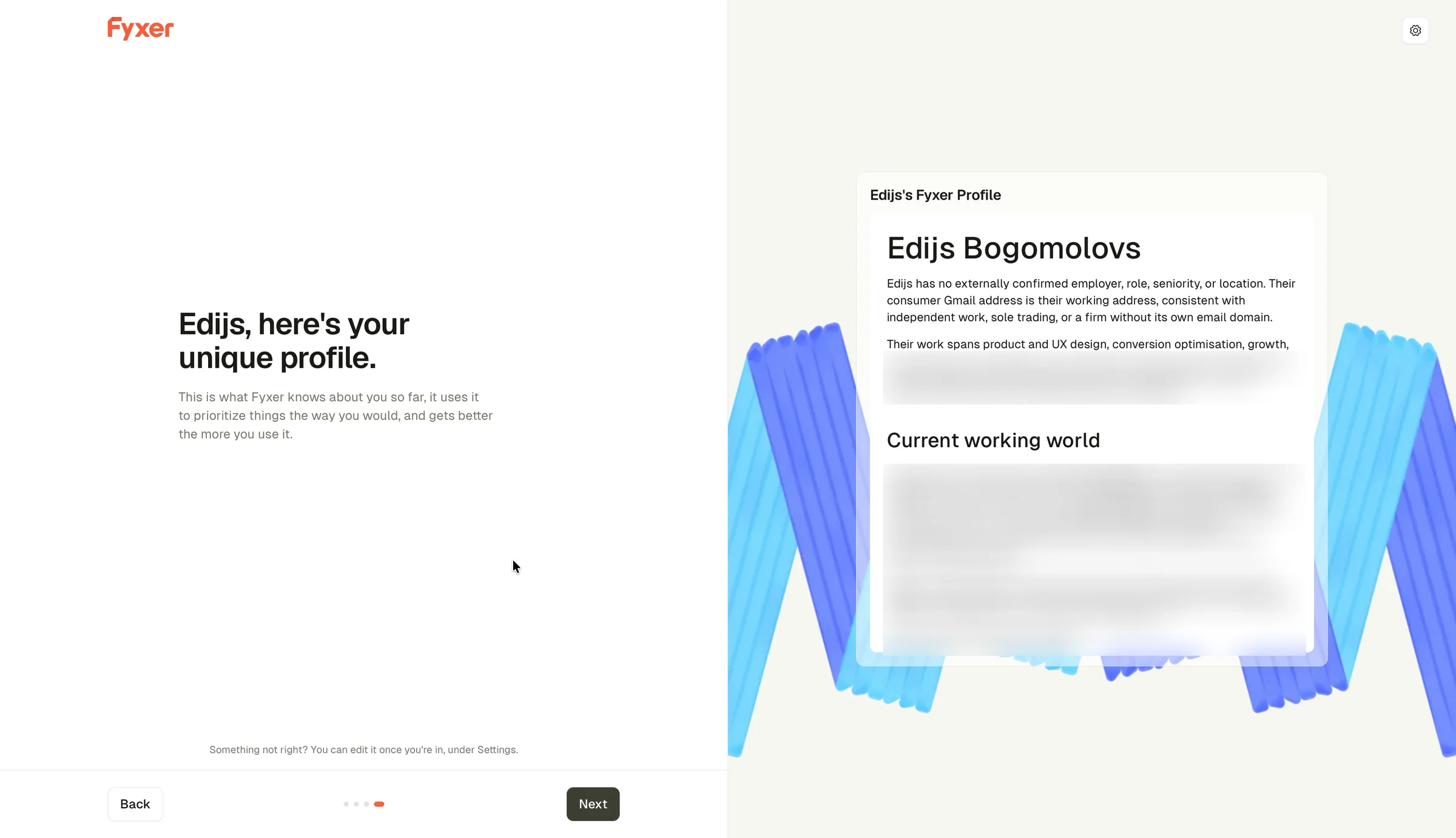
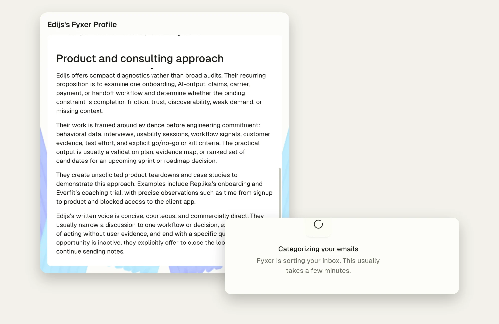
It named the people I meet every week. The clients I invoice. The languages I write in, and when I use each.
Two minutes in, and Fyxer already knew who I work with and how I write.

Then a section called "Product and consulting approach":
"They create unsolicited product teardowns and case studies to demonstrate this approach. Examples include Replika's onboarding and Everfit's coaching trial…"
And at the end:
"Edijs's written voice is concise, courteous, and commercially direct."
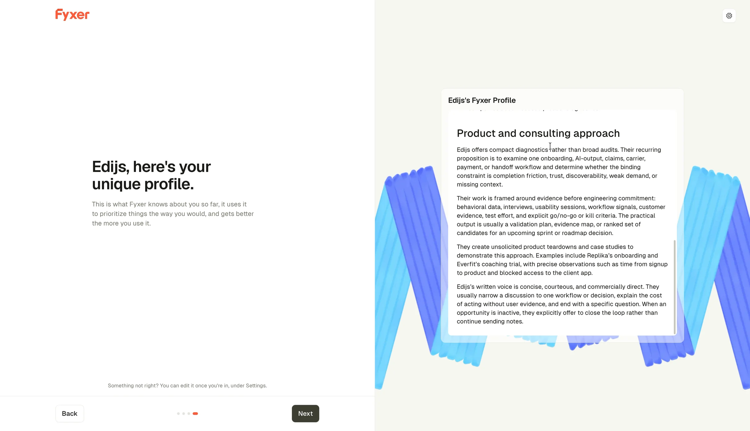
I've read worse summaries of my work from humans.
✅ Put your best screen before the card.
In my Opal teardown, the best screen came after I paid. Melius made its first great image after I paid.
Fyxer does it the other way round. The proof that the AI works comes before it asks for anything.
That's rare, and it's right.
❌ A profile proves you read. A draft proves you can help.
But look at what the screen proves.
It proves Fyxer read my inbox, and understood it. It doesn't show Fyxer doing the job I came for.
The plan page lists that job first: "Emails sorted and replies drafted in your tone." The profile even describes my tone. It just doesn't use it.
One reply to one real email, written the way the profile says I write, would turn "it knows me" into "it saves me time."
That's the moment it would click. The profile is the step before it.
The lesson: For an AI helper, value means the job done, not proof that it read your stuff. Show one finished piece of the job before you ask for the card.
The more it knows, the more I want the controls
Here's the other thing about that screen.
It's the best screen in the flow, and it's the one that made me stop.
It's a strange feeling to read a page about your clients and your weekly meetings. A product you met two minutes ago wrote it. Impressive, and a bit creepy.
At the bottom, in small grey text:
"Something not right? You can edit it once you're in, under Settings."
Once I'm in. After the card.
❌ Show what you read, and give the controls right there.
When a product shows how much it knows, the next question is always: what else did it read, and can I change it?
That's the moment to answer. Not in Settings, after the payment.
"Read: your last 90 days. Hide a sender. Edit what Fyxer knows." Three small controls on the profile screen would turn the creepy part into trust.
The lesson: The more personal the first thing your AI shows, the closer the controls should be.
6. Team highlighted, for someone who said Solo
Next: "Which plan works best for you?"
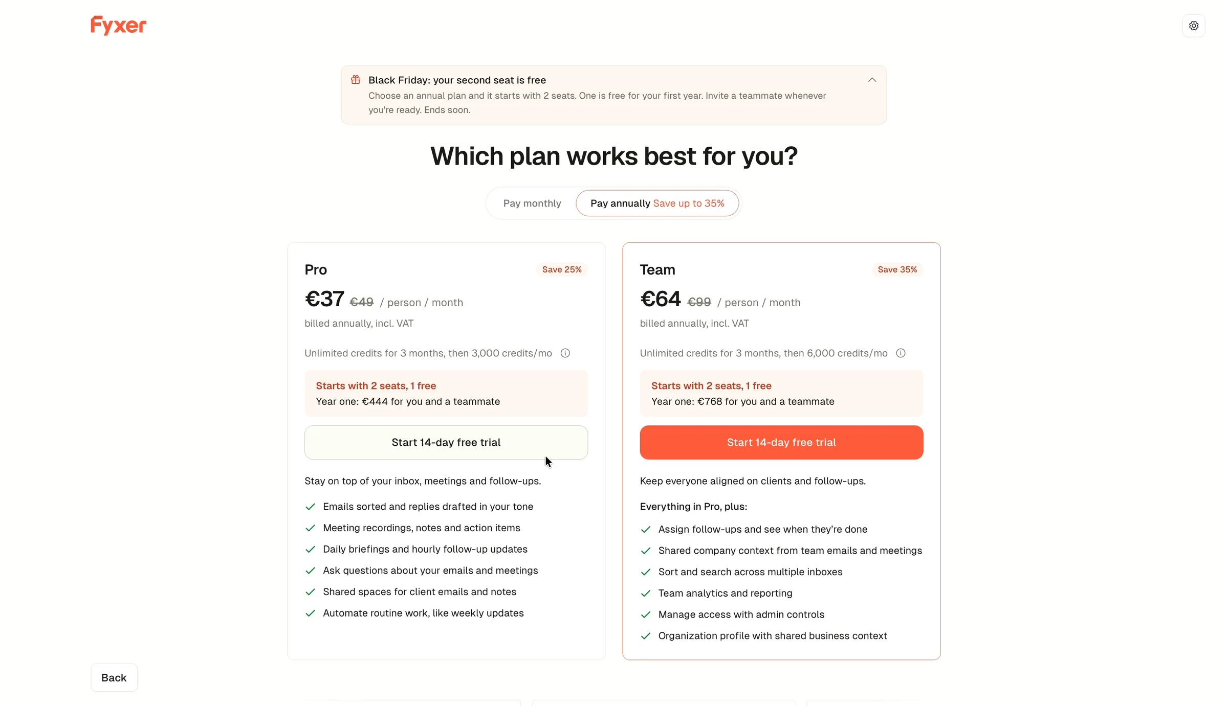
Two screens ago, Fyxer asked how I work. I said Solo. This whole offer ignores that.
A Black Friday banner: "Your second seat is free." It tells me to "invite a teammate whenever you're ready." Both plans "start with 2 seats, 1 free." The plan with the orange button is Team, at €64 per person. And yearly billing is picked for me.
❌ The offer ignores my answer.
I don't have a teammate. Every part of this page is built for someone who does.
I've written about using people's answers in my Melius and Replika teardowns. So, just one line here: a person who said Solo should see Pro, one seat, first.
I switch to monthly and pick Pro, €49 a month.
The payment page opens. It's run by Stripe.
✅ Say when the money starts.
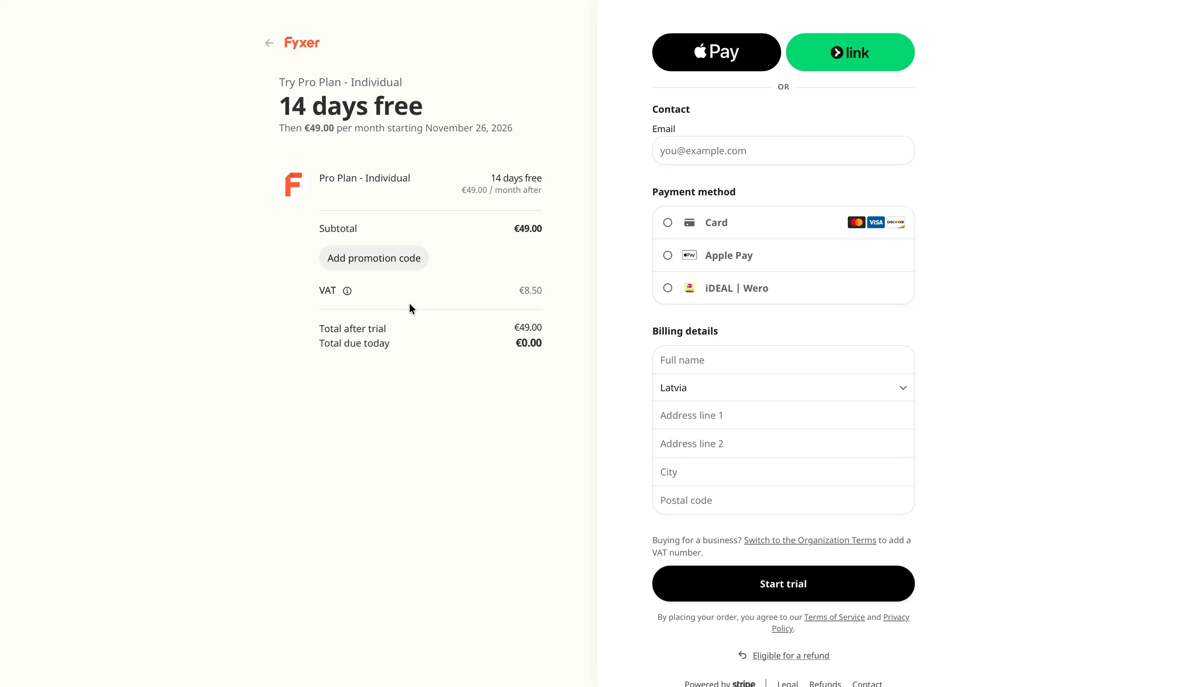
"14 days free. Then €49.00 per month starting November 26, 2026." Total due today: €0.00. A trial that needs your card can't get much clearer.
The email field is empty, though. Fyxer has my email. Google gave it.
I sat on that page for half a minute before I typed anything.
That's the price of asking for a card first. And all I'd seen so far was a page about myself.
7. After the card: a big box, my bills, and a spinner
I enter my card, confirm it with my bank, and land in the app.
My eyes go to the middle first. A greeting, "Good afternoon, Edijs," and under it a big box:
"Ask Fyxer anything."
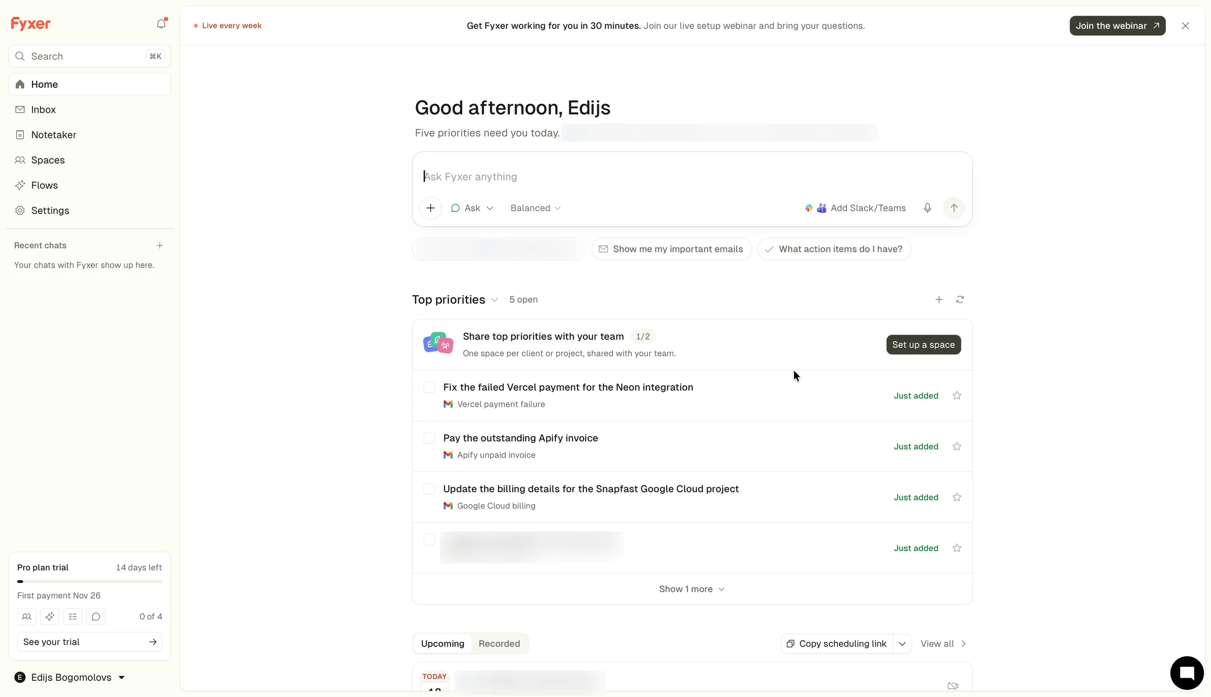
Ask about what? My email? The meetings? Something in Teams or Slack, since there's an "Add Slack/Teams" button inside the box? It doesn't say, so I don't type anything.

Under the greeting: "Nothing needs you right now." Two seconds later, it changes to "Five priorities need you today."
Here they are: fix a failed payment, pay an invoice, update billing details, update a questionnaire, and try another company's new feature.
Four bill reminders and an ad.
They're real, at least. That's my inbox. But none of them is a reply to a person.
And none of them is news to me. They're just my unread emails. I pay my bills at the end of each month anyway.
❌ Don't show me what I already know.
A priority list should find what I'd miss. Like a client who's been waiting two days for an answer. A list of unread bills is my inbox in a different order.
Then I notice the thin banner at the very top:
"Get Fyxer working for you in 30 minutes. Join our live setup webinar."

I've just given my card. Now it's 30 more minutes, and a webinar.
I open Inbox.
"Categorizing your emails. Fyxer is sorting your inbox. This usually takes a few minutes."
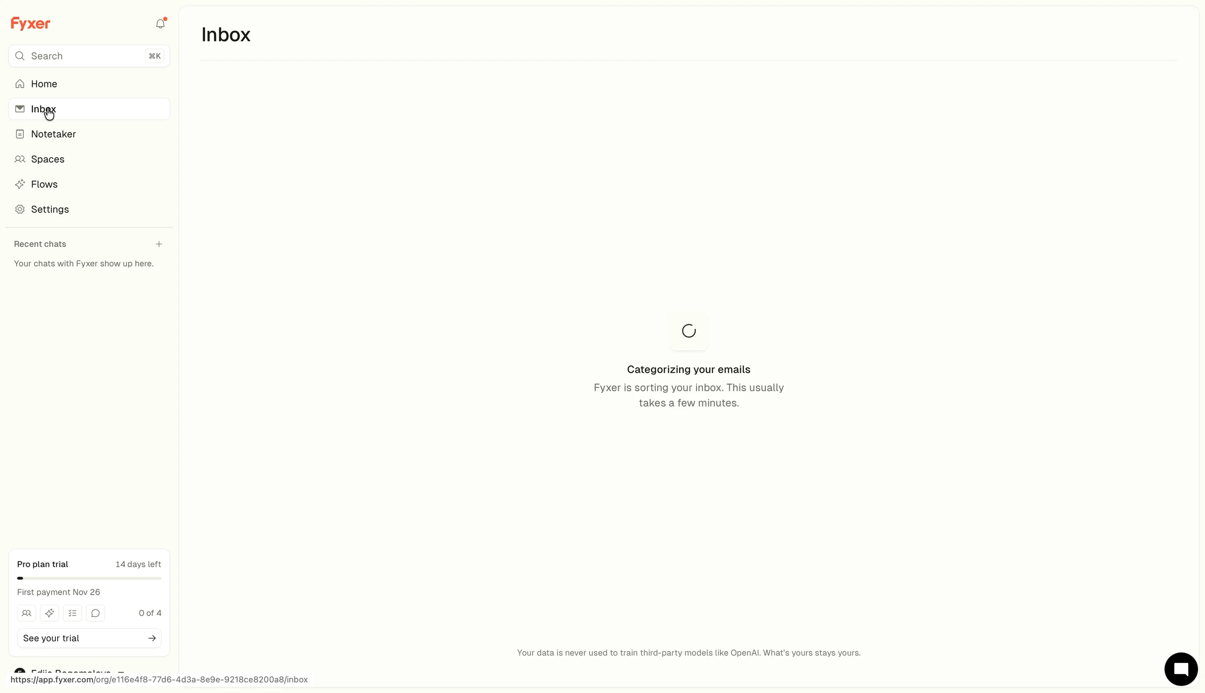
94 seconds later, my inbox appears. The labels I can see: Notification and Marketing. "Nothing open yet."
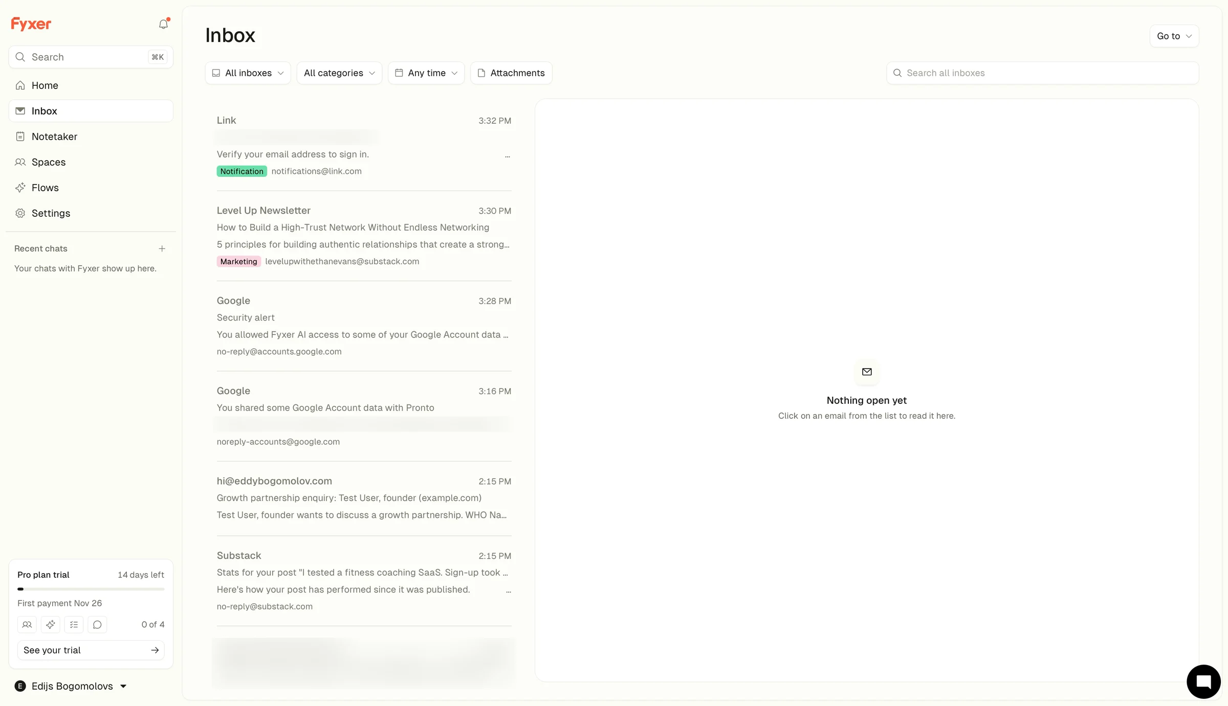
These are the same emails I already have in Gmail, with a few labels on top. Is this a copy? Did Fyxer change anything in my Gmail, or is everything the same? Nothing on the page says.
I watched it for another minute and a half. When my recording ended, eight and a half minutes after the homepage, I hadn't seen a draft.
Maybe they come later. Fyxer's own banner suggests it takes 30 minutes.
But the trial clock had already started, and so had the card.
So here I am, eight and a half minutes in. I connected my inbox, answered its questions and gave my card. Fyxer read my emails and wrote a whole page about me.
Where is that page now? What did Fyxer make from it? The dashboard doesn't say. I never got the moment where it clicks.

❌ Land on the job, not on the setup.
After the card is the moment people check whether they made a good decision.
Fyxer's answer is a webinar invitation, a list of my bills and a spinner.
Fyxer could start drafting the moment I connect, and keep the first draft for this screen. Then the first thing after the card is a reply to check, not a wait.
The lesson: The first screen after the card should show the thing the plan page sold. If it isn't ready, say when it will be, and show the first piece of it.
8. What Fyxer gets right
Before my fixes, here's what I'd keep exactly as it is.
✅ One click in. One Google click, and I'm in the app in under five minutes.
✅ Questions while it works. It asks how I work while it builds my profile, so setup never feels empty.
✅ A profile before the card. It read my inbox and got my work and my tone right, before asking for anything. Most trials make you pay before you see anything this good.
✅ A clear checkout. €0 today, and the exact day the first payment starts.
So the parts are good. What I'd change is the order they come in.
9. How I'd redesign it
So what would I change? Not much. Fyxer can already read my inbox, learn my tone and sort my emails. The parts are there. The order is wrong.
Before the card, I got a page about me. After the card, a webinar, my bills and a spinner. I never saw what I came for: one reply written for me.
So I'd keep the inbox connection, the questions while it builds, and the profile. They're the best parts. And I'd change two screens: the one before the card, and the one after it.
Before the card: one real draft
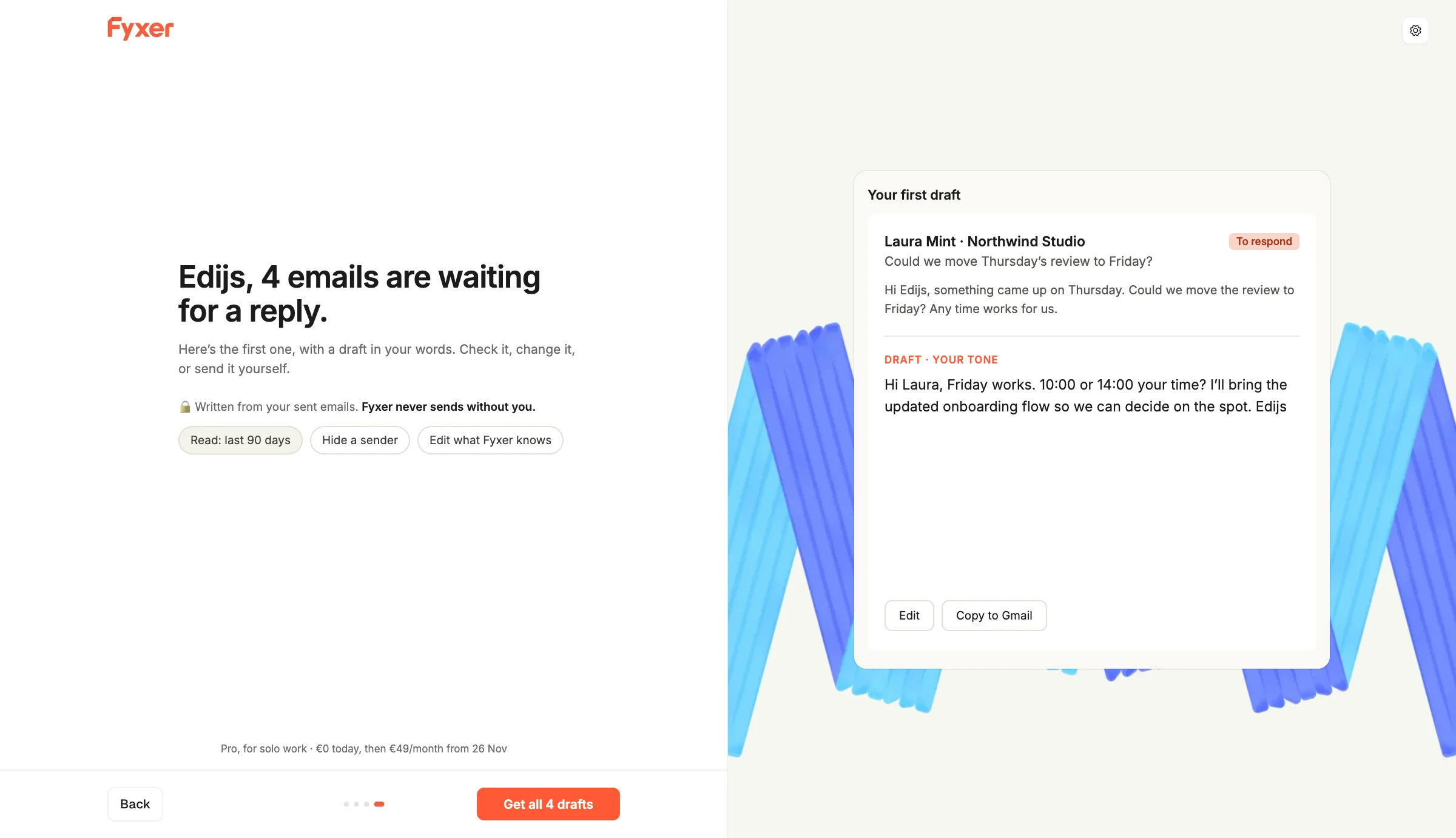
"Edijs, 4 emails are waiting for a reply. Here's the first one, in your words." One real email, one draft. Fyxer doesn't send it. I can just read it.
Why: A reply is the job the plan page sells. Seeing it done once, in my words, is what makes the card feel safe.
Right under it: the controls
"Read: last 90 days. Hide a sender. Edit what Fyxer knows." On the screen, not in Settings.
Why: The more it shows it knows, the sooner people ask what else it read. Answer while they're asking.
Then: the plan that matches my answer
"Pro, for solo work." The button says what I get: "Get all 4 drafts."
Why: I said Solo. I shouldn't have to skip a Team plan to find mine.
After the card: open on the drafts
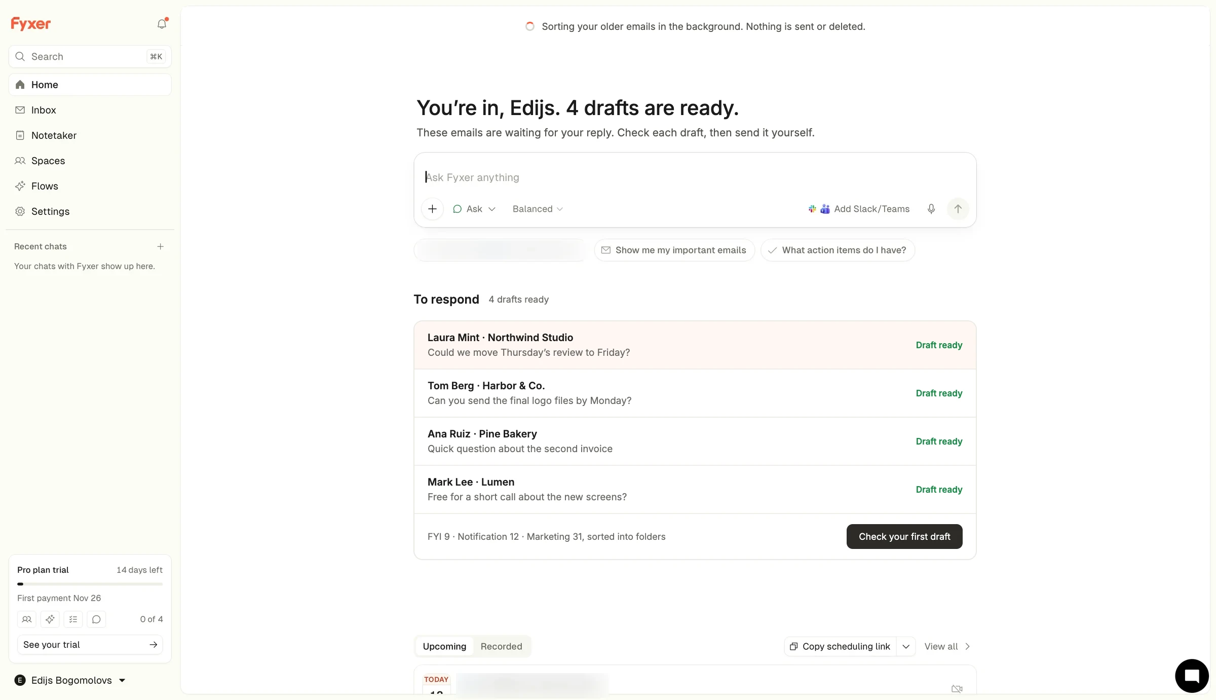
"You're in. 4 drafts are ready for you to check." The rest of the inbox sorts in the background.
Why: Right after paying, people want proof they chose well. Show the job, not a webinar.

10. Three tests I'd try first
If I worked on getting more people to start a Fyxer trial and pay for it, I'd start with these three.
Test 1: One real draft before the card
Problem: The screen before the card shows a profile of me. The first draft doesn't appear before the card, or, in my recording, after it.
Change: After the profile, show one real email that needs a reply and a draft in my tone. Nothing is sent.
What I think will happen: When people see the job done once, more of them will start the trial. More will send a first draft on day one.
What to count: How many people go from the plan page to adding a card, how many approve a first draft within 24 hours, and how many pay after the trial.
Test 2: My inbox in the setup screens
Problem: Setup shows every option with Acme Co., Sarah Chen and a fake Slack chat. But Fyxer already has my inbox.
Change: Replace the samples with my own top three emails, labelled the way Fyxer would label them.
What I think will happen: Seeing their own email sorted will get more people through setup. More of them will pick the clean view and keep it.
What to count: How many people finish setup, how long it takes them to reach the plan page, and how many still use the clean view a week later.
Test 3: Controls on the profile
Problem: The profile shows how much Fyxer read, and the only control is "edit it once you're in, under Settings."
Change: Add what it read, a way to hide a sender, and an edit link, on the profile screen.
What I think will happen: People who feel in control will go on to the plan page more often. Fewer will disconnect their inbox in the first days.
What to count: How many people go from the profile to the plan page, how many disconnect their inbox in the first 72 hours, and how many write to support about privacy.
Before any of these, I'd pick Pro for people who said Solo. That's not a test. It's using the answer.
These are ideas to test, not promises. Some of them might not work.
11. Knowing me isn't helping me (yet)
Fyxer gets a lot right.
The line about never sending emails is in the right place.
The questions run while it works.
The checkout says exactly when the money starts.
And the profile is the most impressive screen I've seen in any trial so far. It read my inbox and understood my work.
But it spent that moment describing me, instead of doing one thing for me.
Before the card, I saw someone else's inbox and a page about myself. After the card, a webinar, my bills and a spinner.
The thing the plan page sold, a reply in my tone, never showed up while I was watching.
What Fyxer gets right
- Questions while it builds: I'm never waiting on an empty screen during setup.
- The best screen before the card: The profile proves the AI works before it asks for anything.
- A clear trial: €0 today, and the exact date of the first payment.
What I'd improve
- The proof: One real draft before the card, not just a profile.
- The ask: Read first. Ask to send only when I want Fyxer to send, so "never sends" and Google's screen say the same thing.
- The samples: My own emails in the setup screens, once Fyxer has them.
- The controls: What it read and how to change it, on the profile screen.
- The plan: Pro first for someone who said Solo.
- The first screen after the card: The drafts, not a webinar banner.
- The wait: 36 seconds of loading with nothing to do, and 94 more for the inbox.
The bigger lesson
AI products that read your data can do something most trials can't: show you a result about you before you pay.
Fyxer does that. It's the best screen before the card in this whole series.
But knowing you is not the same as helping you. A profile tells me the AI read my inbox. A draft tells me it will save me time.
If your product reads people's data, ask three questions:
Is the first thing you show them proof that you read it, or proof that you can do the job?
Once you have their data, is there any sample data left on screen?
And when you show how much you know, are the controls right next to it?
For Fyxer, the fix could be as simple as one real draft under the profile.
Same inbox. Same profile. Same card.
But this time, I'd have seen my tone used, not just described.
Does your trial show people a result about them before the card? Is it the job, or a description of it? I'd love to hear how your product handles it.
I break down real sign-ups and free trials to show where they lose potential paying customers and how to improve the experience.
Want me to review your trial? DM me "teardown" on LinkedIn.
Eddy
Bitpanda let me do everything (except invest)
Bitpanda, Nov 12, 2026