Bitpanda let me do everything (except invest)
9 min read · about Bitpanda ·

Bitpanda let me do everything (except invest)
Sign up, six questions, an ID check, two videos, a deposit, my bank’s app. Six times “almost there”. Zero investments.
1 / 32

Written by
Eddy Bogomolov
Product designer for free trials
Published
What you'll learn
- “Almost there” is a promise. Bitpanda said it six times, from “two more steps” to “your money is on the way”. Each one spent a little trust. None of them was true, and I never got my Bitcoin.
- Your vendor’s screens are your product. Two other companies wrote my two endings. Sumsub wrote “You may close this page” after the ID check. A payment page wrote “return to the merchant’s website” after I paid.
- The law sets the checks, not the words. Six questions, ID photos and a video are required. “Two more steps”, the silent errors, the dead end and a €20 buy that became a deposit were choices.
I came to Bitpanda to invest €20. Over two days I signed up, verified my ID, filmed two videos and deposited the money. Bitpanda told me I was almost there six times. I never invested.
Bitpanda let me do everything (except invest), chapter by chapter
In this story, I run a small design business on my own. I want to start investing a little every month: some stocks, a bit of crypto, for the long term. I've never used a broker.
I'm looking for one app where I can sign up, add money and buy my first thing.
So I signed up for Bitpanda on the web. I recorded every screen, from the homepage to my first investment, over two days.
I did everything it asked. I made an account and answered six questions. I gave my phone number and address. I took photos of my ID and filmed two videos. I paid in €20 and confirmed it in my bank's app.
Everything except the one thing I came for: invest.
Along the way, Bitpanda told me I was nearly done six times:
- "Just two more steps."
- "One last step."
- "Almost there!"
- "Your profile has been verified."
- "Thank you for your payment!"
- "Your money is on the way."
I came to invest €20. I left with €20 in a euro wallet, and no investment.
This teardown is different from my last few. Melius, Replika and Opal asked me quiz questions and then ignored the answers. Bitpanda's questions aren't a quiz. They're a legal form, and every check it ran is required by EU law.
So I'm not asking if the checks should exist. I'm asking why every "almost" was wrong. Did Bitpanda tell me how many steps there really were? Who ran them, and who wrote their words? And which parts were the law, and which were a choice?
Let's get into it.
1. The homepage promises one app
I open the Bitpanda homepage. The headline:
"The app for all your investments."
Under it: "Invest and trade 650+ cryptos, 10,000+ real stocks, ETFs and metals."
One app for all of it. That's what I want.
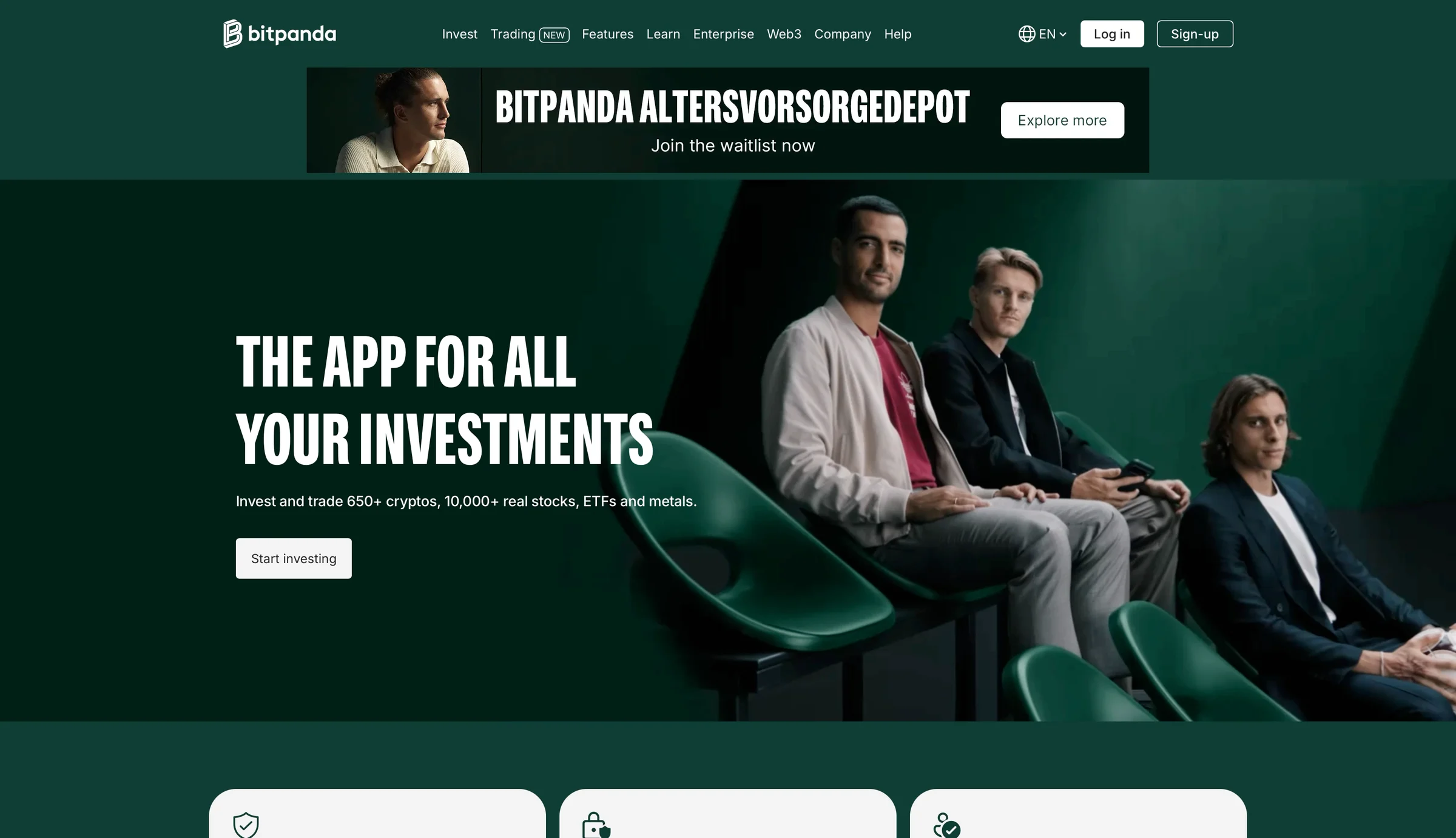
Behind the headline plays a film of people in green stadium seats. One of them holds a football. Not one screen of the app. (My Everfit teardown had the same problem, so I'll leave it there.)
Above the hero, a banner:
"Bitpanda Altersvorsorgedepot. Join the waitlist now."

A German pension account, on the English page, for someone in Latvia. The first thing on the page isn't for me.

Remember the promise, though: one app. It'll matter later.
2. One long form, then "two more steps"
I click "Start investing."
First, a bot check. Then one long form. Name, email, password and country. A "not a U.S. person" box. Two switches. And a block of legal text about risk.
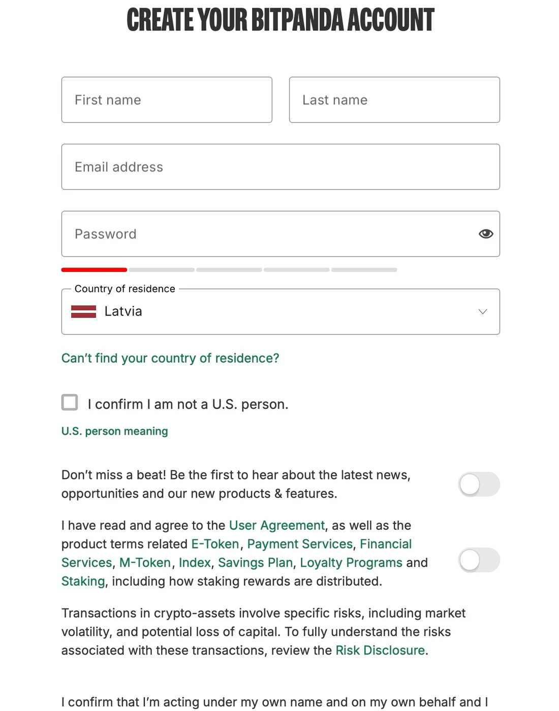
Latvia is already filled in. Nice. But there's no "Continue with Google" or Apple. I type everything, then wait for a six-digit code by email.
Then:
"Welcome to Bitpanda! Just two more steps to start trading."
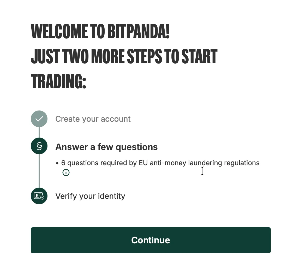
Answer a few questions. Verify my identity.
And it says why: "6 questions required by EU anti-money laundering regulations."
Two steps. I can do two steps.
✅ Tell people how close they are.
This works. People want to finish things. When a screen says you're almost done, you're more likely to keep going.
One team doubled how many people finished a finance app's setup step. All they did was call it "completing" setup.
But it only works while the number is true.
Remember: two steps.
3. Six fair questions
The questions come one per screen, with a counter: 1/6, 2/6, 3/6.
What will I use the account for? I pick "Long-term investment."
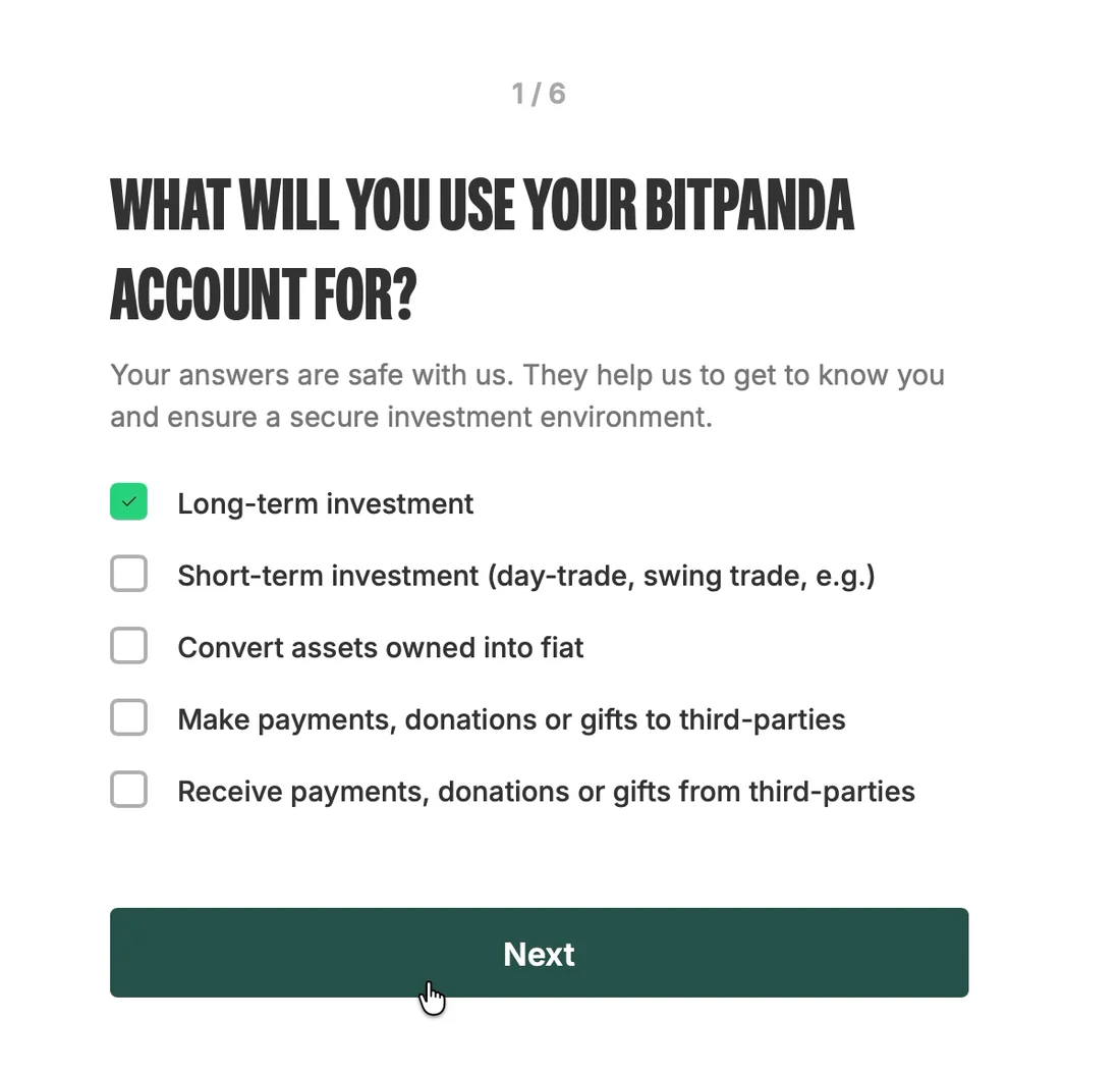
Then my job and industry, where my money comes from, my monthly income, my net worth, and how much I plan to invest in a year.
Under each one: "Your answers are safe with us."
✅ Say why you ask.
Income and net worth are personal questions. I'd usually stop and think.
Compare that with my Opal teardown. Opal asked me to guess my screen time, when it could have measured it. The question felt like a setup for a scary number.
Bitpanda asks for hard facts, one at a time, shows how many are left, and says who requires them: the EU.
That turns a nosy form into a fair one.
These six screens are the best part of the whole sign-up.
The lesson: If the law makes you ask, say so. People accept a hard question when they know who's asking and why.
Then:
"Thank you! One last step to start investing."
Have my ID ready. Find a quiet room with good light.
One last step. Here we go.
4. "One last step" is sixteen screens, and two companies
A box opens over the app.
First, my phone number. Then an SMS code, with a 20-second clock.
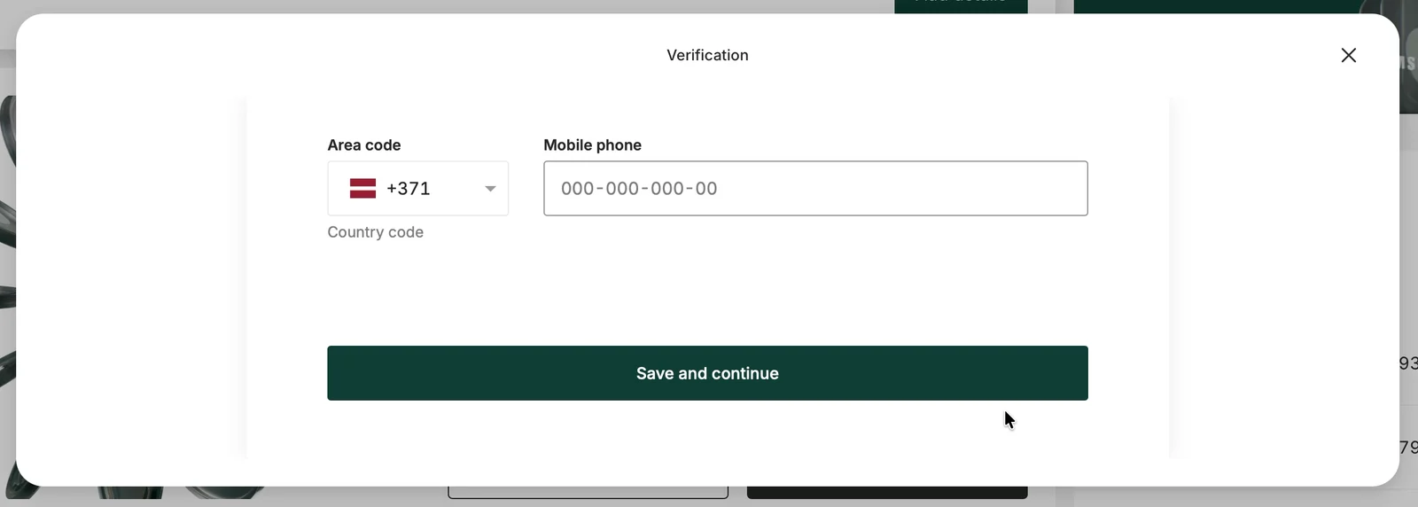
That wasn't on the list. Fine. Maybe it's part of "verify your identity."

Next: name, birth date and address. At the bottom, in a yellow box:
"Please note that it is not possible to change your data later."
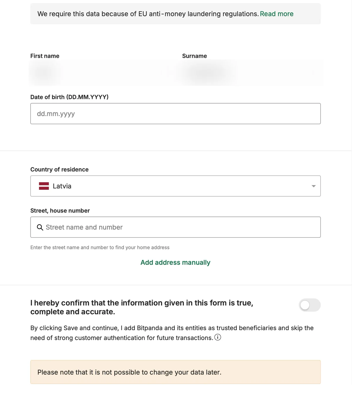
And under the switch, a line I read twice: by clicking Save, I "add Bitpanda and its entities as trusted beneficiaries and skip the need of strong customer authentication for future transactions."
I still don't know what that means.
A second company joins
Then my country, my language, and which ID I'll use: passport, ID card, driving licence or residence permit.
I pick Passport.
Three screens later, the box changes. White turns dark. A new logo at the bottom: "Powered by Sumsub." Sumsub is the company that checks IDs for Bitpanda.
And it asks:
"Select type and issuing country of your identity document."
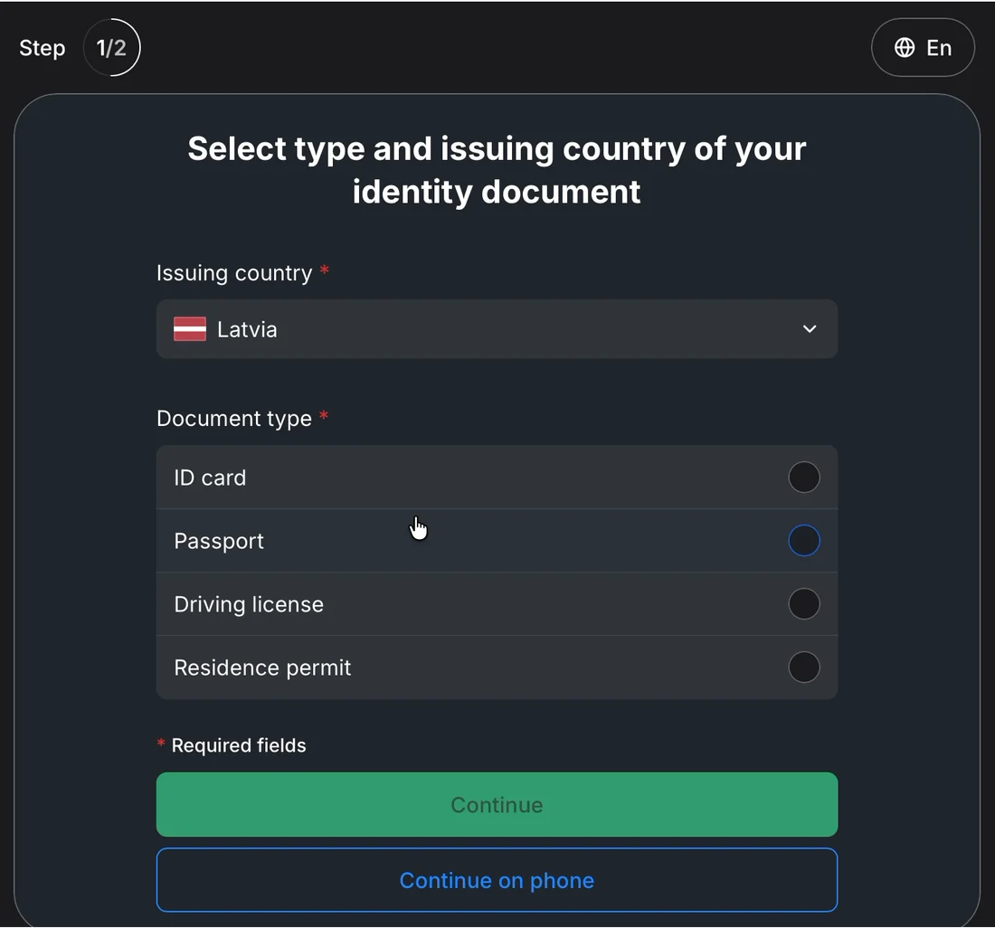
Latvia. Document type, again. This time I pick ID card, and nothing minds that it doesn't match what I told Bitpanda.
❌ Your vendor's screens are your product.
Most money apps buy their ID check from another company, a vendor. That makes sense. The vendor knows the rules and the fraud patterns.
But the seam shows.
From here on, half the screens are Sumsub's, inside Bitpanda's box. A different design. Different words. Its own step counter.
And Sumsub asks for everything Bitpanda's screen just asked. The country. The document. Even the language, with its own "En" switch in the corner.
So Bitpanda's screen is redundant. Take it out, and nothing is lost. The "last step" gets one screen shorter.
I don't see two companies. I see Bitpanda, asking me the same things twice.
Remember the homepage: "The app for all your investments." One app. For the next six minutes, it's two.
The lesson: If a vendor runs part of your flow, its screens are your product. If the vendor asks a question anyway, don't ask it first. And make the whole thing look and count like one flow.
Three permission screens
Then the camera.
A Bitpanda screen asks if it can use my camera and microphone. Then Safari asks for the camera. A minute later, Safari asks again, for the camera and the mic.
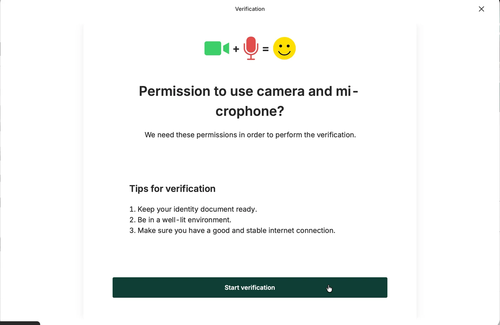
One is for the photos of my ID. The other is for a video.
Nobody told me there'd be a video.
Three counters
Here's the "one last step," screen by screen:
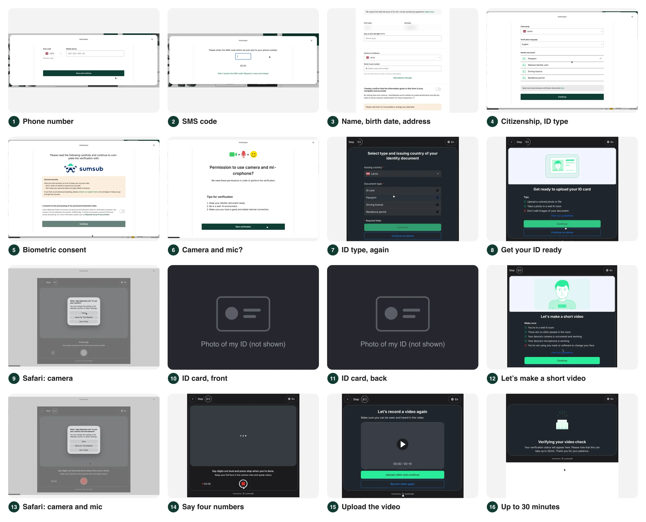
- Phone number
- SMS code
- Name, birth date and address
- Citizenship and document type
- Biometric consent
- Camera and microphone
- Document type, again
- Get your ID ready
- Safari: camera
- ID card, front
- ID card, back
- "Let's make a short video"
- Safari: camera and microphone
- Say four numbers out loud
- Upload the video
- "This can take up to 30 min"
Now look at the counters I was shown along the way.
Bitpanda said "Just two more steps." Then "One last step." Then, on screen seven, Sumsub started a counter of its own: "Step 1/2."
Three counters. Two companies. Sixteen screens in "one last step," twenty-two by the time I was done.

None of the counters was true.
❌ A progress counter is a promise.
When crypto apps had to add bank-style ID checks, far fewer people finished signing up. The teams that recovered went through the flow screen by screen, asking why people dropped off at each one.
Bitpanda can't skip the checks. Every EU broker has the same rules.
But it can show one counter, and make it true.
A true count doesn't make the flow longer. It turns the length from a surprise into a plan: "About 6 minutes. Have your ID ready. You'll record a short video."
The lesson: "Almost done" borrows trust. Every screen past the number you promised uses some of it up. A second counter from your vendor uses it up twice as fast.
What I'd test
I'd replace "Just two more steps" with one true counter. It would cover Bitpanda's and Sumsub's screens, and show every step and how long it takes. The surprises would come first: the video, the camera prompts, and "you can't change this later."
My hypothesis: When people know how long it takes and what's coming, fewer will quit halfway through the ID check.
I'd measure how many people finish the ID check, and where they quit.
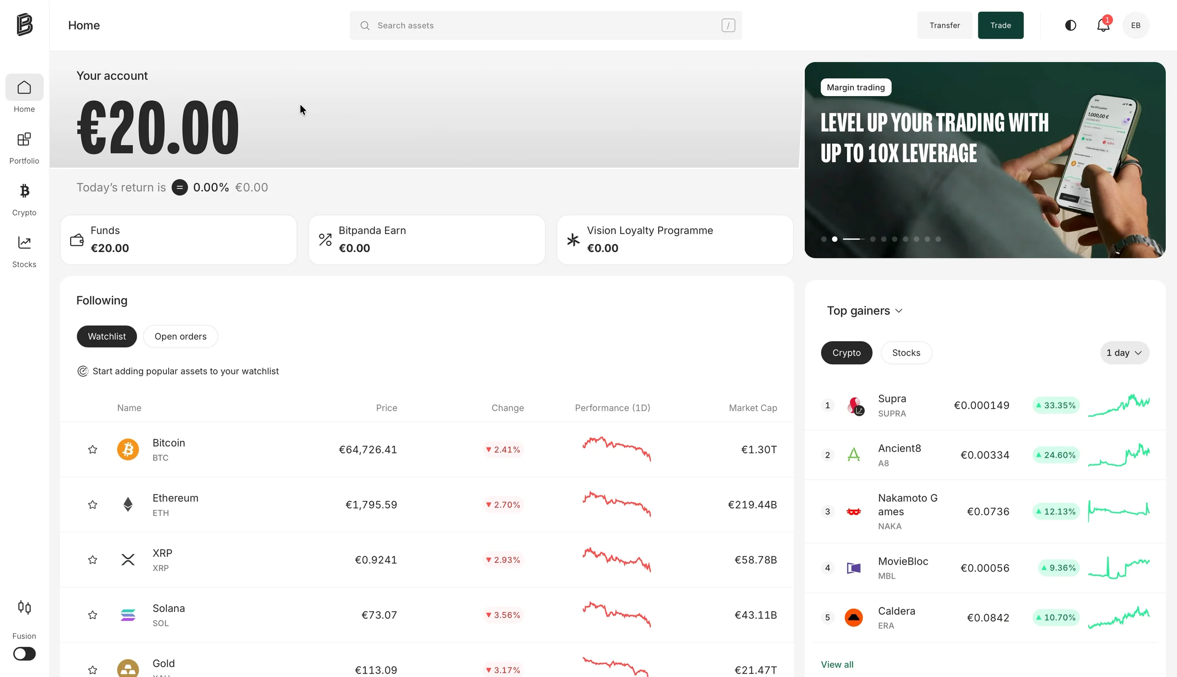
5. While I verify, the home sells leverage
The verification box sits over the app's home screen. So for three minutes, the only other thing I can see is what's behind it.
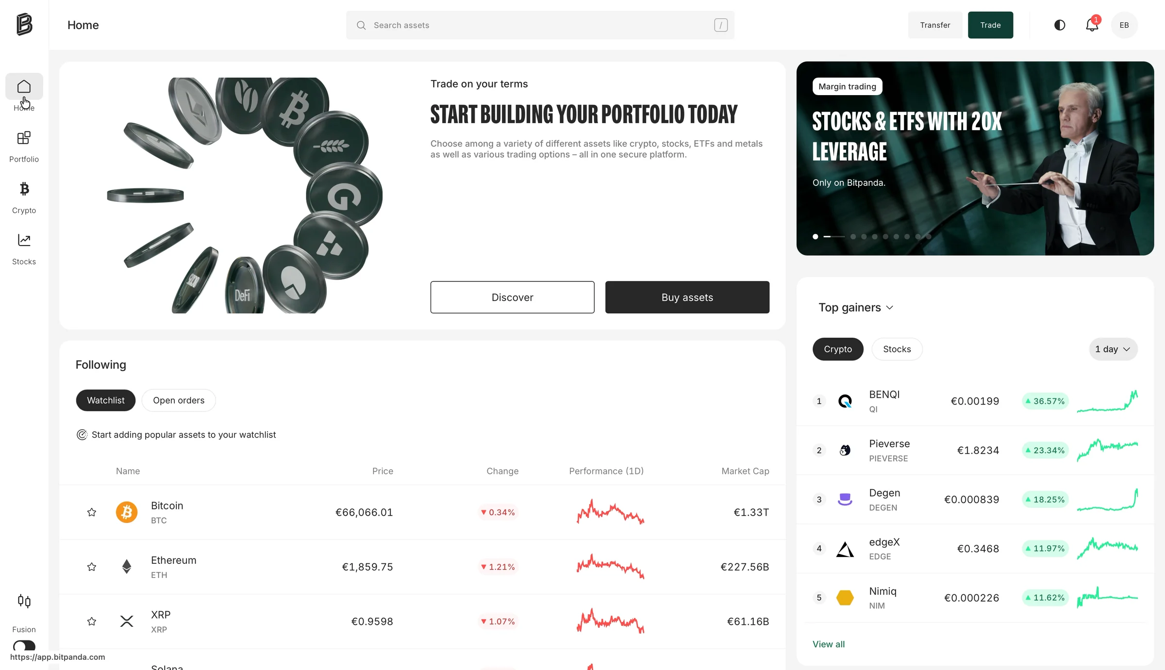
A banner carousel:
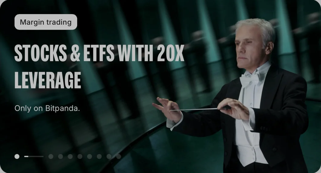
"Stocks & ETFs with 20x leverage."
"Level up your trading with up to 10x leverage."
In the corner: "Switch to advanced trading." In the sidebar: the day's top gainers, small coins up 12 to 33 percent.
I've never bought a stock. I can't even buy one yet.
❌ Don't greet a beginner with leverage.
In a game or a photo app, the first offer a new user sees is a marketing choice.
In an investing app, it's also a statement about what the app is for.
The first products a beginner sees set their idea of what normal looks like here. Bitpanda's says: borrowed money, advanced trading, coins that jumped 30 percent today.
The same carousel has a banner for savings plans: "Set up a savings plan to buy your assets automatically." It's one of nine slides, and it isn't first.
The lesson: In a money app, the first screen a beginner sees is part of the sign-up. Show them the product you'd want a beginner to start with.
What I'd test
I'd show new users savings plans and ETFs first. Leverage would wait until someone asks for it.
My hypothesis: A home made for beginners will get more new users to add money, and to add more a month later.
I'd measure how many people add money, start a savings plan, and add more in month two.
6. The video check fails, in the vendor's words
The last screen: a short video. Keep my face in the circle, say four numbers out loud, press stop.
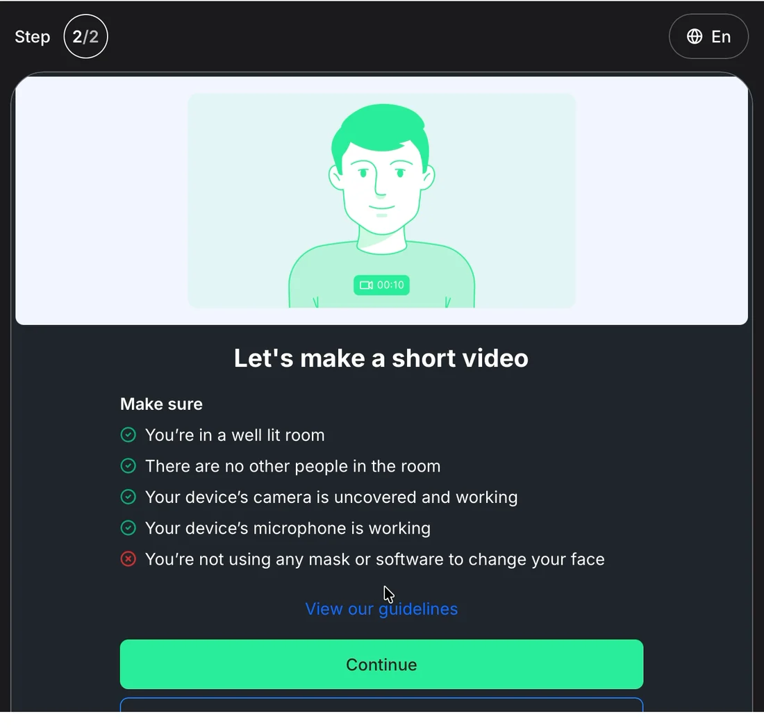
Nine seconds in, my camera picture goes dark. Three dots. The timer keeps running.
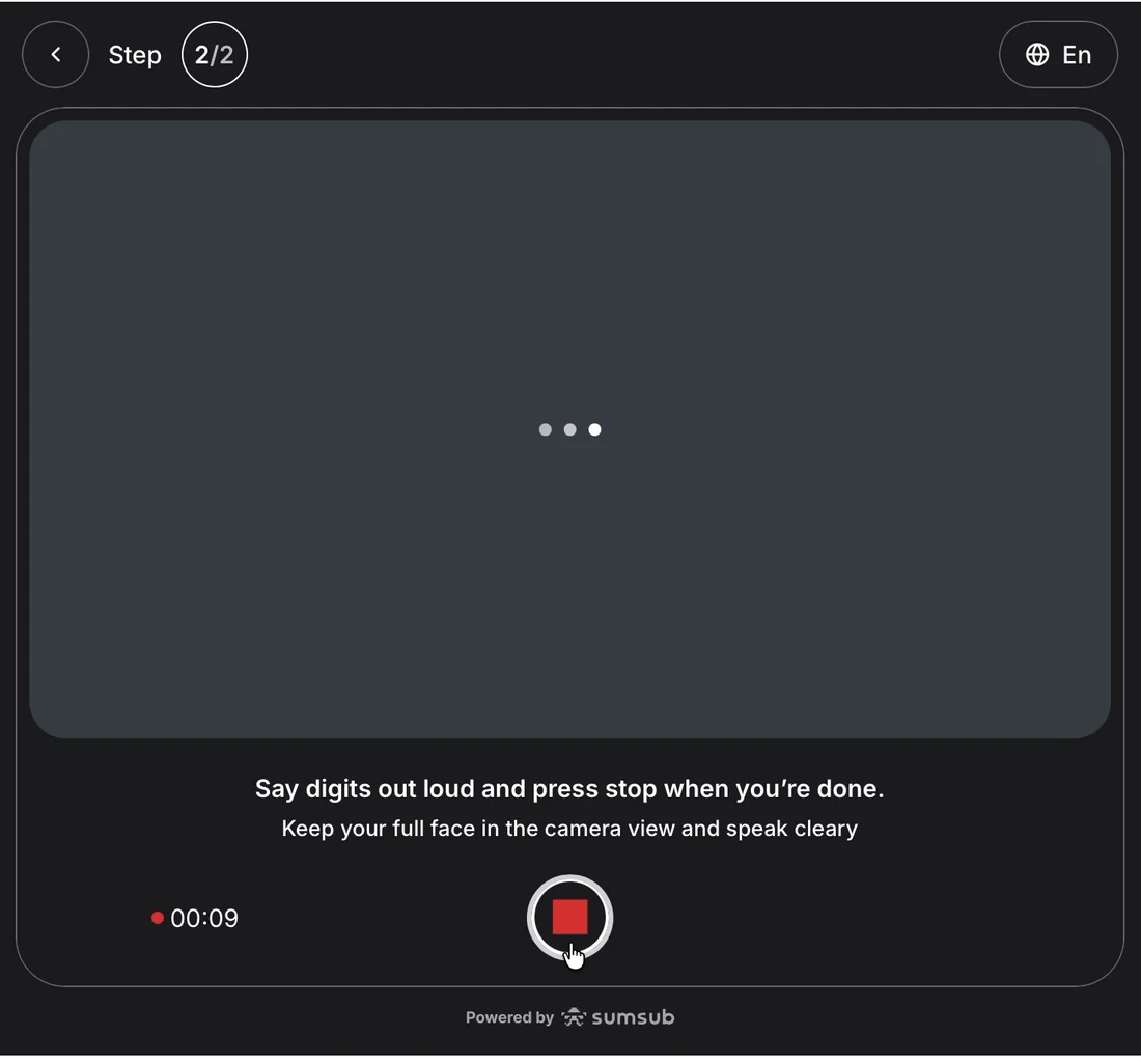
I keep reading numbers to a grey box.
Then the review screen. Its title: "Let's record a video again." Its big green button: "Upload video and continue."
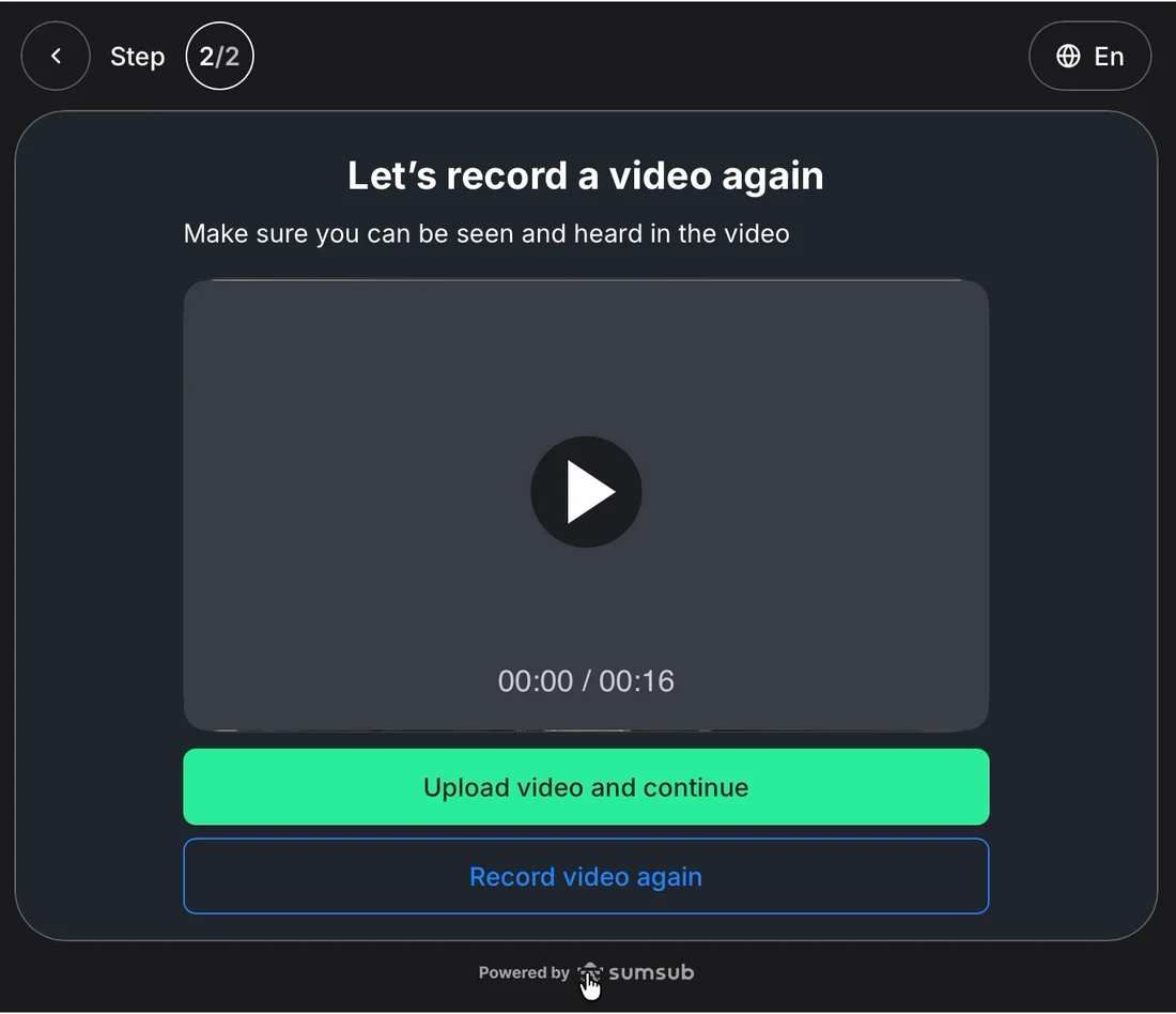
So which one is it? I upload.
"Verifying your video check. Please note that this can take up to 30min."
43 seconds later:
"Almost there! Let's fix a few things."
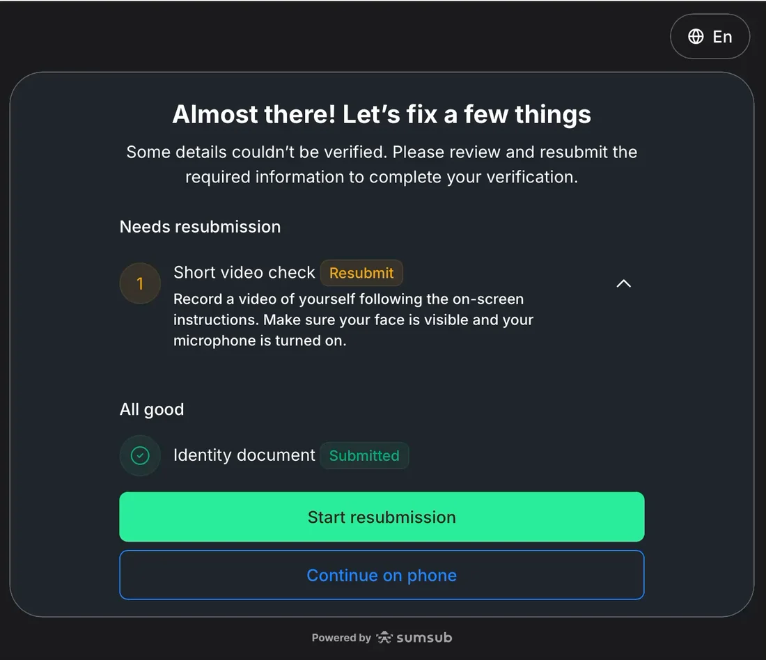
Short video check: Resubmit. "Make sure your face is visible and your microphone is turned on."
They were.

✅ Keep what worked.
"Almost there" is a kind way to deliver bad news. And my ID photos stay "Submitted." I only redo the video.
❌ Say what went wrong, and how to fix it.
This is Sumsub's standard checklist, and I'd passed every item on it. It doesn't say what actually failed.
My guess: the picture went dark. The video check probably knows.
"Your camera stopped at 0:09. Check that no other app is using it, then try again" would fix it in one go.
The lesson: Your vendor's standard error is just a stand-in. Replace it with what actually happened and what to do next.
7. Verified, then "Please verify your account"
I record the video again. The picture goes dark again, at the same moment. I upload it anyway.
About three minutes later:
"Your profile has been verified. You may close this page."
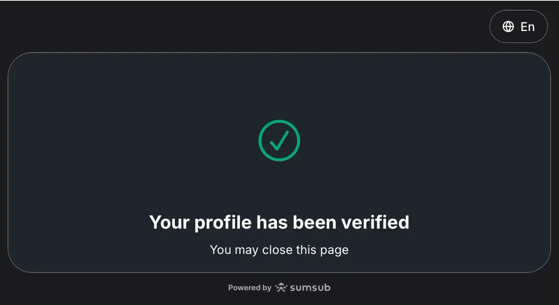
✅ Fast checks.
From the second upload to "verified" took about three minutes, against the 30 it warned me about. For a full ID and video check, that's quick.
❌ Write the last screen yourself.
But look at the words: "You may close this page."
That's Sumsub's default ending, written for a page of its own in a browser tab. Here it sits inside Bitpanda's app, at the moment I'm most ready to act.
Close it and do what?
The vendor can't know my next step. Bitpanda can. "You're verified. Add money."
Instead, the home still says "Enter your personal details." A notice asks for my tax number before January 2027. Nothing says "Add money."
So I find the button myself. I click "Buy assets."
"Please verify your account. In accordance with EU regulation, users are required to verify their account to deposit and trade on Bitpanda."
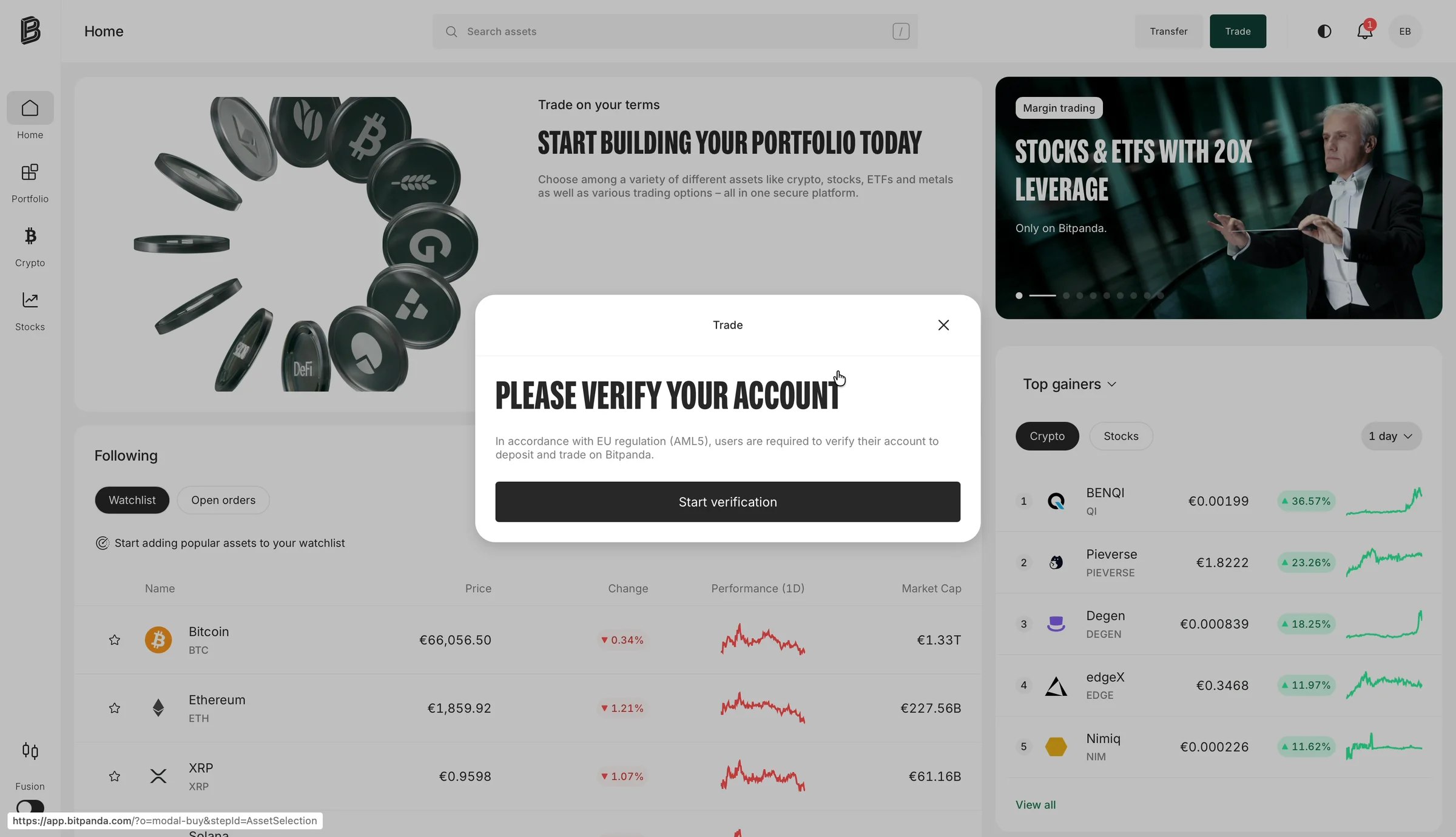
I click "Start verification." An empty box opens. A spinner, then nothing.
I close it and try again. The same empty box.

❌ Give one answer to "am I verified?"
Here's what I think happened. Sumsub said yes. Bitpanda's buy button hadn't heard yet. So it sent me back to Sumsub, which had nothing left to ask me. Hence the empty box.
Maybe the two systems needed a few more minutes to agree. That happens.
But then say so: "Finishing your check, about a minute." Not "Please verify your account," to someone who just watched a green tick.
If I had money ready to invest, this is where I'd close the tab.
The lesson: When two systems decide if a user can buy, the user should hear one answer.
Day one: nine minutes to "verified." No buy.
Here's the whole journey, from my recording:
- 0:00 "The app for all your investments."
- 0:14 One long sign-up form, then an email code.
- 1:10 "Just two more steps."
- 1:14 Six fair questions.
- 1:52 "One last step": sixteen screens.
- 4:42 "This can take up to 30 min."
- 5:25 The video is sent back, with no reason.
- 9:00 "Your profile has been verified."
- 9:30 "Please verify your account."
8. Two days later: €20, and no Bitcoin
Two days later, I try again.
The home no longer asks for my personal details. "Buy assets" opens a picker. Crypto, Bitcoin, €20.
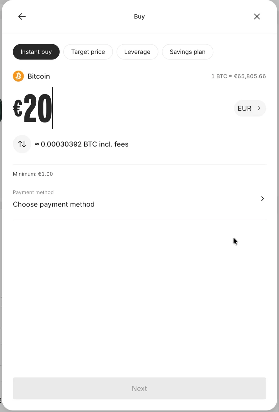
✅ A clear buy screen.
One amount. What I'll get for it, fees included. A €1 minimum, so I know a small buy is fine.
This is the screen I came for on day one.
Last field: "Choose payment method." I click it.
Eighteen seconds, then an error
A white box. A spinner. Eighteen seconds. Then:
"We are having issues loading this page."
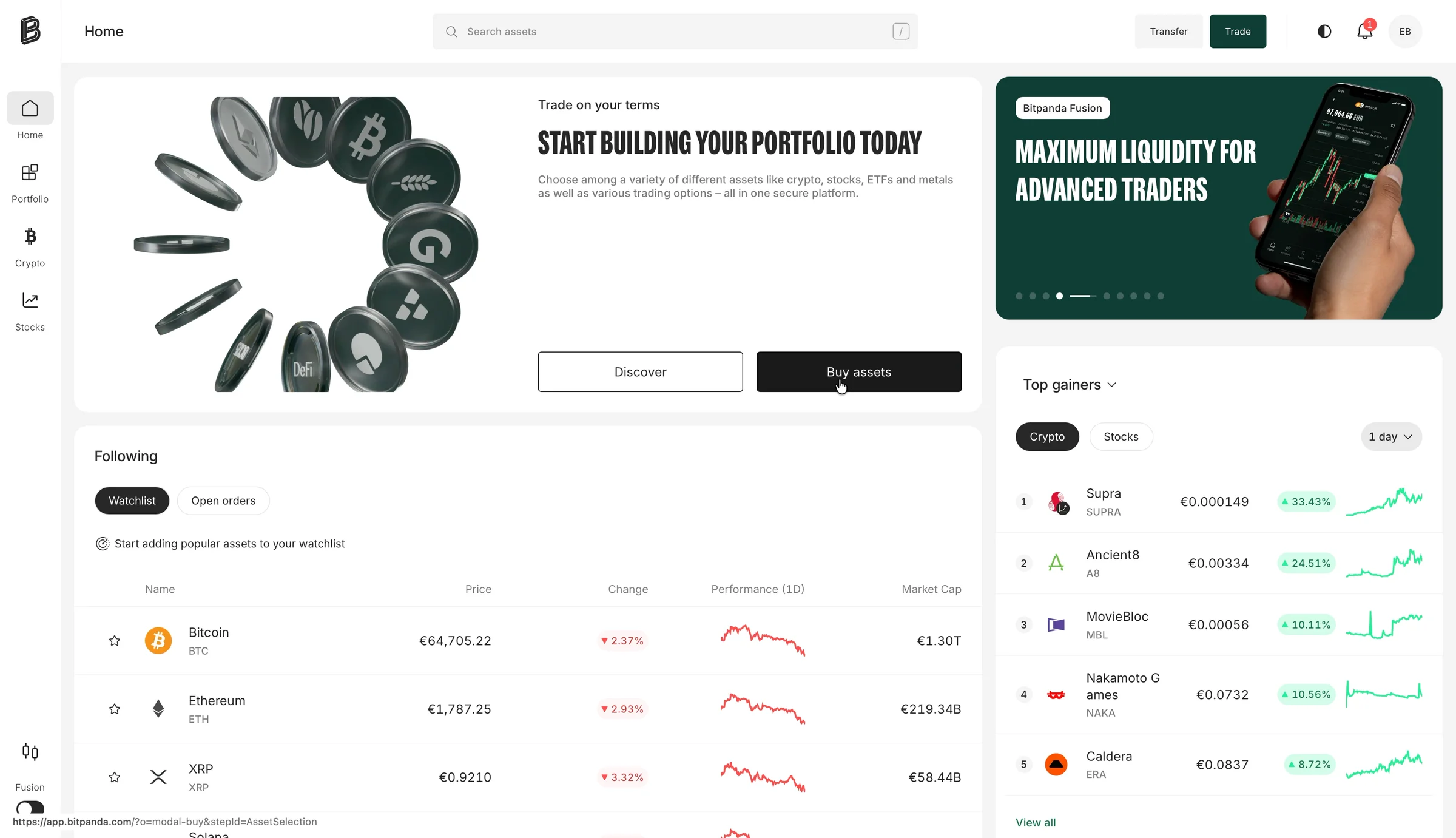
"Try again" closes the whole thing. My €20 and my Bitcoin are gone. I start over from "Buy assets."
That's the third error in this story with no reason. First the video. Then the empty box. Now this.

The buy becomes a deposit
Second try. Bitcoin, €20. The "Next" button stays grey until I pick how to pay, so I click "Choose payment method" again.
I think I'm choosing how to pay for my Bitcoin.
Eighteen seconds of spinner. Then the window comes back with a new title: "Deposit." For about two seconds, it loads without its design, as a raw list of currency names.
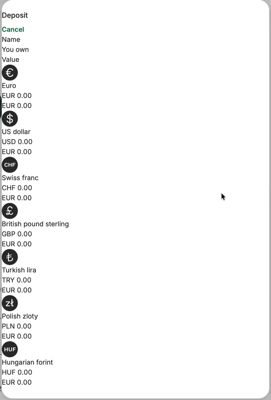
❌ Don't switch the job without saying so.
From where I sit, this is a bug. I started a purchase. "Choose payment method" started a deposit instead.
The only sign was the window's title, which changed from "Buy" to "Deposit." Nothing told me my Bitcoin order was gone.
If a buy needs money in the account first, say so: "First, add €20. Then we'll buy your Bitcoin."
The lesson: If one task has to turn into another, tell people before it happens, and bring them back to the first task when it's done.
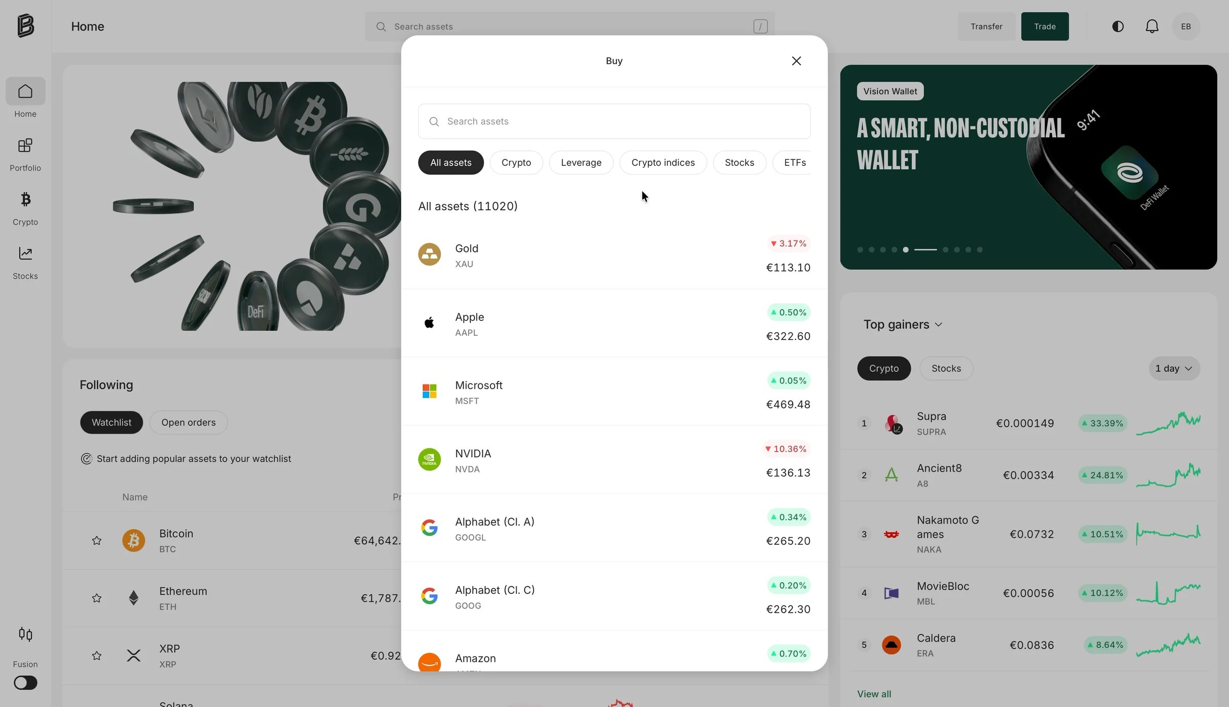
First, pick a currency: euro, US dollar, Swiss franc, British pound, Turkish lira, Polish zloty… thirteen of them. I live in Latvia, and I just typed an amount in euros.
Then a payment method: bank transfer, Google Pay or card. I pick card.
Then the amount, again:
"How much money would you like to deposit?"
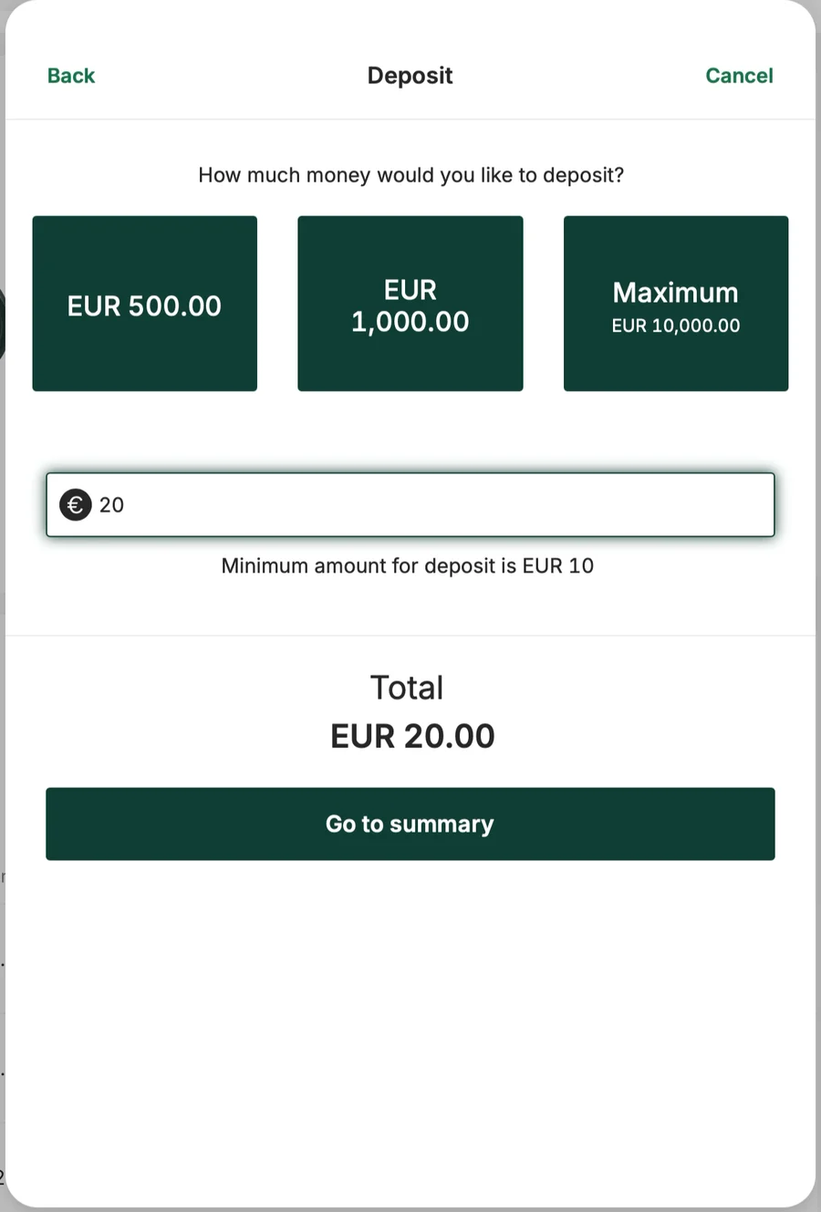
Three big buttons: €500, €1,000, and "Maximum €10,000."

❌ Presets are advice.
Quick-amount buttons aren't just there to save time. They tell a newcomer what normal looks like here.
Mine said €500 to €10,000, one screen after I typed €20.
For a first buy, €10, €20 and €50 would fit. And the €20 I'd already typed should have been waiting in the box.
They don't even look like choices. They're three big dark blocks, the same colour as the main button at the bottom. Nothing shows which one is picked. Nothing says the box under them wins. Are they buttons? Are they buttons that already did something?
And the main button: "Go to summary."
It names the next screen, not what happens to my money. "Deposit €20" would tell me. (My LinkedIn teardown made the case for naming buttons after what happens. This is a good example of why.)
❌ Make presets look like choices.
A quick-amount button should look like an option: small, outlined, and filled in when it's picked. Three big dark blocks look like three more main buttons.
The lesson: Set your presets for the person on the screen, not your best customer. And make them look like choices, not commands.
Two vendors, two endings
Then a summary, with one more switch:
"I hereby confirm that the account is in my name and that I am acting on my own behalf."
That's the third time I've confirmed it's me.
Then "You're connecting to your payment provider." A new page opens, on checkout.bitpanda.com, for my card. Then my bank's app asks me to confirm.
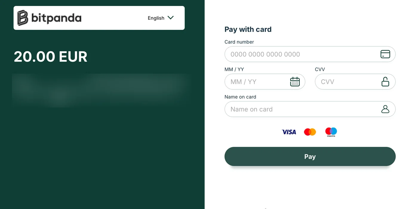
Then:
"Thank you for your payment! Now please return to the merchant's website."
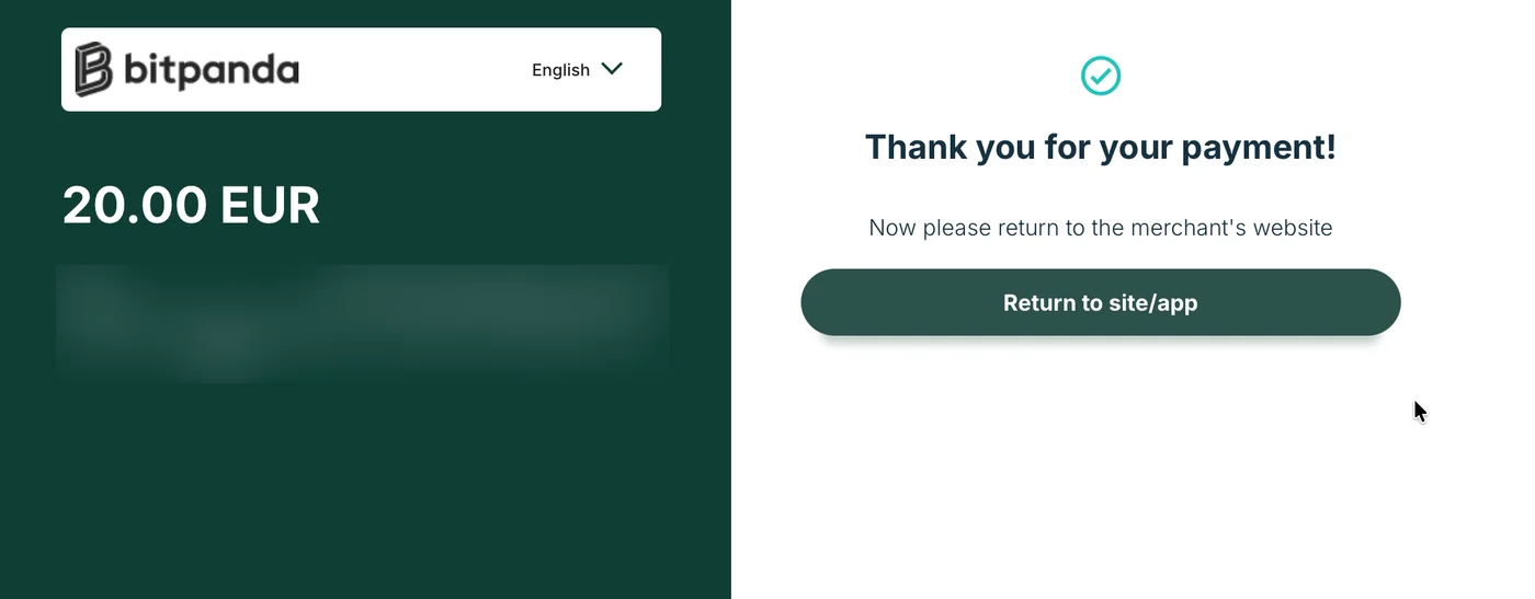
The merchant. That's Bitpanda. It's the copy a payment page shows after any online shop.
❌ Write every ending yourself.
Day one ended on Sumsub's "You may close this page." Day three ends on a payment page's "return to the merchant's website."
Two vendors. Two default endings. Both land at the moment I'm most ready to act.
And neither tells me the most important thing: my Bitcoin hasn't been bought.
The lesson: Every screen a user sees is yours, even the ones another company shows. Especially the last one.
Money on the way, money already there
I click "Return to site/app." Back home:
"Your money is on the way. This can take a few minutes or up to a day."
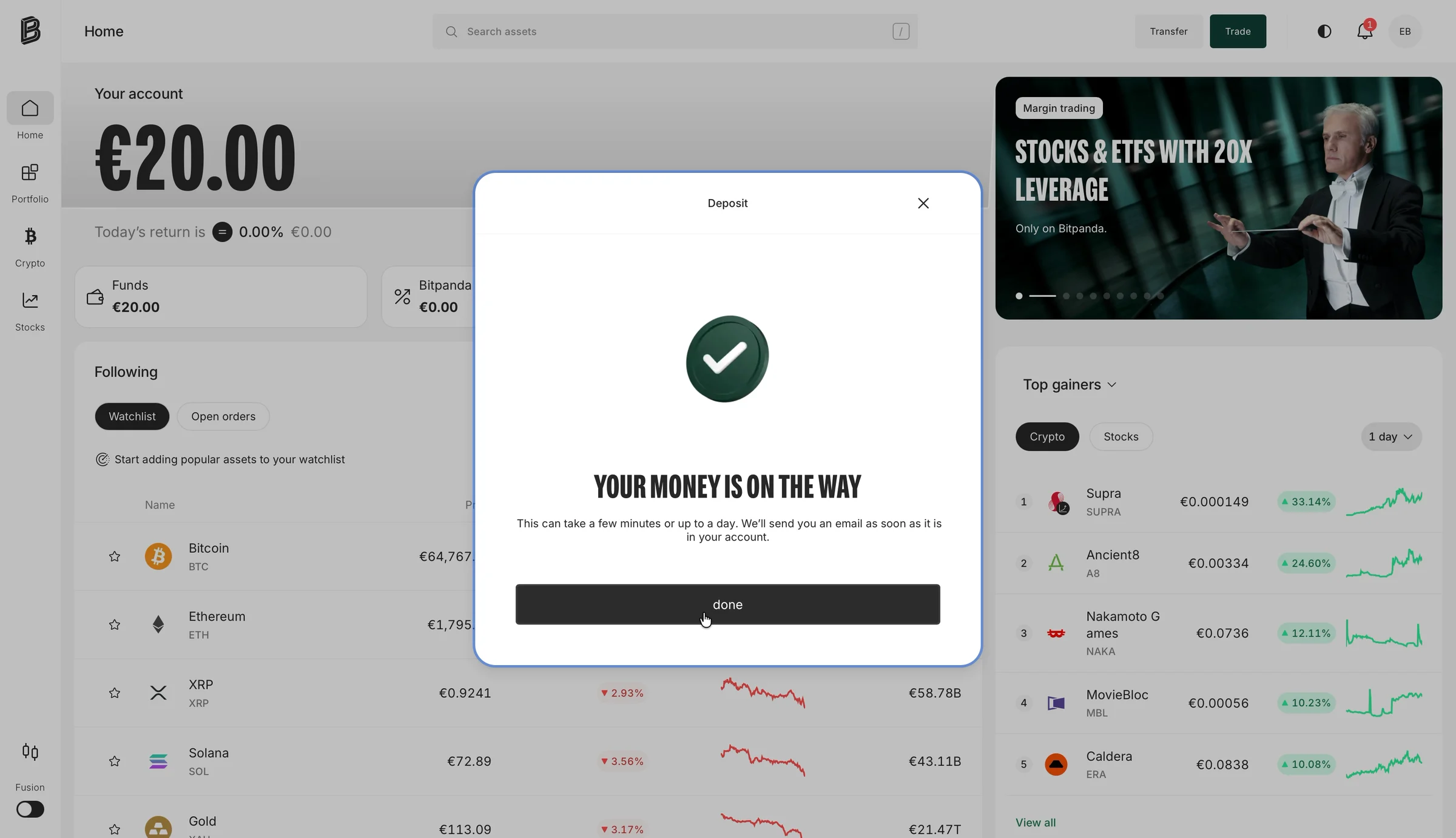
Behind the box, my balance already says €20.00.
I click "done." €20 in my euro wallet. No Bitcoin.
The buy I started four minutes earlier never happened. And at the top of the page: "Level up your trading with up to 10x leverage."

❌ One purchase, one flow.
In my Instagram teardown, the upgrade forgot where I'd clicked. This is the money version.
I clicked "Buy Bitcoin." I got a deposit. Somewhere between the two, the purchase was dropped.
If buying needs money in the account first, that's fine. Then take the payment inside the buy, keep my €20, and finish the order when the money lands. "Pay €20 and buy Bitcoin." One button, one result.
The lesson: If a purchase needs a detour, the detour has to bring the purchase back.
Day three: four minutes to €20. No Bitcoin.
- 0:02 Bitcoin, €20.
- 0:12 Eighteen seconds of spinner.
- 0:32 "We are having issues loading this page."
- 0:46 Bitcoin, €20, again.
- 1:20 A deposit: currency, payment method, amount again.
- 2:12 A new page for my card, then my bank's app. (Most of this was me finding my card.)
- 4:18 "Return to the merchant's website."
- 4:24 €20 in a euro wallet. No Bitcoin.
Two days and about fourteen minutes of screens later, I still don't own anything.
Six times almost there
Here are the six times Bitpanda told me I was nearly done, and what was actually left:
- "Just two more steps" · 22 screens
- "One last step" · 16 screens and a video
- "Almost there!" · A second video, no reason given
- "Your profile has been verified" · "Please verify your account"
- "Thank you for your payment!" · "Return to the merchant's website"
- "Your money is on the way" · €20 in a wallet. No Bitcoin.
None of these messages is wrong on its own. Each is a small, friendly promise that the end is close.
But promises add up. By the sixth "almost," I'd stopped believing the screen.
❌ "Almost there" is a promise.
Telling people they're nearly done is one of the strongest tools in onboarding. It's also borrowed trust. Every "almost" that isn't true makes the next one weaker.
The lesson: Count your "almost there" messages. Then check each one against what's really left. If they don't match, fix the flow or fix the words.
Who decided what
It's tempting to blame all of this on regulation. So I sorted what I saw:
- Six questions about work and money · EU anti-money-laundering rules
- Proof of identity: ID photos and a video · EU rules require a check; the method is a choice
- "Just two more steps" · Bitpanda's copy
- Document type, asked twice · The seam between Bitpanda and Sumsub
- "You may close this page", "return to the merchant's website" · Two vendors' default copy
- Verified, then "Please verify your account" · The seam, out of sync
- A €20 buy that became a €20 deposit · Bitpanda's flow
The law explains the first two rows.
The other five are words and wiring. Every EU broker has the same rules. That's where they differ.
9. How I'd redesign the steps
I'd keep every check. The law asks for them, and Bitpanda and Sumsub run them quickly.
What I'd change is what the flow says about them, and who writes it.
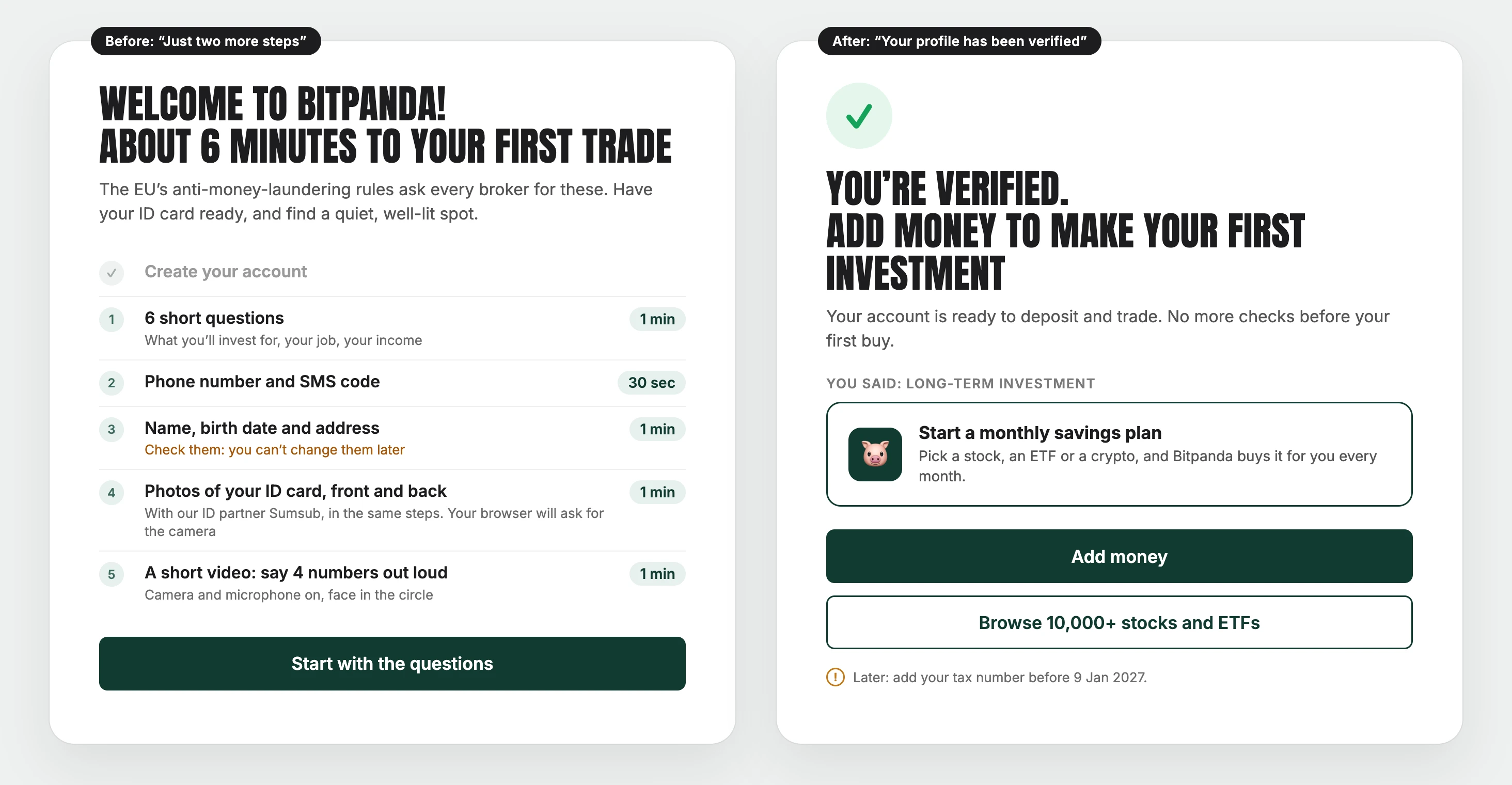
First, one true counter
Not "two more steps." "About 6 minutes to your first trade," with every step and its time: questions, phone, details, ID photos, video. One counter, across both companies' screens.
Why: A true number keeps "almost done" working to the end, instead of breaking halfway.
Second, say what's coming before it comes
"Check them: you can't change them later." "With our ID partner Sumsub, in the same steps." "Say 4 numbers out loud."
Why: A surprise in the middle of a flow feels like a trick. The same step, announced, feels like a plan.
Third, Bitpanda writes the ending
"You're verified. Add money to make your first investment." One button. And a buy button that agrees.
Why: "Verified" is the moment people are most ready to act. The vendor's generic ending wastes it.
Fourth, a beginner's first offer
"Start a monthly savings plan," not 20x leverage.
Why: The first product a new investor sees tells them what the app is for.
And the first buy
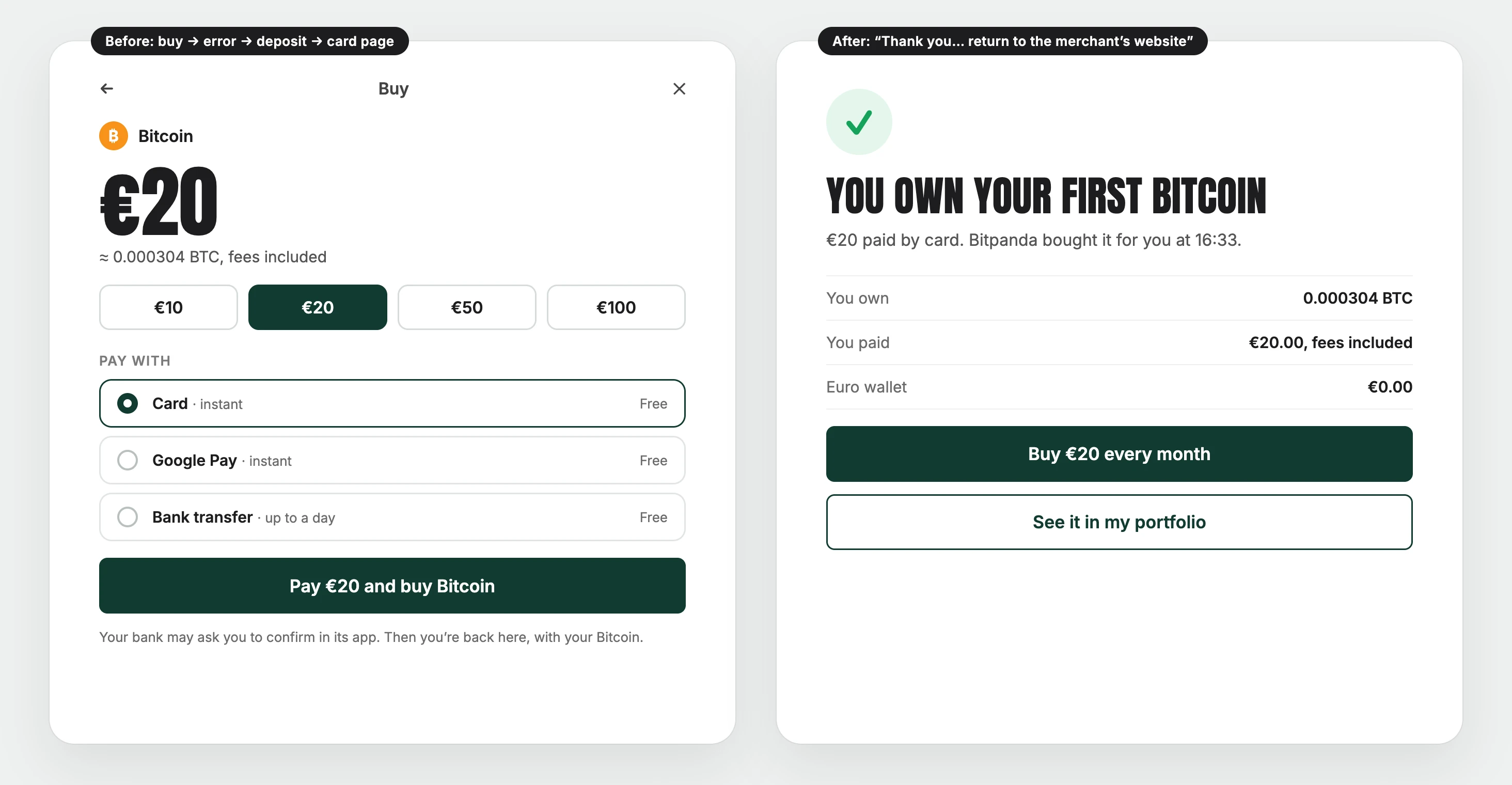
One sheet: Bitcoin, €20, and presets for a first buy (€10, €20, €50, €100). They look like choices: outlined, with the one I picked filled in. The payment method sits inside the buy. And one button that says what it does: "Pay €20 and buy Bitcoin."
Why: One purchase should be one flow. The deposit can happen in the background. I shouldn't have to notice it.
And the ending, written by Bitpanda: "You own your first Bitcoin." What I own, what I paid, and the next step: "Buy €20 every month."
Why: The last screen is where a first-time investor decides whether to come back. It should show what they own, not send them to "the merchant's website."

10. Three experiments I'd prioritize
If I worked on getting more Bitpanda sign-ups to a first deposit, I'd start with three tests.
Experiment 1: One true counter
Problem: Three counters cover twenty-two screens: "Just two more steps," "One last step" and Sumsub's "Step 1/2." Nobody mentioned the phone number or the video.
Change: One counter across Bitpanda's and Sumsub's screens, with every step, its time, and the surprises up front.
Hypothesis: When people know how long it takes and what's coming, more of them will finish the ID check.
Measure: How many people finish the ID check, where they quit, and how long it takes to get "verified".
Experiment 2: Own the vendors' screens
Problem: Sumsub asks for the document type again, its error doesn't say what failed, and its ending says "You may close this page." The payment page ends on "return to the merchant's website."
Change: Drop Bitpanda's document screen, since Sumsub asks it all anyway. Rewrite their errors to say what really went wrong. Replace both endings with Bitpanda's own: "You're verified. Add money," and "You own your first Bitcoin."
Hypothesis: Fewer people will need a second try. More people will add money within an hour of being verified.
Measure: How many people have to send the video again, and how many verified people add money within an hour and within a week.
Experiment 3: One purchase, one flow
Problem: A €20 Bitcoin buy hit an error. Then it turned into a deposit. It asked for the currency, the payment method and the amount again, with buttons from €500 to €10,000. It ended with €20 in a wallet and no Bitcoin.
Change: Take the payment inside the buy. Keep the amount. Offer €10, €20 and €50 buttons. Finish the order when the money lands.
Hypothesis: More people who press "Buy" will end up owning what they chose, and more of them will buy again.
Measure: How many "Buy" clicks end with the asset bought, how long that takes, and how many people buy again within 30 days.
Before any of these, I'd fix two bugs. A verified user can't buy. And a payment page won't load.
These are ideas to test, not promises. Some of them might not work.
11. The law sets the checks, not the words
Bitpanda gets a lot right.
The six questions are fair, and say why they're asked.
The country is prefilled.
"Almost there" is a kind way to say no.
And the whole ID and video check took minutes, not days.
But between the homepage and my first buy, it told me I was almost there six times. I was told three different counts, I read two vendors' default endings, and the buy itself fell through.
"Two more steps" was twenty-two screens.
"Verified" wasn't, as far as the buy button knew.
"Buy Bitcoin" was a deposit.
The law didn't write any of that. Bitpanda and its vendors did.
What Bitpanda gets right
- Fair questions: One per screen, with a counter and the legal reason.
- "Your answers are safe with us": The right line under the most personal questions.
- A prefilled country: One less thing to type.
- A kind error: "Almost there," and my ID photos kept.
- Speed: About three minutes from the second upload to "verified".
- A clear buy screen: One amount, what I get for it with fees, and a €1 minimum.
What I'd improve
- The counter: One true counter, across both companies' screens.
- The seam: Drop Bitpanda's document screen. Sumsub asks it all again anyway. One look, one set of words.
- Surprises: Say up front that there's a video and camera prompts.
- The error: Say what went wrong with the video.
- The endings: "You're verified. Add money" and "You own your first Bitcoin," written by Bitpanda, not its vendors.
- "Verified": One answer, from both systems, before the buy button speaks.
- The first buy: The payment inside the buy, first-buy presets, and an order that completes.
- The home: A beginner's first offer, not leverage.
The bigger lesson
Money apps love to blame the law for a long sign-up. And more and more of them hand the hardest part to another company.
But every EU broker has the same rules, and many of them use the same vendors.
What differs is the counter on the screen, the seams between the screens, and the words at the end.
If your sign-up has steps the law requires, or steps a vendor runs, ask four questions:
Does the number on the screen match the number of screens?
Would a user notice where your product ends and your vendor's begins?
And when the last screen says "done," does every button agree?
And when someone presses "Buy," do they end up owning something?
For Bitpanda, the fix could be simple. One honest counter at the start. One shared "verified" in the middle. And one button at the end: "Pay €20 and buy Bitcoin."
Same checks. Same law. Same vendors.
But this time, I'd know how long it takes. And when I press "Buy," I'd own a Bitcoin.
Does your sign-up run on a vendor's screens? Would your users notice the seam? I'd love to hear how your product handles it.
I break down real sign-ups and free trials to show where they lose potential paying customers and how to improve the experience.
Want me to review your sign-up? DM me "teardown" on LinkedIn.
Eddy
Opal knew my screen time (but showed it after the paywall)
Opal, Nov 9, 2026