Everfit Nailed the Sign-Up (But the Aha Happens to Someone Else)
5 min read · about Everfit ·

Everfit Nailed the Sign-Up (But the Aha Happens to Someone Else)
1 / 30

Written by
Eddy Bogomolov
Product designer for B2B free trials
Published
What you'll learn
- Why a two-sided trial has to show the buyer the other side
- Why an aha on another device is the hardest step in a trial
- Why setup questions only count if the first screen uses the answers
Everfit got me from “Start free trial” to the product in 93 seconds. Google sign-up, my name already filled in, no card, three short steps.
Everfit Nailed the Sign-Up (But the Aha Happens to Someone Else), chapter by chapter
Everfit got me from "Start free trial" to the product in 93 seconds. Google sign-up, my name already filled in, no card, three short steps.
In this story I run a small wellness studio with fewer than ten clients. Their workouts go out as PDFs and WhatsApp messages. I want one app where I build a workout and my clients see it on their phone.
So I recorded my screen from the homepage to the first screens of the product. The sign-up is one of the best I've tested. But a coaching app has two users, and the aha belongs to the one who isn't at the desk.
What I found:
- The sign-up is fast and honest: email in the hero, name from Google, no card, a step counter.
- Everfit has two users. The coach pays, and the value lands on the client's phone. That's the aha.
- "Experience Client App" knows it. Then it sends that aha to my email, my phone and a password I never made.
Let's get into it.
1. The promise: headline, look, proof
Meet me. I run a small wellness studio, fewer than ten clients. Their workouts go out as PDFs and WhatsApp messages. I want one app where I build a workout and they see it on their phone.
First, the headline:
"The all-in-one platform for nutrition coaches to level up your business."
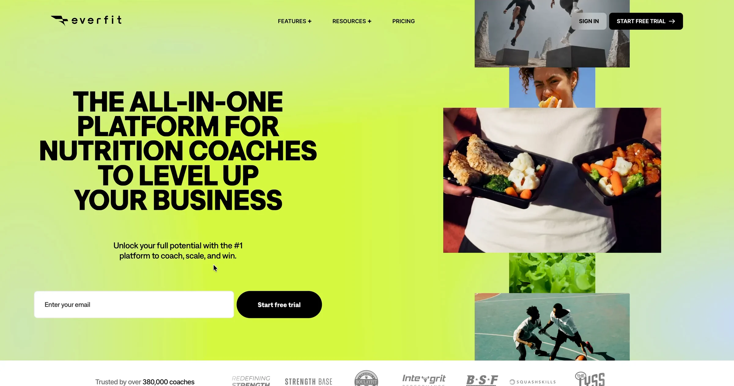
It changes every two seconds: sport coaches, fitness coaches, gyms and studios. One of them is me. But "all-in-one" and "level up" don't tell me what I'd do in it.
Then the look: neon lime, huge black capitals, a collage of athletes and meal prep. It feels like sport, not like software. But there's no product in the hero. Not the coach's screen, not the client's phone. I'm about to try something I haven't seen.
Under the hero: "Trusted by over 380,000 coaches", and a row of logos.

I don't know any of the names: Strength Base, Integrit Performance, SquashSkills. But they're gyms and coaches like me, and 380,000 is a lot of coaches.
Good enough to try. I type my email and click "Start free trial".
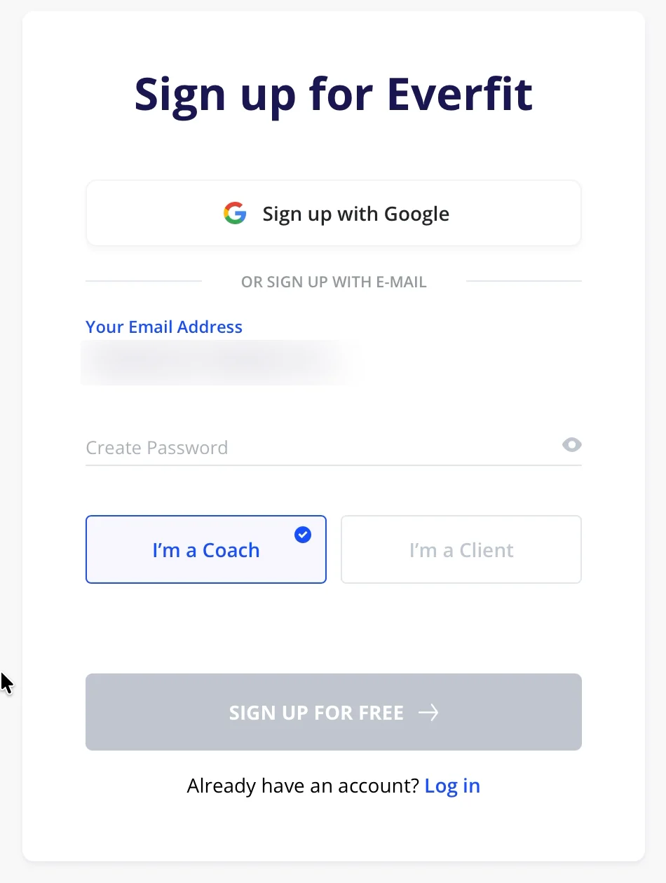
"Sign up for Everfit." My email is in the form. It still wants a password, so I take "Sign up with Google".
2. Three steps, done right
Step 1 of 3. "Nice to meet you! What should we call you?" Edijs Bogomolovs, already filled in from Google.
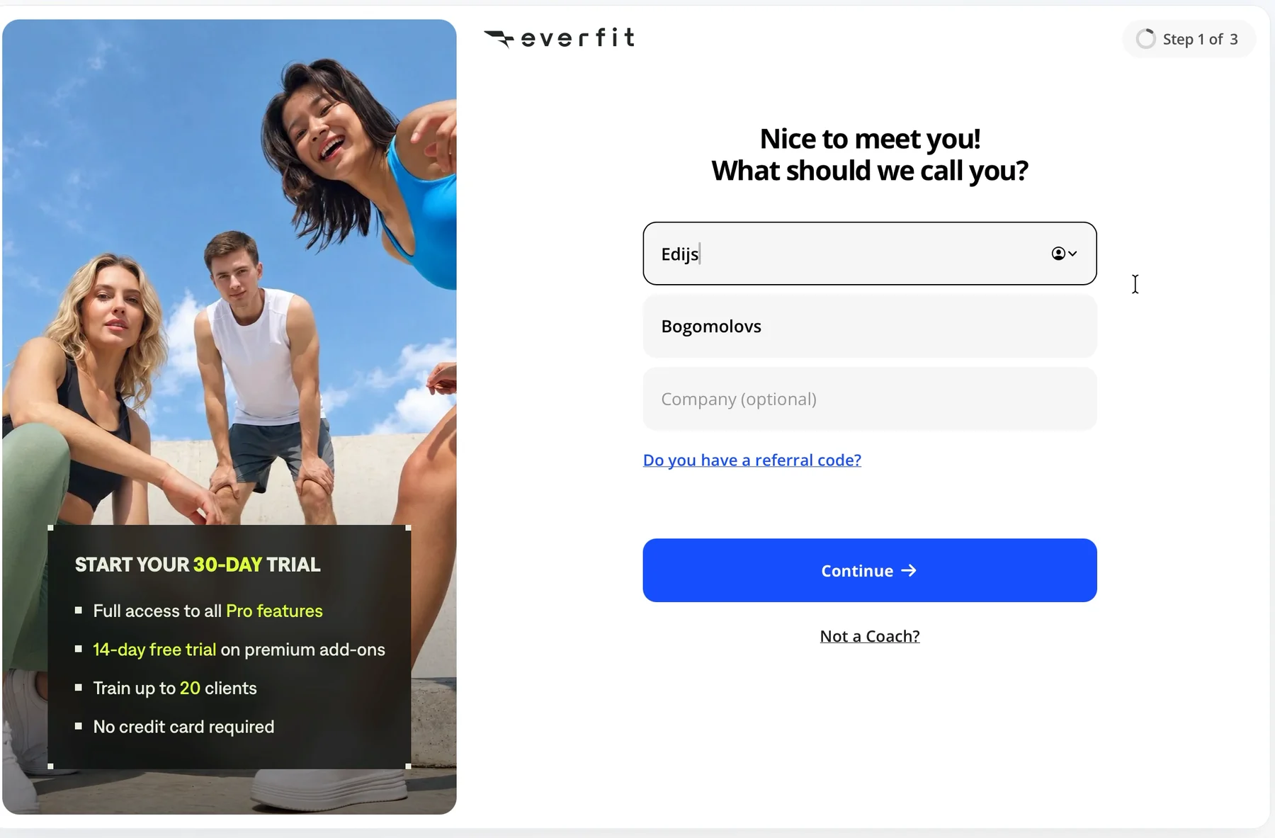
Most sign-ups make me type my name again. Everfit just used the one Google sent. I see you, Everfit.
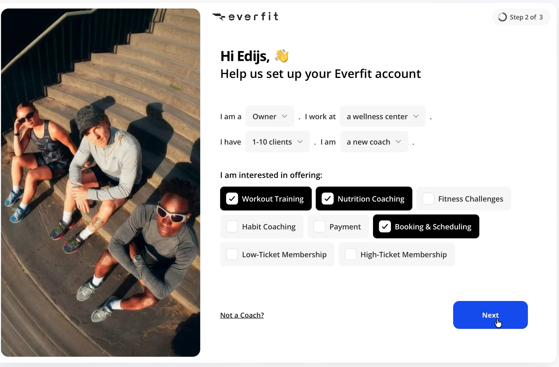
Step 2 of 3 is a sentence with blanks: "I am a Owner. I work at a wellness center. I have 1-10 clients. I am a new coach." Then what I want to offer. I pick Workout Training, Nutrition Coaching and Booking & Scheduling. Remember the last one.
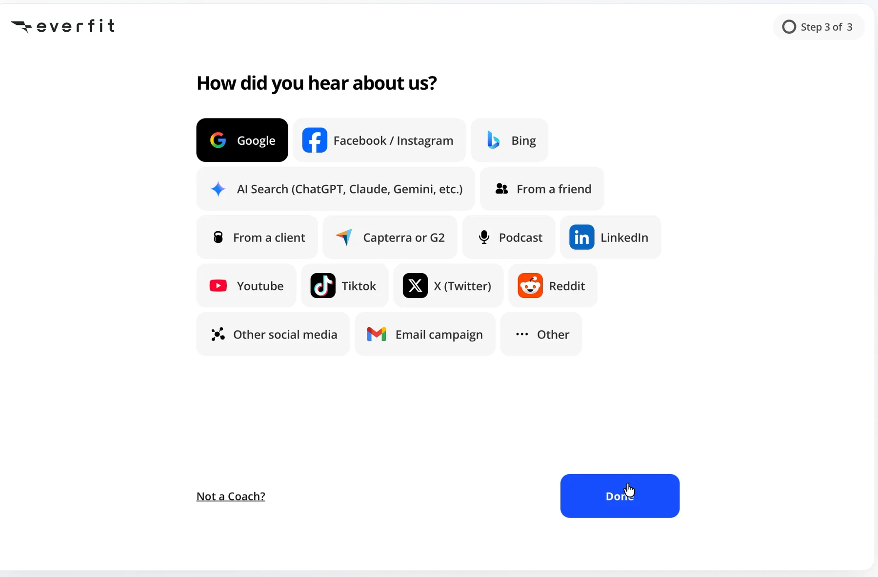
Step 3 of 3: "How did you hear about us?" Google. Done.
Then a welcome video: "Everything, all-in-one place." 17 seconds between Done and the first screen of the product.
I don't want to watch a video about the product. I want to see what my clients will see.

3. The first screen: the same for everyone
"Welcome to Everfit, Edijs!" A checklist: Experience Client App, five coaching basics, Download Coach App. "0 of 7 completed."
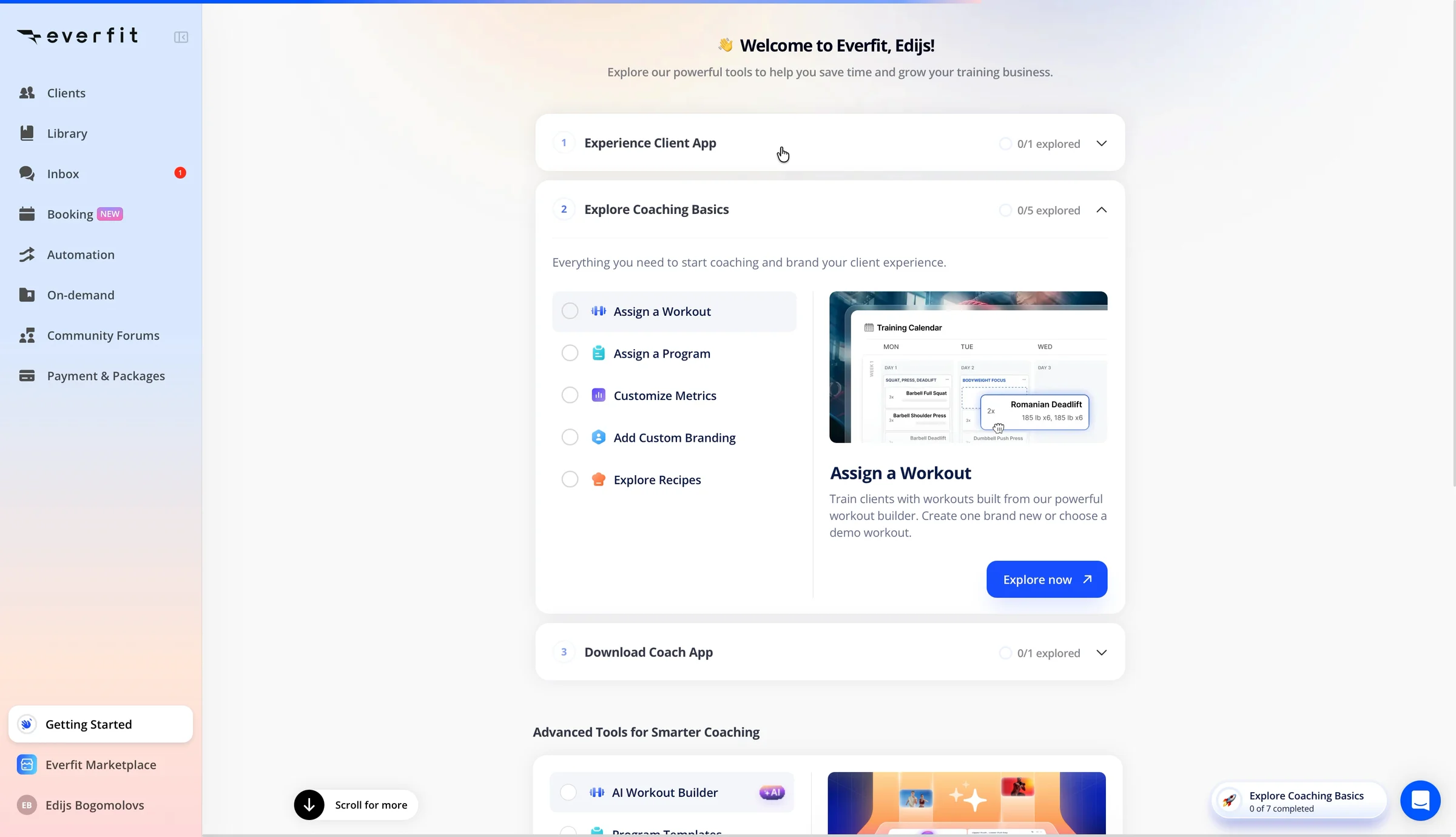
I said I want booking. It isn't on the list. It's in the sidebar with a "NEW" badge, like it would be for anyone.
4. The aha happens to someone else
The first item: "Experience Client App. Step into your client's shoes and experience the app as they will, through a personalized demo prepared just for you."
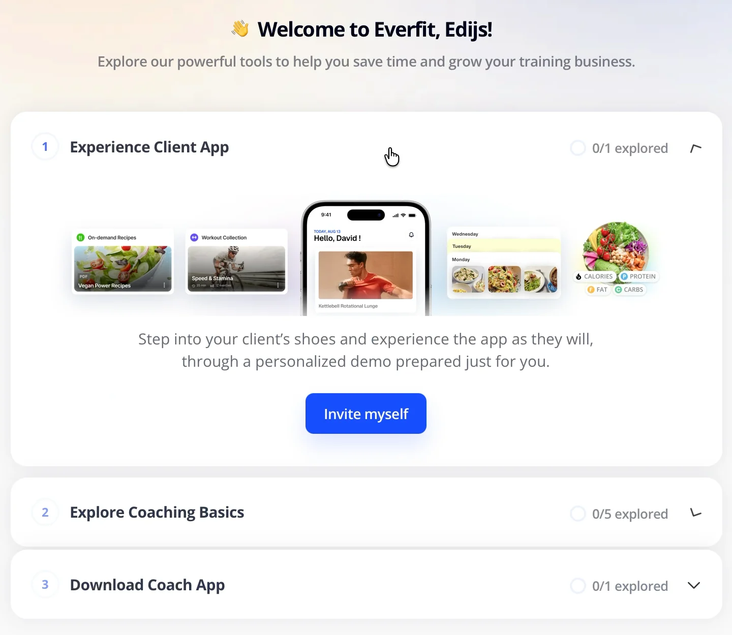
That's the aha. Not my calendar, my client's phone. I click "Invite myself".
"Check your email. Please open the email on your mobile." Download the Everfit app. Log in "with your Coach email and password".
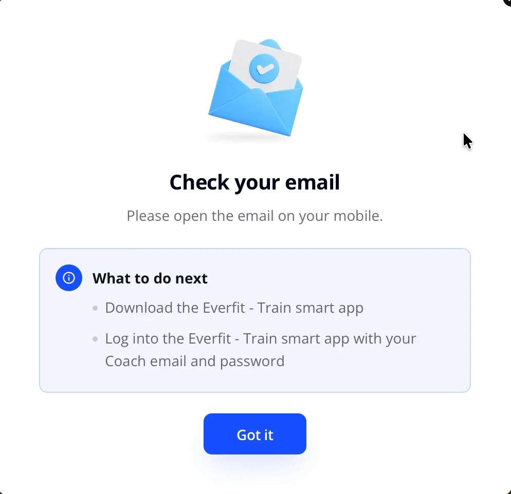
Password? I signed up with Google. I never made one.
Gmail. "You're invited by Edijs Bogomolovs." Download the Client App "and log in using your same email address and password."
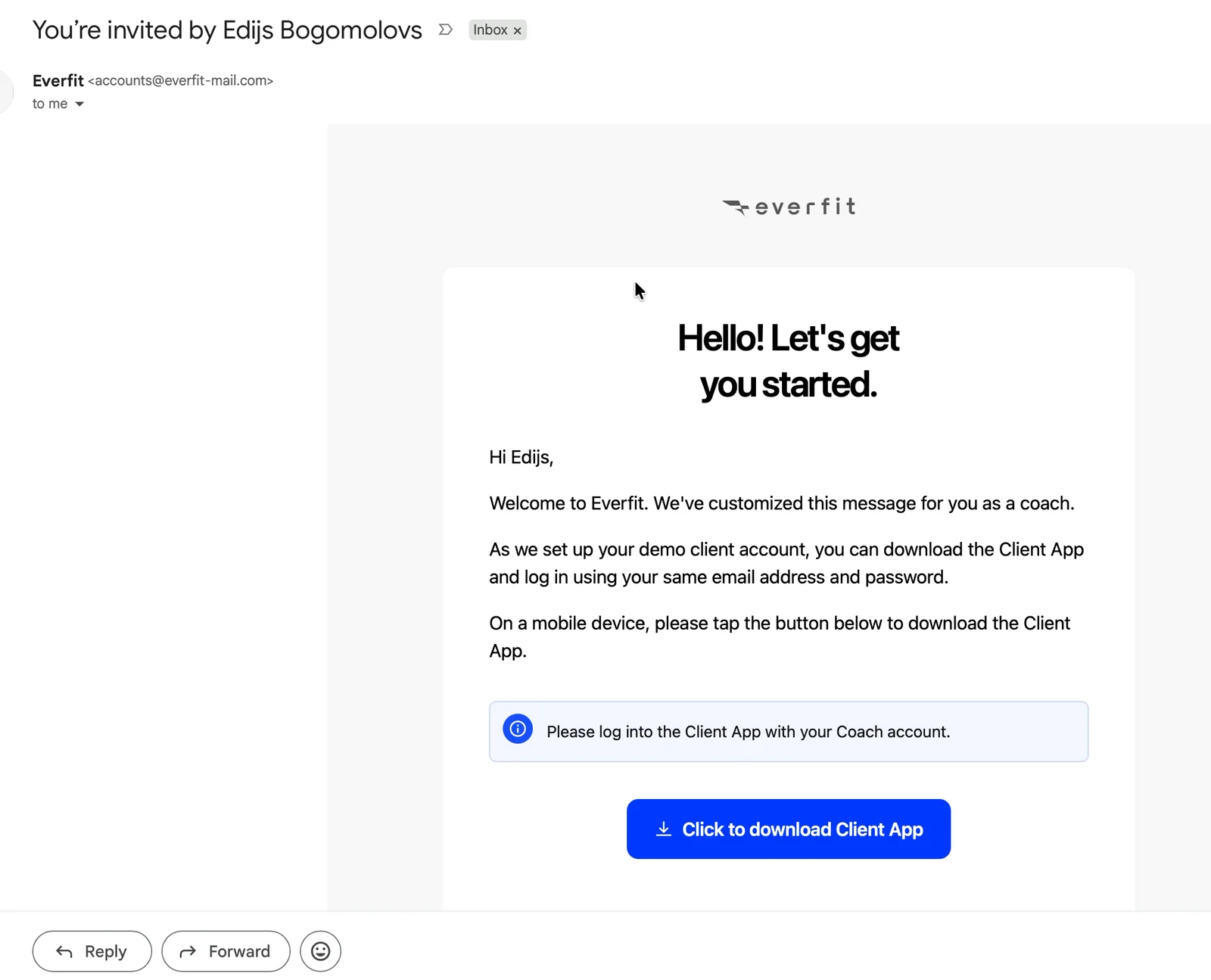
Invited by me, to my own client app, with a password I don't have.

I'm reading it in Gmail on my laptop, not on a phone. I switch back to Everfit.
5. The demo, under four layers of tips
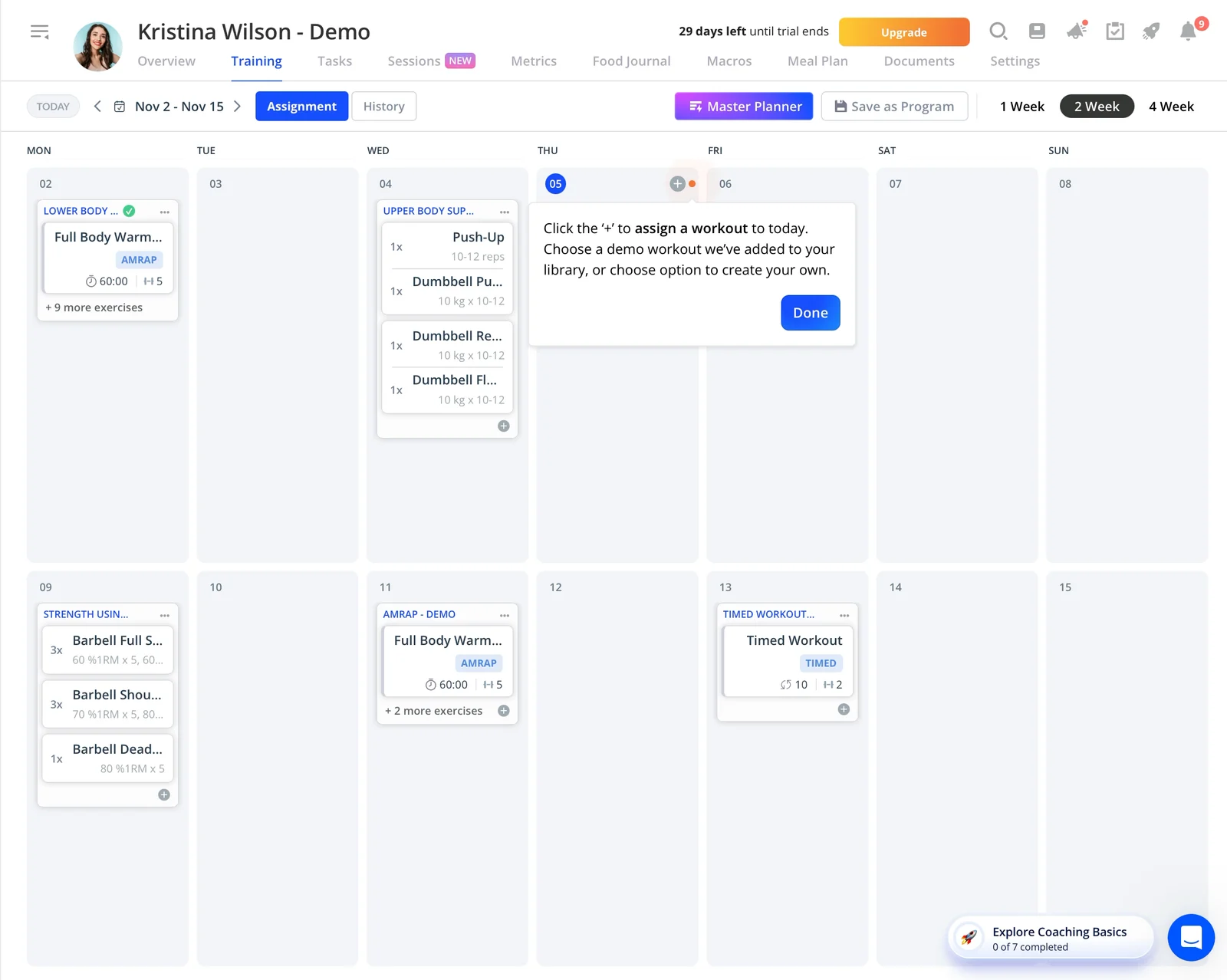
Back in Everfit. Kristina Wilson, a demo client, with two weeks of workouts already on her calendar.
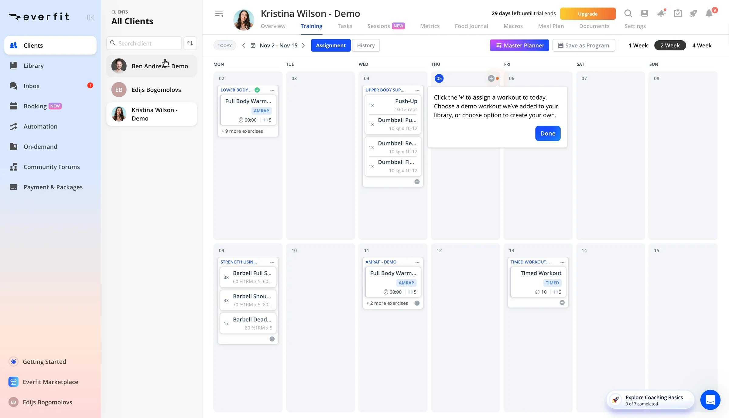
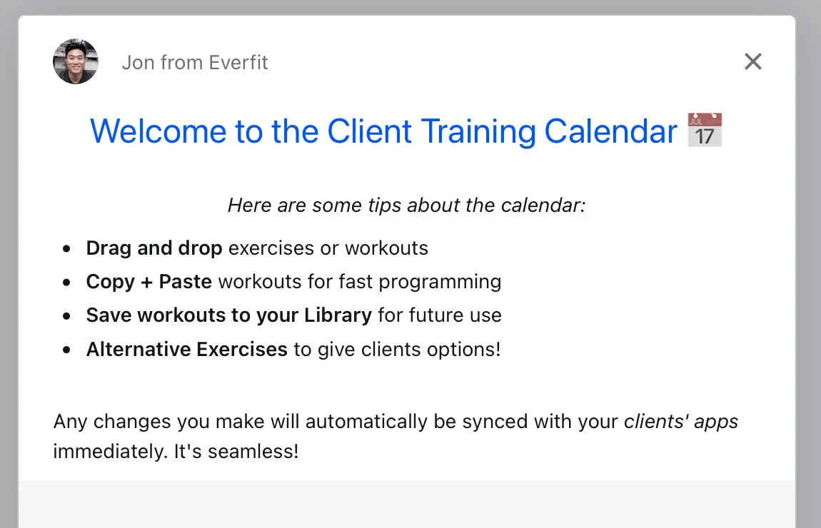
Then a note from "Jon from Everfit" with four calendar tips. Then a tooltip: "Click the '+' to assign a workout to today."
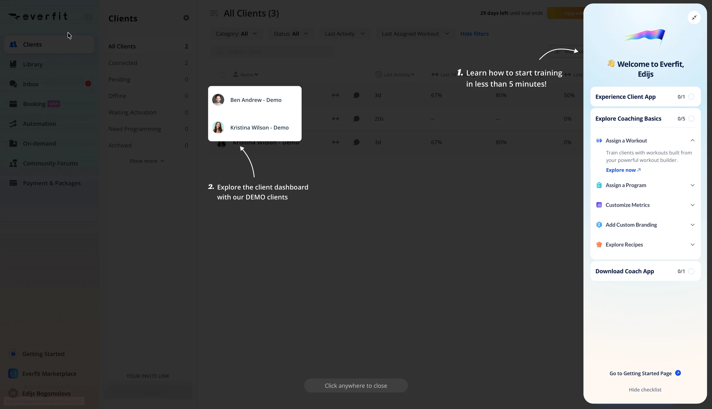
Seconds later, a dark overlay. Two arrows: "Learn how to start training in less than 5 minutes!" and "Explore the client dashboard with our DEMO clients." A checklist slides in from the right. "Click anywhere to close." I do.

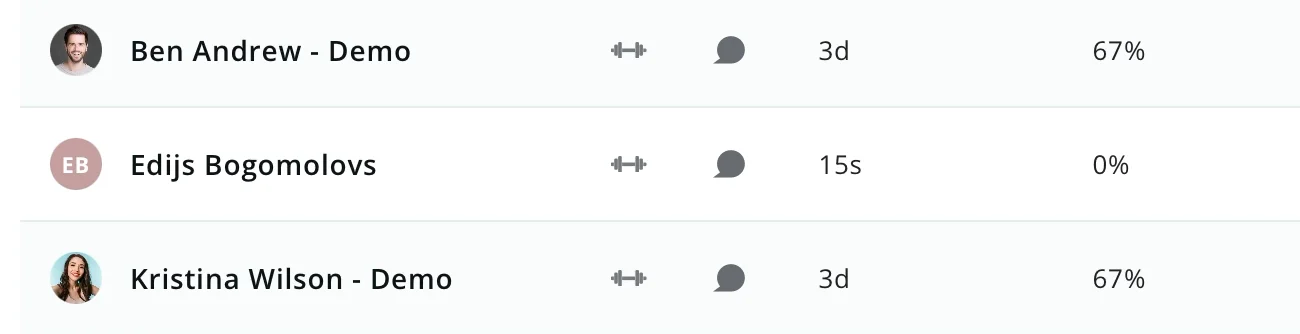
All Clients (3): Ben Andrew - Demo, Kristina Wilson - Demo, and Edijs Bogomolovs. "Invite myself" made me one of my own clients.
The recording ends at 2:59. "0 of 7 completed." I never assigned a workout, and I never saw one on a client's phone.
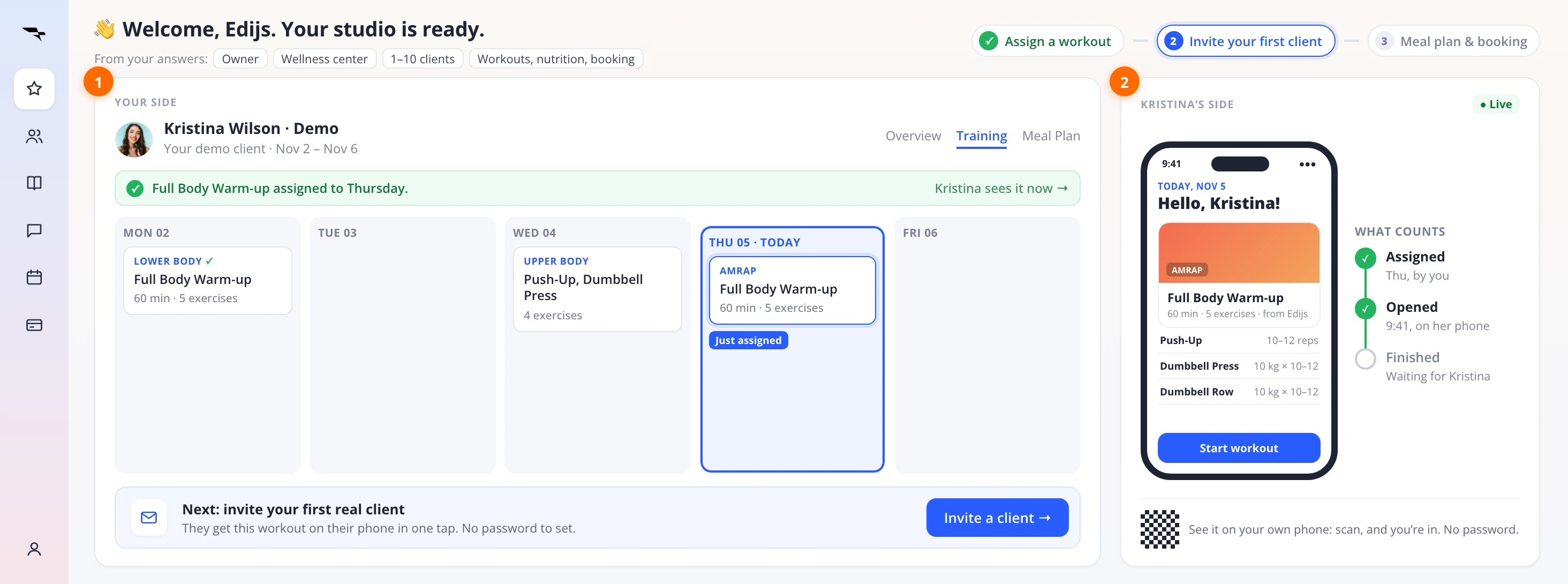
Here's how I'd redesign the first screen: two columns, my side and hers, on one screen.
Part by part, and why:
The header: my answers, and a three-step plan. It plays my step-2 answers back to me (owner, wellness center, 1–10 clients, workouts, nutrition and booking) and turns them into three steps, not seven.


Why: I told Everfit what I run, then it showed me the same checklist as every coach. If you ask, use the answer.
My side: a workout, already assigned. Kristina's week opens with Full Body Warm-up on today.
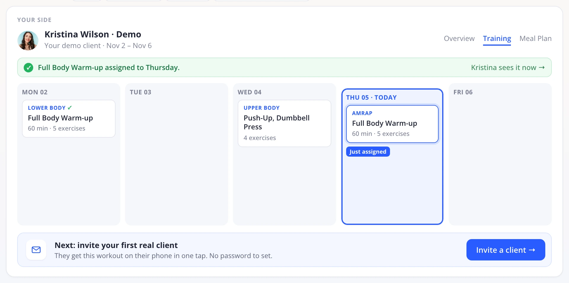
Why: a coach's aha is a workout landing on a client's phone, and I left the trial without assigning one. Do the first one for me, on a demo client, and I start at value, not at 0 of 7.
One next step: invite your first real client. Under the calendar, one card, and no password for the client to set.
Why: today I got a note, a tooltip, an overlay and a drawer in ten seconds. One guide at a time. And this one moves me from the demo to a real client, where my business starts.
Her side: her phone, and what counts. Kristina's phone, live, next to the calendar. Beside it: assigned, opened, finished. A scan puts it on my own phone, no password.
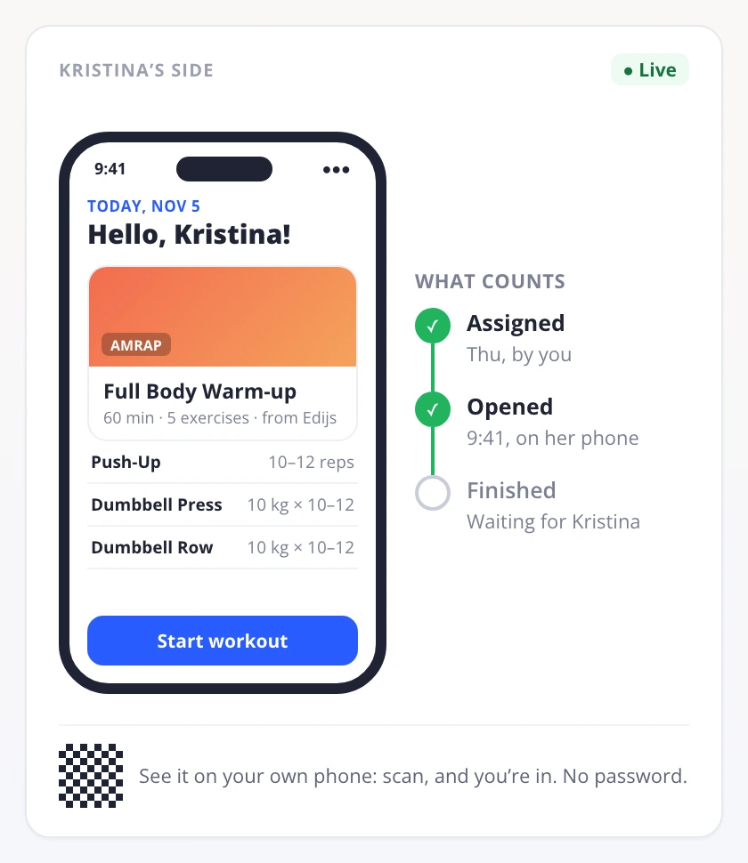
Why: today "Experience Client App" hides behind an email, a phone and a password. Here the aha happens on my screen, and activation is counted on her phone, not in my checklist.
Today, the same moment shows the same checklist for everyone at 0 of 7, and the client app behind an email.
Same 93-second sign-up. This time I'd see my workout on a client's phone before I close the tab.

6. Three ways to keep the aha on screen
Each one gets a coach from "Invite myself" to a client's view without leaving the desk.
📱 Show the client app here
A phone preview next to the demo calendar. Assign Kristina a workout, and watch it land on her screen. Shaun Clowes: "there is not a natural force that pulls companies towards thinking about the end user's enjoyment and success early in their journey" (Lenny's Podcast). So put it there on purpose.
🔗 Or make the phone one scan
A QR code on screen that opens the app already signed in. No email, no password, nothing to remember. Slack's first mobile app skipped the password: "We'll send them a link. The link will automatically open the app and authenticate them." (Stewart Butterfield, Lenny's Podcast).
🎯 Count it on the client's side
Not 7 of 7 tutorials. One workout assigned, and opened on a client's phone. Build the first screen around that, from my step-2 answers. David Lieb, who led Google Photos, has a test for this: picture yourself sitting next to a user, and count the action that proves they got value. Google+ counted clicks on a notification bell as "active", and the numbers lied (Startup School).
The coach pays. Show them the client's side.
Ready in 93 seconds. Then the handoff.
Product-led means no salesperson walks you through the product. The product itself has to convince you to stay and pay. To do that, a trial has to answer four questions on its own:
- Does it do what the homepage promised? Yes. Workouts, nutrition, booking and payments sit in one sidebar, and demo clients show them working.
- Can I get in quickly? Yes. Google, my name filled in, no card, three steps: 93 seconds.
- Do I see value fast? No. For a coach, value is a workout landing on a client's phone, and that view goes to an email, a phone and a password I don't have.
- Do I know what to do next? No. A note, a tooltip, an overlay and a drawer, and a checklist at 0 of 7.
Two out of four: Everfit gets me in fast, then sends the aha away.
Wes Bush's Bowling Alley Framework scores onboarding on three parts: a straight line from sign-up to the first win, product bumpers that keep you on it inside the app, and conversational bumpers that bring you back.
- 1 · Straight-line onboarding · Google, three steps, a demo calendar with two weeks of workouts: 93 seconds · ✅
- 2 · Product bumpers · A note, a tooltip, an overlay and a drawer, each pointing somewhere else; a checklist that ignores my answers · ❌
- 3 · Conversational bumpers · The one email in my trial pulled me out: to a phone app, with a password I don't have · ❌
One out of three: a straight lane, and bumpers that push me off it.
Everfit got me into the product in 93 seconds, with no card and no field I had to type twice. Then the one moment that sells a coaching app left the screen.
What Everfit does well
- 1 · An email field in the homepage hero, carried into the sign-up form · ✅
- 2 · My name filled in from Google · ✅
- 3 · A 30-day trial, no card, terms next to the form · ✅
- 4 · Three steps with a counter, and a fill-in-the-blanks sentence · ✅
- 5 · "Experience Client App" first on the checklist: it knows where the aha is · ✅
- 6 · Demo clients with two weeks of workouts on day one · ✅
- 7 · "Trusted by over 380,000 coaches", with logos from gyms like mine · ✅
What's weak
- 1 · Step 2 asks what I'll offer, and the checklist ignores the answer · ❌
- 2 · "Experience Client App" sends me to email, a phone and an app store · ❌
- 3 · The app wants a password I never made: I signed up with Google · ❌
- 4 · The invite a client gets is about the coach, a download and a password · ❌
- 5 · A note, a tooltip, an overlay and a drawer within ten seconds · ❌
- 6 · The headline names the audience but not the job, and the hero shows photos, not the product · ❌
The whole journey, from my recording:
- 0:00 · Homepage: rotating headline, no product shown · ❌ Says who, not what
- 0:09 · "Start free trial" from the hero · ✅ Trial starts at the promise
- 0:18 · "Sign up for Everfit" · ✅ Email carried over
- 0:37 · Step 1: "What should we call you?" · ✅ Name from Google
- 0:49 · Step 2: "I am a… I work at…"
- 1:17 · Step 3: "How did you hear about us?"
- 1:25 · Welcome video · ❌ Tell, not do
- 1:42 · Getting Started checklist · ❌ Same for everyone
- 2:15 · "Please open the email on your mobile" · ❌ Aha sent away
- 2:35 · Demo client calendar · ✅ No blank slate
- 2:44 · Overlay, arrows and a drawer · ❌ Four layers of tips
- 2:59 · "0 of 7 completed" · ❌ No workout assigned
About 9 seconds of that is Google's own sign-in.
The fix: Show the coach the client's side, on the screen they're on.
The six lessons
- Put the first step on the homepage · ✅
- Take what sign-in already gave you · ✅
- If you ask, use the answer · ❌
- In a two-sided product, the aha happens to someone else · ✅
- Don't send the aha to another device · ❌
- One guide at a time · ❌
Zoom out
Most trials I take apart are single-player. Whoever signs up is whoever gets the value, on the same screen. A coaching app is different. It has two users: the coach at a desk and the client on a phone. The coach pays, but the coach's aha happens on the client's side, when a workout they built shows up on someone else's screen.
Everfit knows that. It put "Experience Client App" first on the checklist. Then it treated the aha like a second sign-up: an email, an app store, a login. And the email it sent is the one every real client will get first.
That's where Everfit's value gap opens. The product keeps the homepage's promise. The proof goes to a phone I'm not holding.
Shaun Clowes says nothing pulls companies toward the end user's success early on. In a two-sided trial, the buyer is the one who has to feel it. If your product has two sides, find the moment the buyer sees the other side, and put it on the screen they're on.
Who gets the aha in your trial: the person who signed up, or someone they invite? Leave a comment. I read every one.
Further reading:
- Letting Attio build my CRM for me, the previous teardown
- Picking sharp problems, increasing virality, and unique product frameworks, Oji Udezue on Lenny's Podcast
- How to increase virality, Lenny's Newsletter
- How To Keep Your Users, David Lieb at YC Startup School
- The Bowling Alley Framework, Wes Bush at ProductLed
I break down real free trials and show where they lose paying users. If this helped, send it to someone who owns a trial.
Want a teardown of your trial? DM me "teardown" on LinkedIn.
Eddy
Pipedrive Showed Me a Pipeline Full of Deals (Mine Had Zero)
Pipedrive, Nov 6, 2026