Melius made a great first image (after I paid)
7 min read · about Melius ·
Melius made a great first image (after I paid)
A countdown, a five-question quiz, a hard paywall and €19.12 on my card came first. The image took five seconds.
1 / 33

Written by
Eddy Bogomolov
Product designer for free trials
Published
What you'll learn
- A quiz before the paywall only works if the paywall uses the answers. Melius asked me five good questions. Then it showed the same price list everyone gets, and my answers picked one tile out of four.
- Give people who aren’t sure a way in. Melius has no free plan and no trial. A first-image-free toggle would let people who are ready pay now and let the unsure try first, at the same prices.
- Start the countdown after a no. Melius’s 24-hour discount started before I signed up. A clock works when it follows someone closing the paywall, not when it greets everyone.
Melius made me a beautiful image in five seconds. But first came a countdown, a five-question quiz, a paywall with no way in, and €19.12 on my card.
Melius made a great first image (after I paid), chapter by chapter
In this story, I run a one-person product design consultancy. I make my own visuals for posts and teardowns. I've never really used an AI image tool.
I'm looking for one tool where I describe what I need and get a picture I can actually post.
So I tested Melius, an AI creative tool for images, video and audio, and recorded the journey from its homepage to my first image. The image was fast and beautiful. But before I saw it, Melius ran me through a countdown, a quiz, a paywall and a €19.12 charge.
It borrowed the onboarding of a consumer subscription app. And it left out the part of each step that makes that onboarding work.
Let's get into it.
1. The homepage shows the product, but it won't sit still
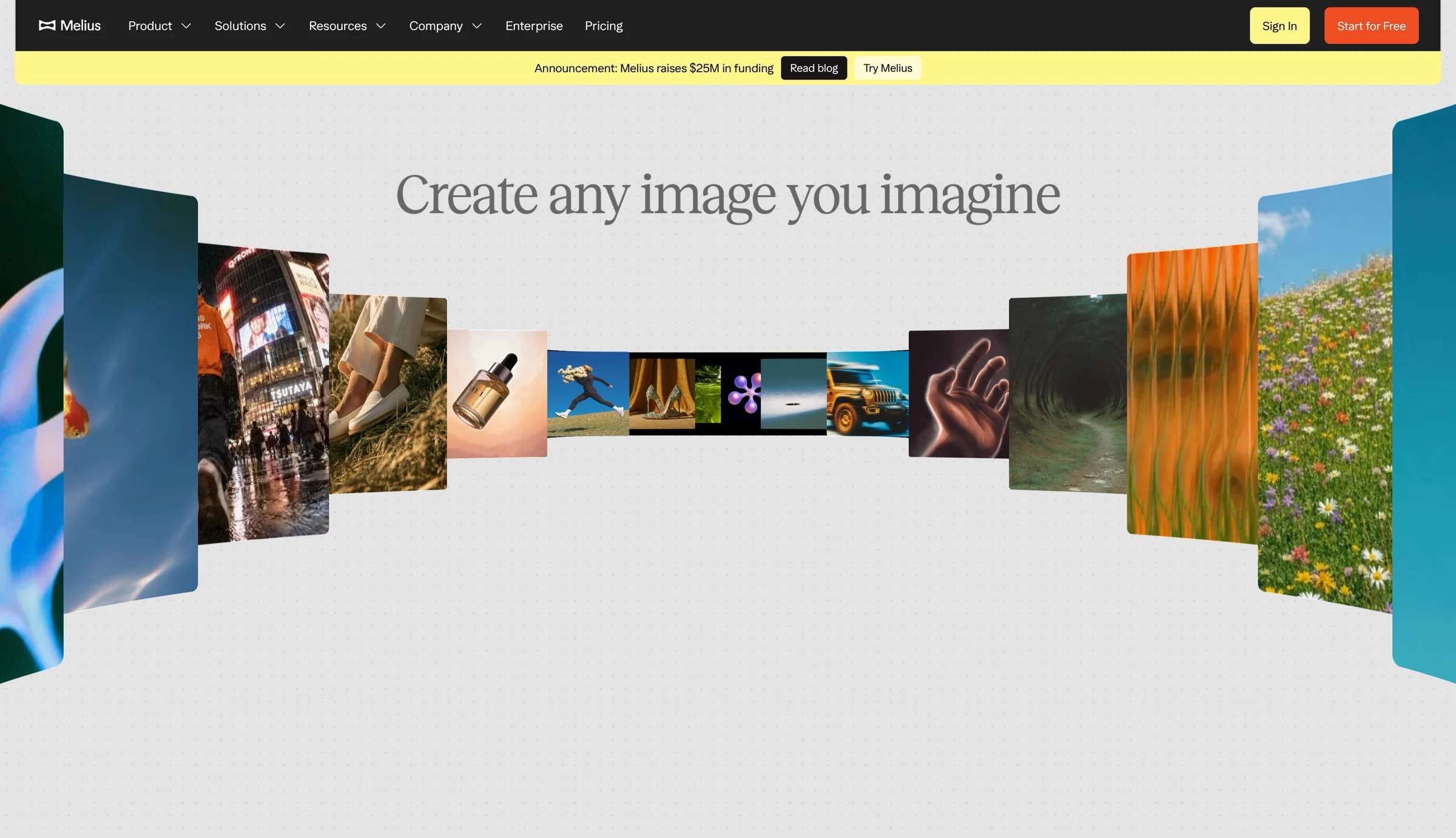
I open the Melius homepage. The first thing I see is a headline:
“Create any image you imagine.”
Behind it, a wall of generated images and videos fans out across the screen. Then “image” turns into “audio”.
My first reaction: wow.
And the promise is exactly what I want: AI agents that work with me until my images, video and audio look the way I imagine them.
Remember that promise. I'll time how long it takes to see it come true.
✅ Make your product's output the hero.
There's no stock photo here. No smiling people at laptops.
The hero is made of things Melius created.
Before I click anything, I know what I'll get.
My Everfit teardown had the opposite problem: athletes and meal prep, and no product.
The lesson: If your product makes something, show what it makes. That's the fastest way to explain it.
Then it never stops moving
Images keep flying past at the edges of the screen while I try to read the headline.
My eyes keep jumping to them.
By the third loop, my peripheral vision hurts. And there's no pause button.

❌ Let people read without fighting the background.
Movement at the edge of the screen pulls our eyes toward it. We can't really help it.
So the wall that sells the product also pulls me away from the words that explain it.
Accessibility guidelines ask for a pause button on anything that moves on its own for more than five seconds.
The lesson: Play the animation once and let it settle. Or give people a way to stop it.
The real app is behind the sign-up
I click “Get started for free.”
Melius doesn't send me to a sign-up page. It opens the real app, with a sign-up modal on top:
“Sign up with work email and get up to 15,000 credits.”
Free credits. That's a good reason to sign up.
✅ Give people a reason to sign up now.
Most sign-up forms only ask. This one offers something first.
It's one of the most popular tactics in online casinos: a welcome bonus just for creating an account. Casinos use it everywhere because it works.
15,000 credits tells me I'll be able to make things right away, without paying.
And it rewards a work email, so Melius learns who might bring a team.
The lesson: A sign-up form converts better when it says what people get for filling it in.
Remember those 15,000 credits.
I close the modal.
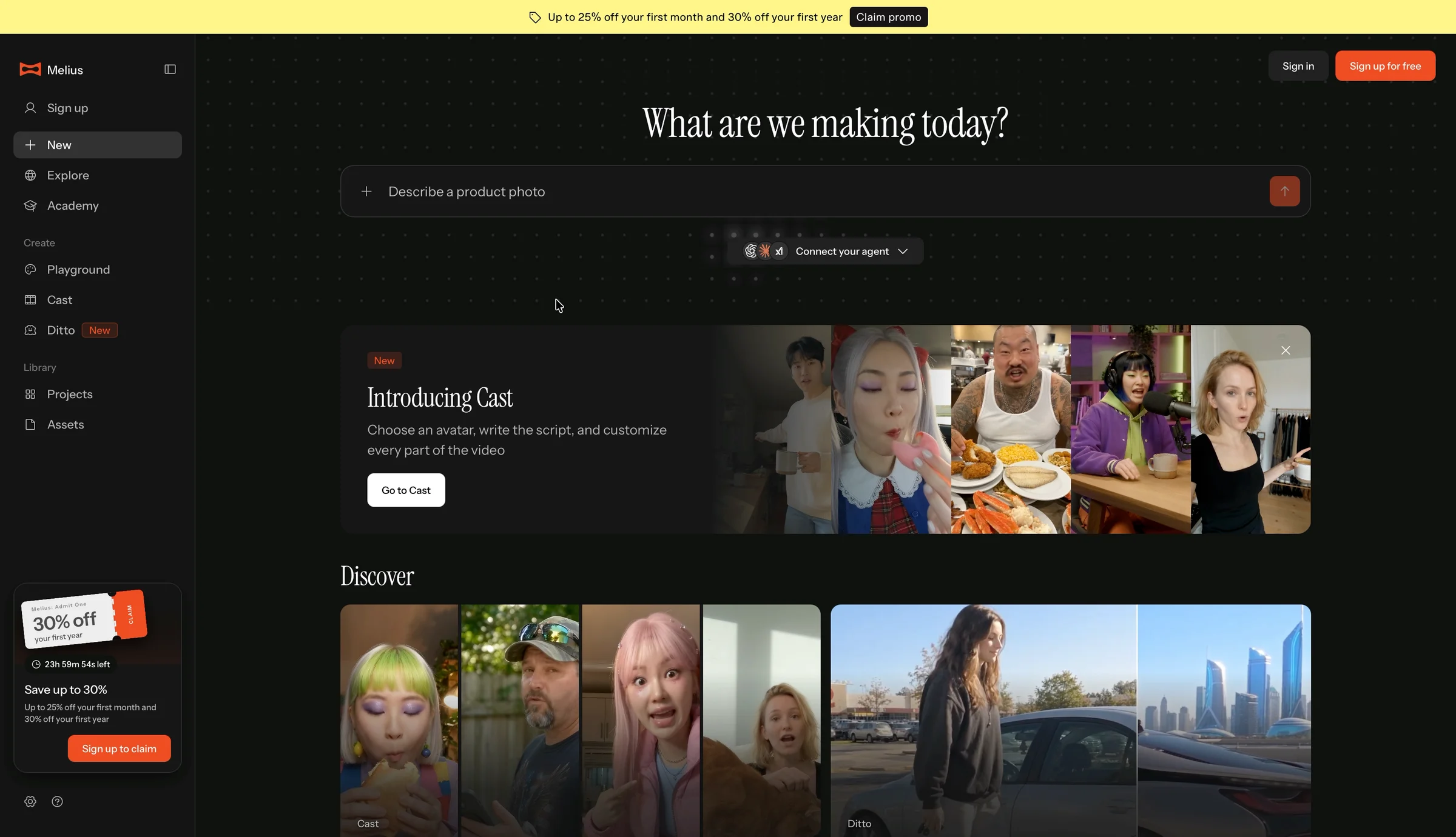
Now I'm looking at the actual product. A prompt box, a gallery of other people's work, and suggestions like “Describe a product photo.”
That's exactly what I'd make.
✅ Show the real product before you ask for an account.
I can see what I'm signing up for before I commit.
That's rare. Most products hide the app behind a form.
But a visible prompt box makes a promise: type here, and something happens.
We'll see if Melius keeps it.
The lesson: Letting people see the product before sign-up builds trust. Just make sure what they see is what they'll get.
2. A countdown starts before I've said anything
In the corner of the logged-out app, there's a ticket:
“30% off your first year. 23h 59m 54s left. Sign up to claim.”
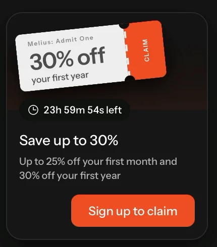
I haven't signed up.
I haven't made anything.
And a clock is already running on my discount.
Then I look at the whole screen.
A yellow banner: “Up to 25% off your first month and 30% off your first year.”
A “Sign up for free” button in the corner.
A “Sign up” link in the sidebar.
The ticket with the clock.
And before all that, 15,000 free credits in the sign-up modal.
They really want me to sign up. Free credits, a discount, a countdown. All before I've made a single image.
❌ Start the clock after someone says no.
A limited-time discount is a real tactic. Consumer subscription apps use it all the time.
But the good ones aim it.
The period tracker Flo shows its expiring discount only to people who turn down its free trial. Other apps email a discount to new users who haven't subscribed after a day or two.
Those clocks start after a no. They go to the people who need a push.
Melius's clock starts before I've said anything. It goes to everyone.
So it can't tell the difference between someone who's ready to pay and someone who's just looking.
The lesson: A discount works best as an answer to hesitation. Give it to people who hesitated.
What I'd test
I'd move the countdown from the landing page to the moment someone closes the paywall.
My hypothesis: A discount shown after a no will win back more of the people who were about to leave, without giving 30% to people who would have paid anyway.
I'd measure paid conversion among people who close the paywall, and the average price paid by everyone who subscribes.
3. Five good questions, then a paywall that ignores them
I sign up with Google.
“Hey, Edijs.”
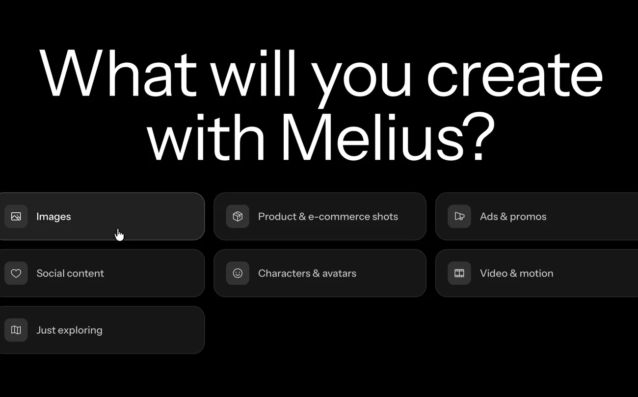
Then a quiz, one question per screen.
Where did I hear about Melius? Am I an individual or a team? What will I create?
I pick Images.
Then:
“What frustrates you most about gen AI?”
I pick “I'm new at this” and “Getting consistent results.”
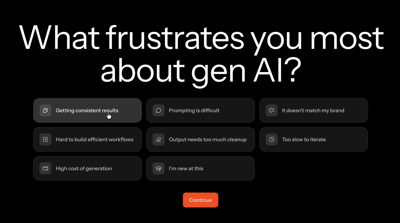
The last question asks how familiar I am with generative AI.
✅ Ask what's getting in people's way.
These are good questions. “What frustrates you” is the one I'd ask too.
It tells Melius what I'm afraid of before I spend any money.
And answering it makes me feel like the product is about to be built around me.
But there's a condition: if you ask people what they need, the next screen has to show you listened.
The next screen is a price list
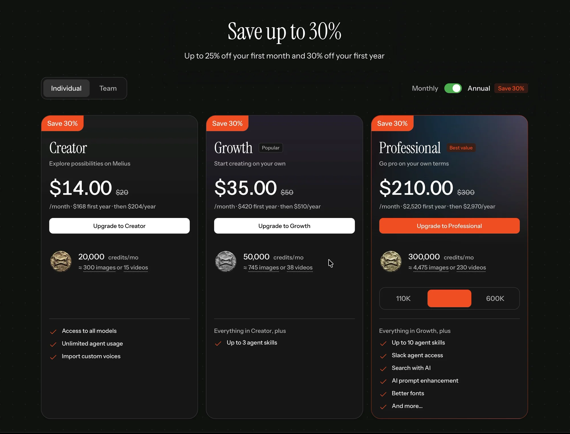
“Save up to 30%.”
Creator, Growth and Professional: $14, $35 and $210 a month, billed yearly.
No free plan. No trial. A small ✕ in the corner.
And nothing about my answers.
❌ If you ask about goals, show the answers on the next screen.
This is the heart of the consumer app playbook.
The book-summary app Headway asks a few questions, then shows you a reading plan built from your answers. Then the price.
The quiz makes the plan feel personal. The plan makes the price feel fair.
Melius kept the quiz and the price, and dropped the plan in between.
So the questions don't feel like personalization anymore. They feel like a delay before the price.
The lesson: Every question you ask should change what people see next.
The plans are written for power users
Then I look at what each plan adds:
“Agent skills.” “Slack agent access.” “Better fonts.” “And more…”
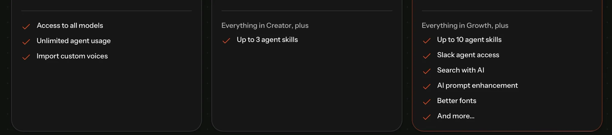
I told Melius I'm an individual who's new at this.
I came to make one image.
Which of these do I need?
There's no way in for someone who isn't sure
Hard paywalls work in consumer apps. But the good ones leave a door open.
Flo puts a toggle on its paywall: turn it on, and you get a free trial instead.
People who are ready pay right away. People who aren't sure can try it first.
Melius's only option is the small ✕.
And it's hard to find. A thin grey ✕ on black, in the far top-right corner, away from everything else on the screen. I had to look for it.
No “Not now.” No “Try it first.”
A hidden way out doesn't make people pay. It makes them feel trapped.
❌ Give people who aren't sure a way in.
Some AI tools draw the line in a smart place: basic images are free, and heavy work like cinematic video is paid.
Melius has a “first generation, on us” offer. I'll find it later.
It only shows up after I've paid.
The lesson: If your best argument is the product, let people see one result before they decide.
Two small details
While I decide, I move my mouse around.
The dots behind the modal light up and follow the cursor.
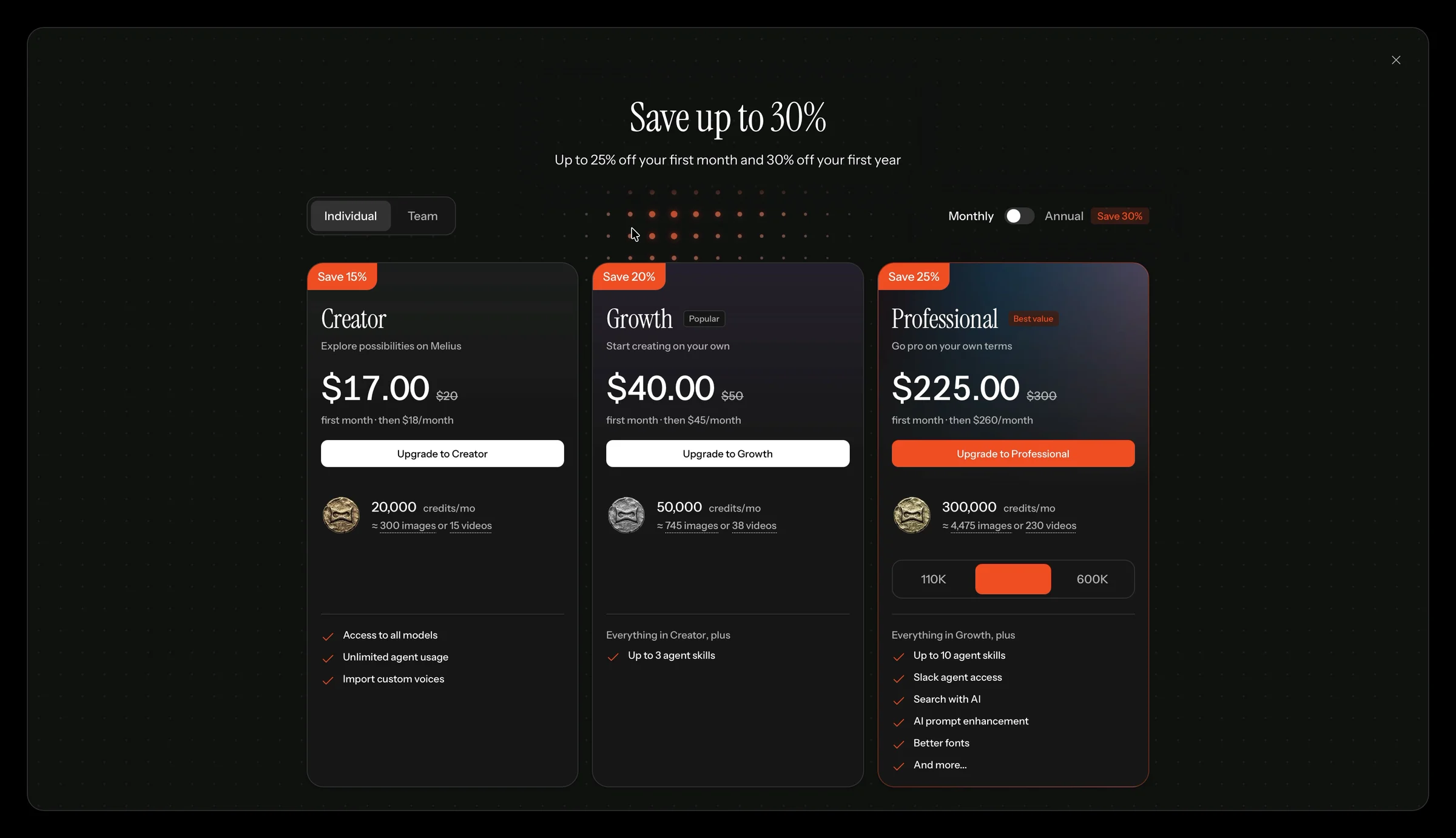
A cool effect.
But I'm also wondering: what about the 15,000 credits from the sign-up modal?
Nothing on the pricing screen mentions them.
I signed up with Gmail, not a work email. So did I qualify?
Nothing tells me.

What does 30% off even mean?
The ticket in the corner said “30% off your first year.”
The pricing screen says “Save 30%” next to the Annual toggle.
So which is it? My countdown discount, or just the price for paying a year upfront?
I do the math on Creator.
The list price is $20 a month, crossed out on both tabs.
Annual: $14 a month for the first year. Then $204 a year, or $17 a month.
Monthly: $17 for the first month. Then $18 a month.
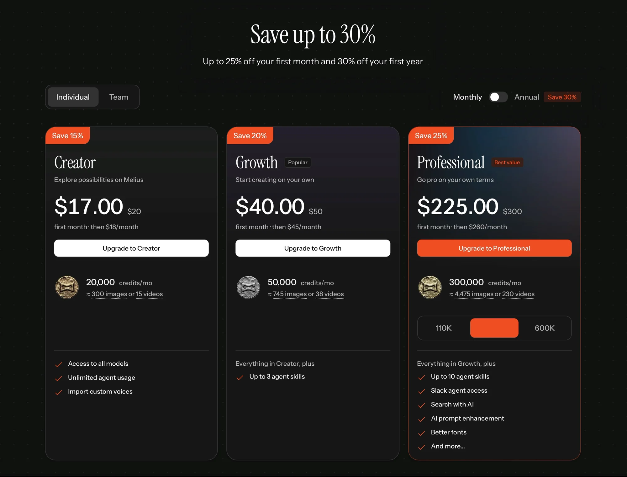
Neither plan ever charges $20.
So the 30% is the first-year price on the yearly plan, measured from a price nobody pays.
And the ticket? Nothing on this screen says it was applied. I can't tell what it added, if anything.
❌ Show one discount, from a real price.
I count four different discounts before I pay:
- 30% off on the countdown ticket.
- “Save 30%” on the Annual toggle.
- “Up to 25% off your first month” in the header.
- “Save 15%” on the monthly Creator plan.
Each one is measured from $20.
A discount builds trust when it's easy to check. A pile of percentages makes people do math. And people who are doing math start to doubt.
The lesson: Pick one offer, measure it from a price people actually pay, and show it was applied.
What I'd test
I'd test a paywall that shows my answers turned into a setup, with a “first image free” toggle under it.
My hypothesis: When the paywall shows what the quiz built, and gives unsure people a free first image, more people will start a plan, and fewer will close the modal for good.
I'd measure how many people subscribe from the paywall, how many turn on the toggle, and how many of those pay after their first image.
4. My card gets charged before I've made anything
I'm here to record the whole trial, so I pick Creator, monthly. $17 for the first month.
Stripe Checkout:
“Total due today: €19.12.”
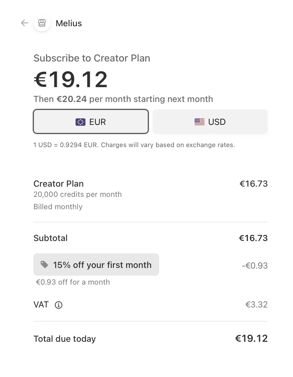
One line catches my eye: “15% off your first month.”
Wait. The pricing screen promised “up to 25% off your first month.” That 25% is only for Professional, the $225 plan. Growth gets 20%. Creator gets 15%.
And that 15% takes off €0.93.
That's $1 off the real monthly price of $18. The 15% only works if you count from the crossed-out $20.
I fill in my card and click “Pay and subscribe.”
Declined.
“Your card has insufficient funds. Try a different card.”
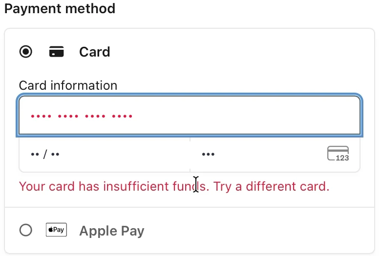
The empty card is my fault.
What surprised me is that Melius found out at all.
Usually, a trial checks that a card is real and charges it later. Melius charges it right now.
So the money has to be there before I've made a single image.
I sort out my card and pay.
❌ Let the product work before the card has to.
Charging right away is fair for a product without a trial.
And Melius is clear about what I'm buying. The plans translate credits into results: 20,000 credits a month is “≈ 300 images or 15 videos.”
But charging first means my card has to work before the product does.
Mine didn't. If I were a real customer, I might have left right there, without seeing a single image.
With a free first image, a failed card would come after I'd seen what I'm paying for. And I'd have a reason to try another one.
The lesson: When you charge up front, every failed payment is a user who leaves without ever seeing your product.
5. The quiz finally pays off. With one tile.
Paid.
In a consumer app, this is the moment the quiz pays off: a plan built from my answers.
Melius:
“Next, start generating. Based on your answers, we think you'll do your best work in Playground.”
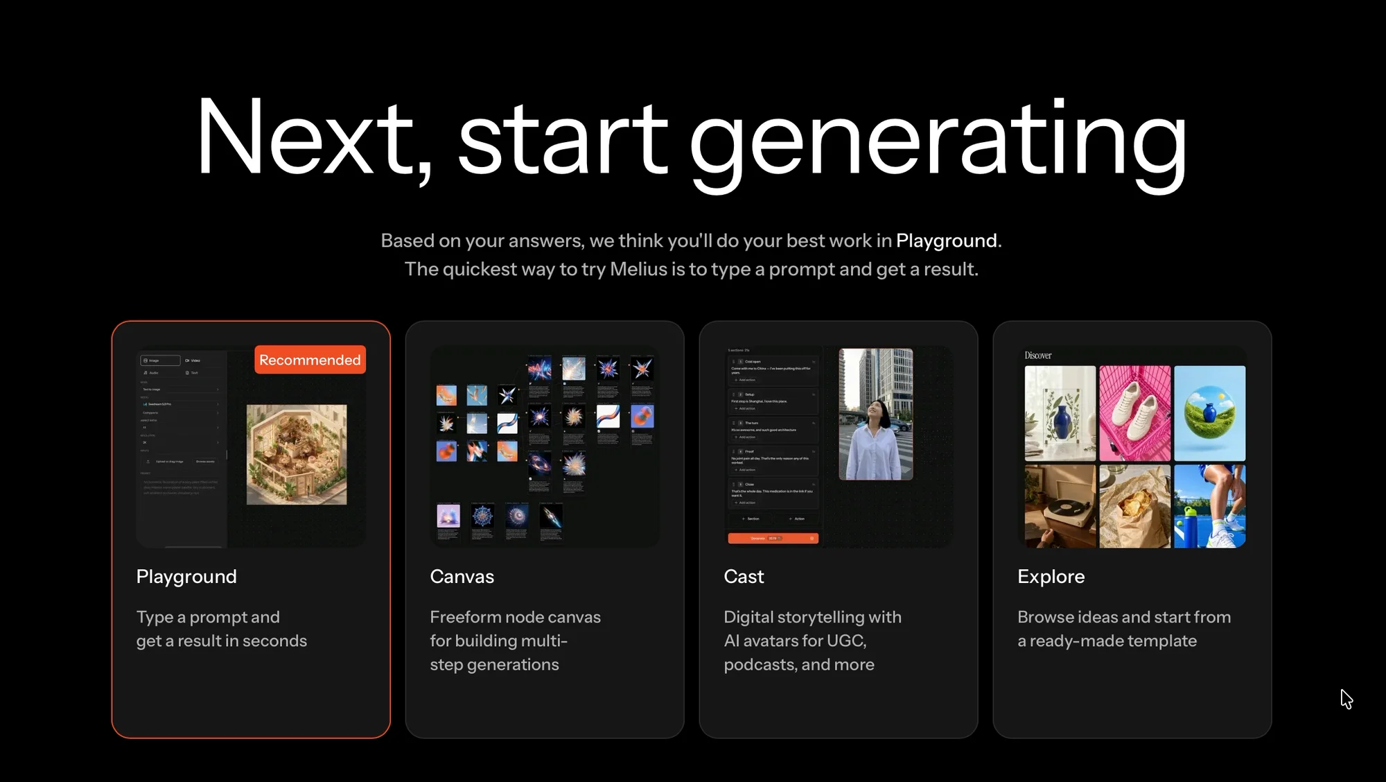
Four products to choose from.
I said images and beginner.
So my five answers picked one tile out of four.

The free image arrives after the payment
Then Playground:
“First generation, on us. We've prefilled your prompt for you, this first one's free.”
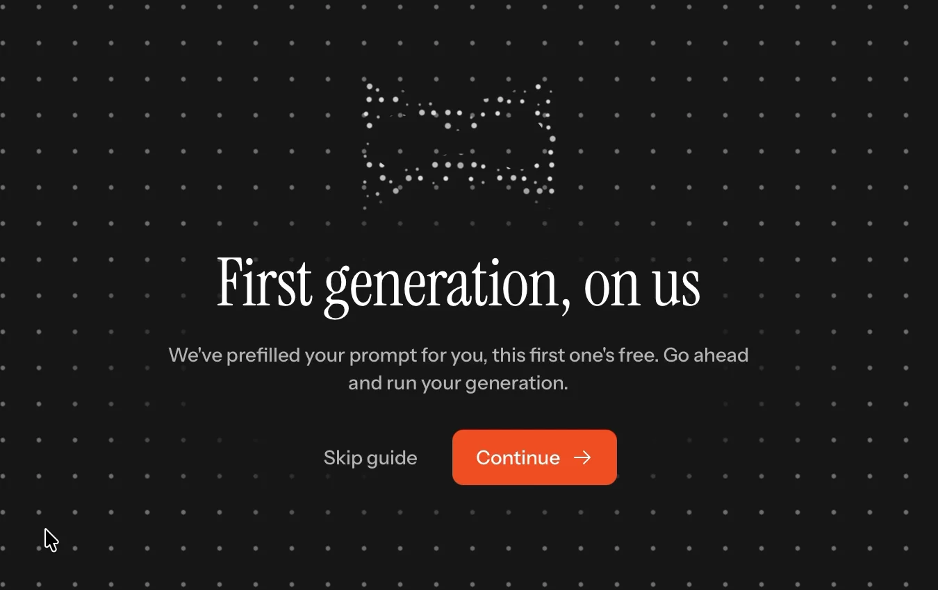
This is a great idea.
A prefilled prompt removes the fear of the empty box. A free generation removes the fear of wasting credits.
But it comes after the €19.12.
The prompt isn't mine
The prefilled prompt:
“An editorial profile portrait against a vivid coral-orange background, soft motion blur, warm studio light, white shirt, cinematic mood.”
Then three tooltips.
“The prompt goes here.”
“Run your first generation for free.”
And after the image:
“Bring your generations into a canvas.”
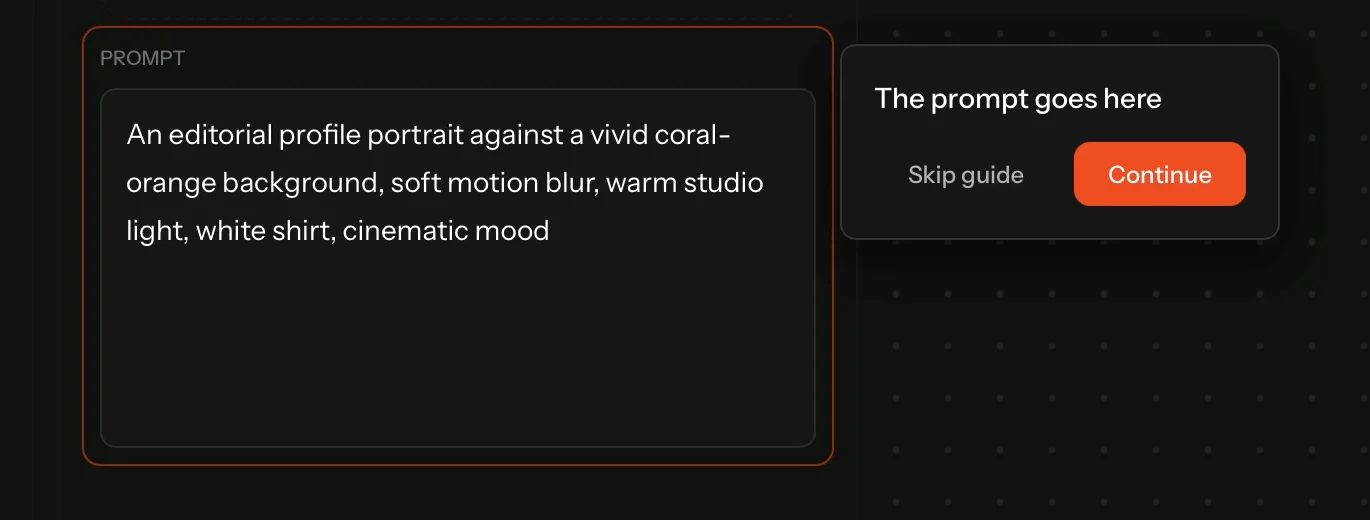
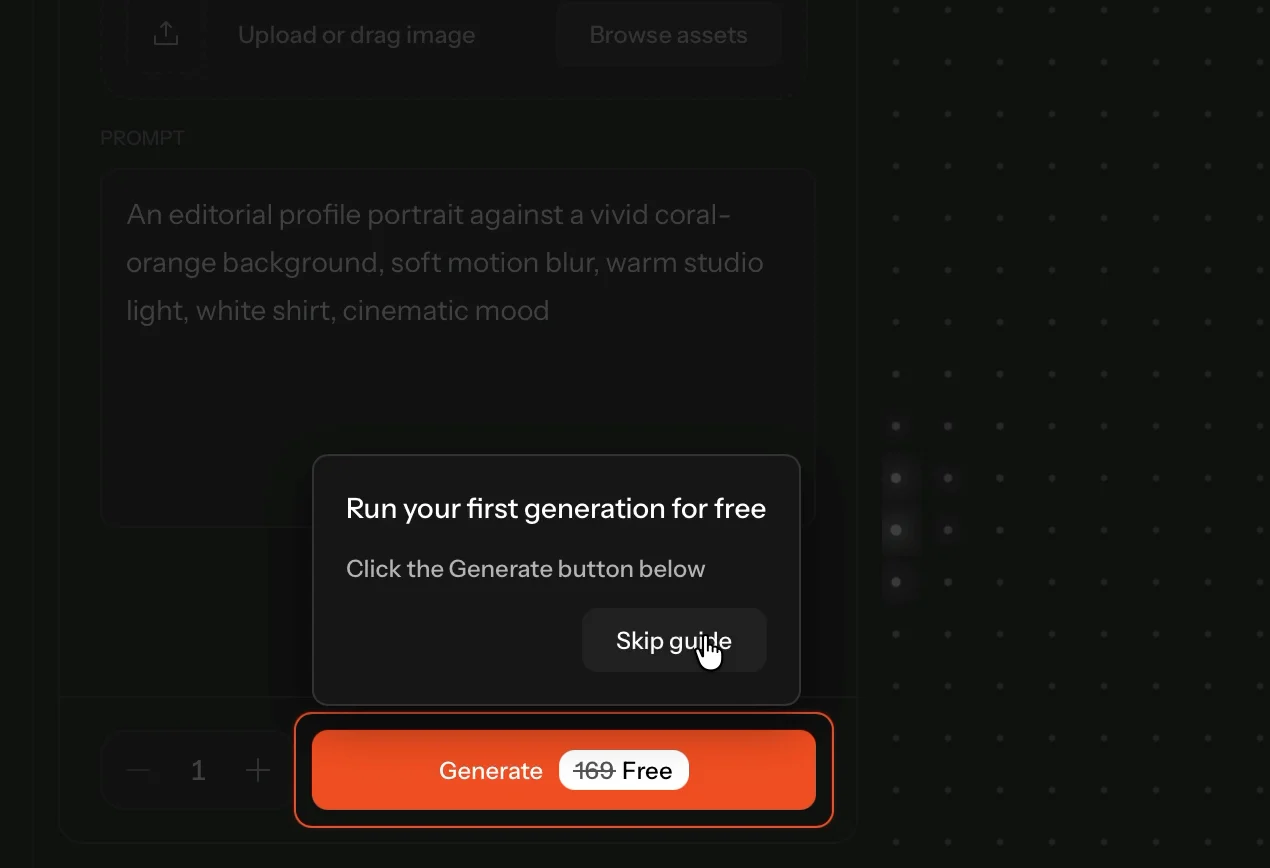
So it's a tour of a prompt I didn't write, for a portrait I'd never post.
Before I signed up, the prompt box suggested a product photo. That's what I wanted.
❌ Turn the quiz answers into the first prompt.
Melius has everything it needs.
It knows I want images. It knows I'm new. It knows I care about consistent results.
And it has a prefilled prompt.
It just doesn't connect them.
The lesson: The first thing people make should come from what they told you.
What I'd test
I'd prefill the first prompt from the quiz answers, and say why:
“Because you're new: a simple product shot, with the same light every time.”
My hypothesis: A first prompt that matches what people said they want will make the first image feel like theirs, and more people will make a second one on their own.
I'd measure how many new users run a second generation with their own prompt, and how soon.
6. Five seconds to a beautiful image
I click Generate.
About five seconds later:
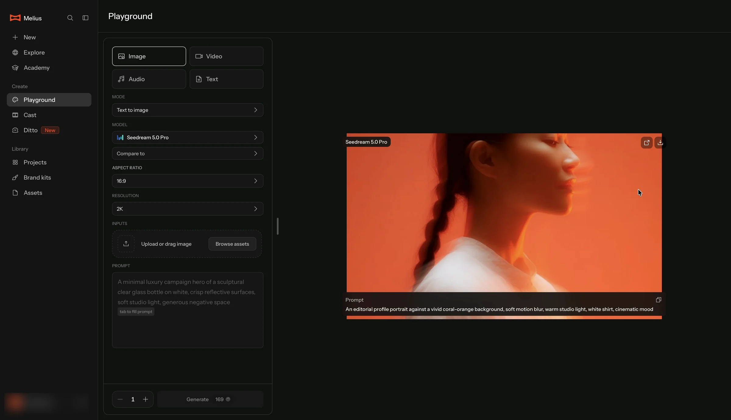
It's beautiful.
The motion blur, the light, the braid.
The product is good.
✅ Make the first result fast.
Five seconds from click to image.
That's the moment the whole trial should be built around. And once I got to Playground, Melius delivered it.
The lesson: When your product is this fast, every screen before it is slowing it down.
From promise to first image: 4 minutes 36 seconds
The homepage promised “Create any image you imagine.” Now I've seen the first proof.
It's not my aha moment yet. It's Melius's prompt, not mine. But it shows the product works.
But here's how long it took to get here, from my recording:
- 0:00 The homepage makes the promise.
- 0:10 The real app, behind a sign-up modal.
- 0:40 Five quiz questions.
- 1:04 The paywall.
- 1:24 Stripe Checkout.
- 4:00 “Next, start generating.”
- 4:36 My first image.
The image took five seconds. Getting to it took four and a half minutes.
Two and a half of those were checkout. Part of that is my empty card. But even a smooth payment puts more than two minutes, a quiz and a price list between the promise and the proof.
❌ Cut the time from promise to proof.
For an image tool, the first proof is the first image.
Melius has a product that delivers it in five seconds. Everything slow happens before it.
The lesson: Measure the time from your homepage's promise to your product's first proof. Then cut every step that isn't the proof.
Then I try my own
I upload a reference photo, a café payment scene, and ask for “the same scene from a completely different camera angle.”
It starts generating.
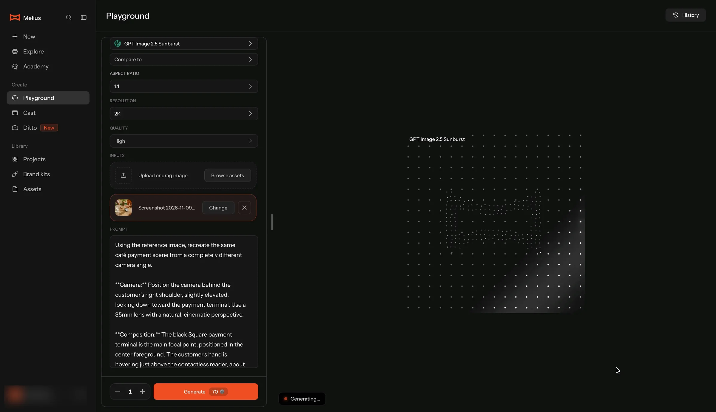
This one takes longer. So I go to another page while I wait.
I come back, and my work is gone
When I come back to Playground, my image is there.
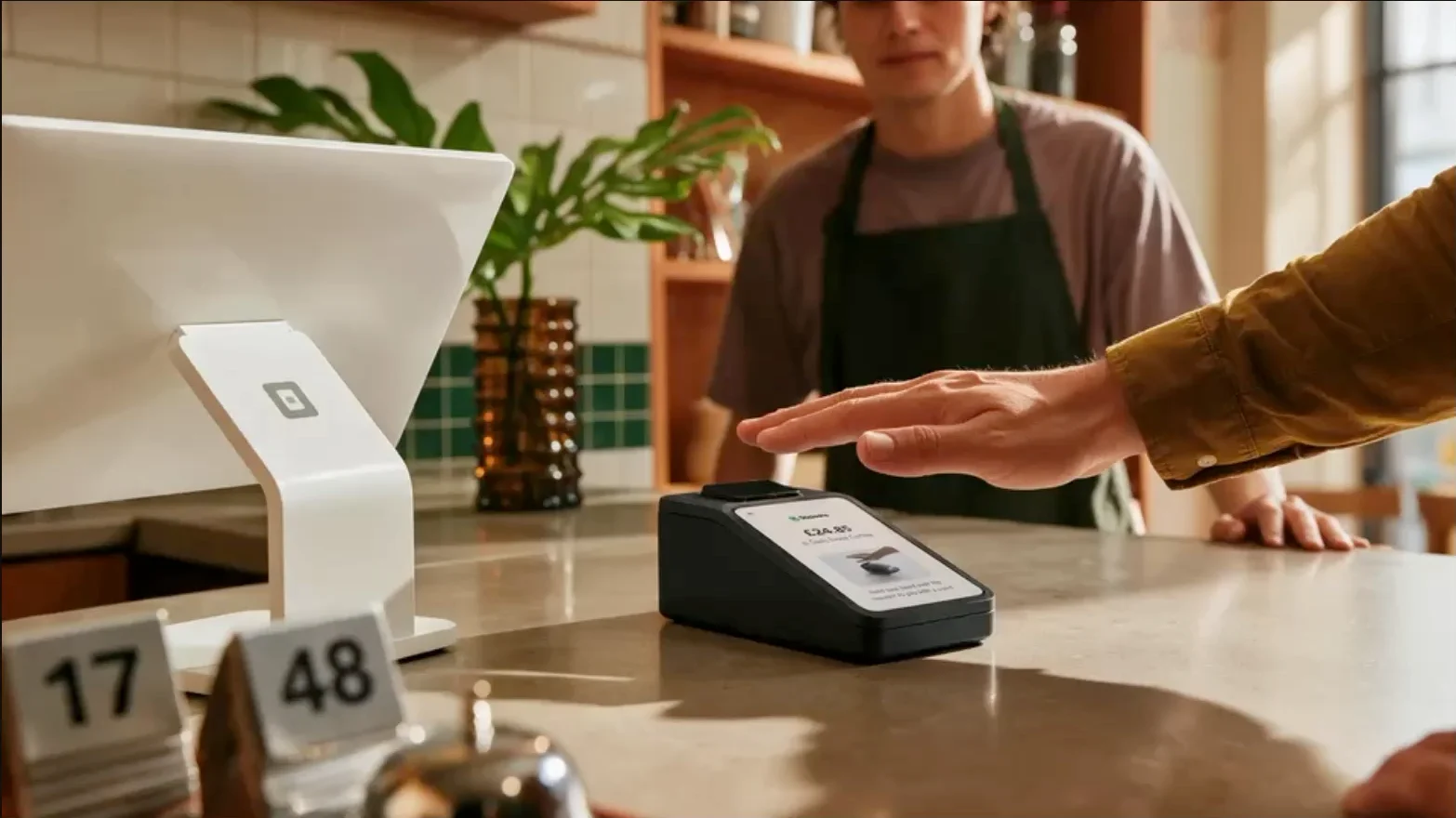
It looks like a real photo.
This is my aha moment. Not the portrait Melius picked for me. My photo, my idea, and it works. This is what I came for: pictures like this, for my own posts.
And the quality is really good. The light, the hands, even the table numbers. I can post this.
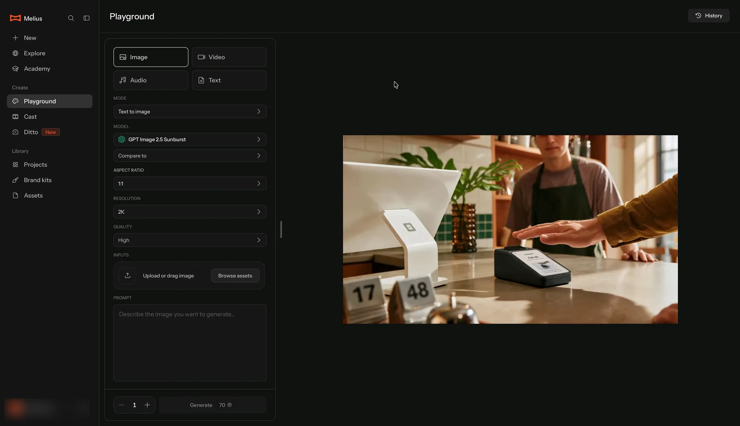
But the left side is empty.
My prompt is gone. My reference photo is gone. The mode is back to “Text to image.” The prompt box says:
“Describe the image you want to generate.”
Where is History?
I want my prompt and photo back. So I look for my history.
I look in the sidebar first. That's where ChatGPT and Claude keep past chats.
Melius has a sidebar too: Projects, Brand kits, Assets. No History.
It takes me a while to find it. A small “History” button, far away in the top right corner of Playground.
I didn't expect it there.
History doesn't take me back
So I click History to get them back.
I expect it to work like my chats in Claude: open an old one, and I'm right back where I was. Same prompt, same files, ready to keep going.
History does show my earlier try, with its prompt and reference photo.
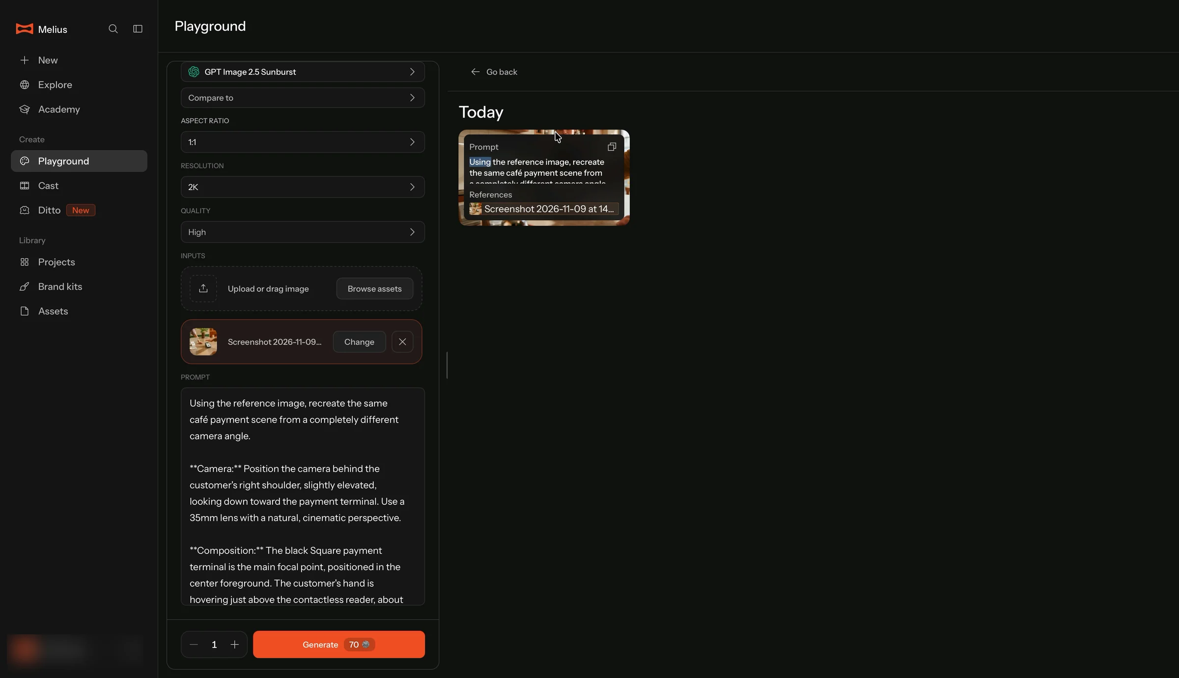
But clicking it just copies the prompt to my clipboard.
Nothing comes back into Playground. I have to put everything back by hand.
❌ Work like the AI tools people already know.
In ChatGPT and Claude, every chat is saved. Open an old one, and your words, your files and the answer are all still there. You pick up right where you left off.
People bring that habit to every new AI tool. Including Melius.
So when my prompt disappeared, I knew where to look: History. And History looked right. It had my prompt and my reference photo.
It just didn't take me back. It only copied text.
Generating takes time, and people will switch pages while they wait. When they come back, everything should still be there: the prompt, the reference, the settings. And History should be a way back to that moment, not a copy button.
This matters even more for Melius. I told the quiz my frustration is “Getting consistent results.” To get consistent results, I need to redo a try exactly, then change one thing.
Melius already saves the prompt and the reference with every try. It just doesn't let me use them.
The lesson: If people will leave while your product works, save their work. And let one click on History put them right back where they were.
7. How I'd redesign the paywall
I'd start with the part that confused me first: the discounts.
The plans can stay. Melius's real prices can stay.
What has to go is the pile of percentages.
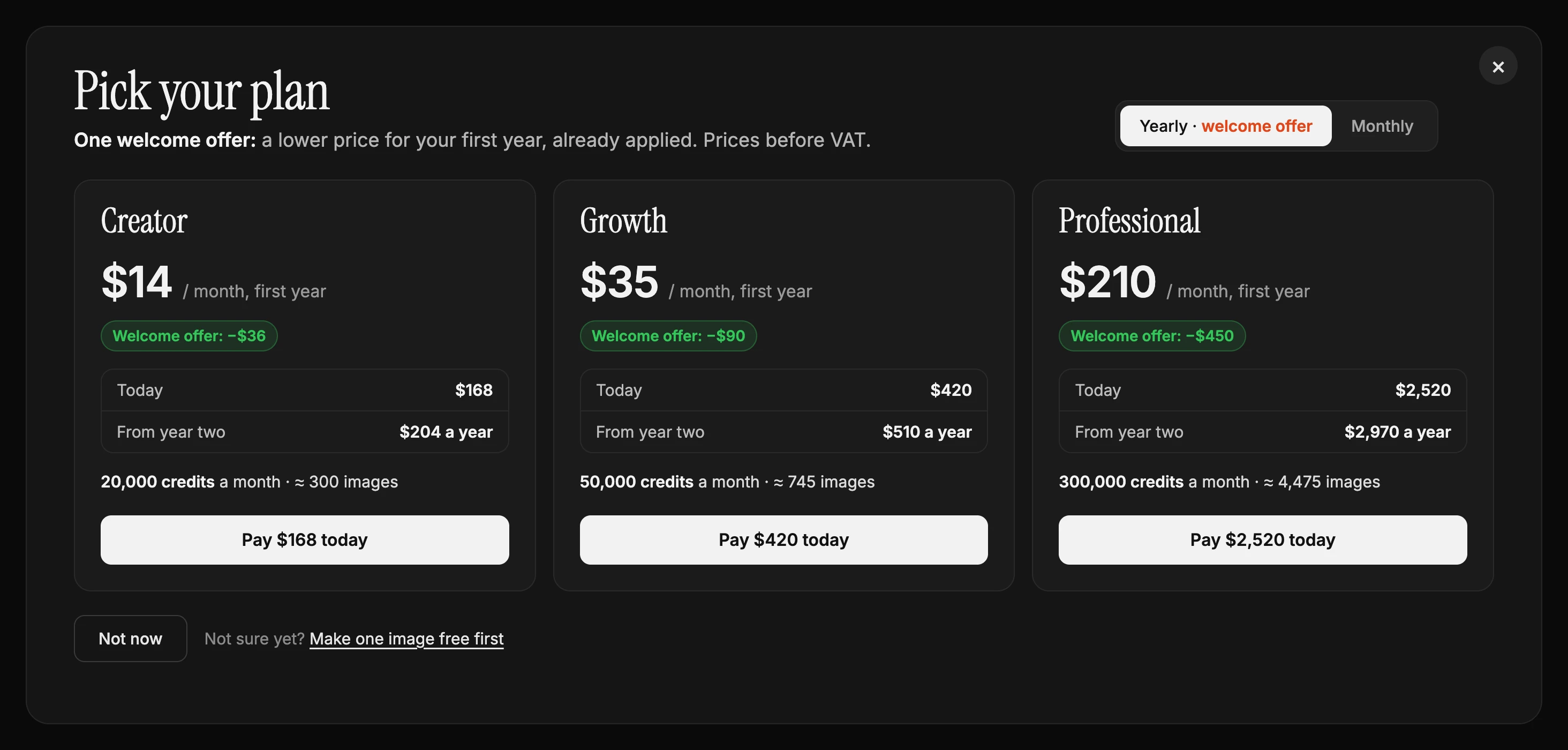
First, one offer, not five
Yearly plans get one welcome offer: a lower price for the first year. Monthly plans don't.
No crossed-out $20. No 15%, 20%, 25% and 30% on one screen. No separate countdown ticket.
Why: One offer is easy to understand. Five offers make people wonder which one they're getting.
Second, the offer in dollars
“Welcome offer: −$36.”
Counted from a price people really pay: $204 a year for Creator.
Why: A dollar amount is easy to check. A percentage of a price nobody pays isn't.
Third, what I pay, and when
Each plan says it plainly:
- Today: $168
- From year two: $204 a year
The button says it too: “Pay $168 today.”
Why: People pay more easily when they know exactly what happens to their money, and when.
Fourth, a way out, and a way in
A real “Not now” button. A ✕ you can actually see.
And next to it, for people who aren't sure: “Make one image free first.”
Why: A clear way out makes people feel safe, not trapped. And the people who aren't ready yet get one image before they decide.
8. Three experiments I'd prioritize
If I were working on Melius's trial-to-paid conversion, I'd start with three experiments.
Experiment 1: One clear offer on the paywall
Problem: The paywall shows a crossed-out $20 nobody pays, four different percentages and a countdown ticket. I couldn't tell what I'd actually pay.
Change: One welcome offer on yearly plans, shown in dollars from the real price, already applied, with what I pay today and from year two.
Hypothesis: When the price is easy to understand, more people will pick a plan, and fewer will drop off at checkout.
Measure: Paywall conversion, checkout drop-off, and the share of people who switch between monthly and yearly before paying.
Experiment 2: Add a “first image free” option to the paywall
Problem: There's no way in for someone who isn't sure. The free first generation only appears after payment.
Change: Next to “Not now”, offer “Make one image free first.”
Hypothesis: More people will reach their first image, and enough of them will pay afterward to beat the current paywall.
Measure: Paywall conversion, free-image usage, and paid conversion after the first image, compared with the current flow.
Experiment 3: Start the countdown after a no
Problem: The 24-hour discount starts before sign-up, for everyone.
Change: Show the discount only after someone presses “Not now”.
Hypothesis: A targeted discount will win back more hesitant users without lowering the price for people who would have paid in full.
Measure: Conversion among people who pressed “Not now”, and average revenue per new subscriber.
I'd prioritize the first experiment because it fixes the first thing that confused me: I couldn't tell what I was going to pay.
These are hypotheses to validate, not guaranteed conversion improvements. I'd also track retention after the first month, to check that people who come in through the free image stay as long as people who paid first.
9. The product isn't the problem. The funnel in front of it is.
Melius gets a lot right.
The homepage shows real output.
The real app sits behind the sign-up.
The quiz asks good questions.
And the first image is fast and beautiful.
But between the homepage and that first image, Melius ran a playbook it only half copied.
A countdown aimed at everyone.
A quiz that changes almost nothing.
A paywall with no way in.
And a charge before a single image.
The product is good enough not to need those tricks.
What Melius gets right
- Output as the hero: The homepage shows what the product makes, not stock photos.
- The real app behind the sign-up: I can see the product before I commit.
- A reason to sign up: “Get up to 15,000 credits” gives me something before it asks for anything.
- Good questions: “What frustrates you” is exactly the right thing to ask.
- Credits in images: The plans say roughly how many images and videos each one buys.
- A prefilled first prompt: No empty box for a beginner.
- Speed: Five seconds from Generate to a beautiful image.
What I'd improve
- Motion: Let the homepage settle, or add a pause button.
- Countdown timing: Show the discount after someone closes the paywall.
- Quiz payoff: Show the answers turned into a setup on the paywall.
- A way in: Let people who aren't sure make one image free first.
- Saved work: Keep the prompt and reference when I leave the page, and let History put a try back in Playground.
- Time to first image: 4 minutes 36 seconds from the promise to the first image. The image itself takes five.
- The 15,000 credits: Say on the pricing screen whether I got them.
- Discounts: One offer, measured from a price people actually pay, and a clear sign that it was applied.
The bigger SaaS growth lesson
Copying another product's onboarding is tempting.
Consumer subscription apps have tested their quizzes, paywalls and discounts on millions of people.
But each step in that playbook only works because of the step after it.
The quiz works because the plan uses the answers.
The plan works because it makes the price feel fair.
The discount works because it goes to the people who said no.
Melius copied the steps and dropped the links between them.
If you're borrowing a playbook for your product, ask one question for every screen you copy:
What does the next screen do with it?
If the answer is nothing, you've copied the form, not the funnel.
For Melius, the fix could be as simple as one free image and a paywall that remembers what I said.
Same quiz. Same prices.
But this time, I'd see what the product can do before it asks for my card.
Did your onboarding borrow a playbook? Which part did you leave out? I'd love to hear how your product handles it.
I break down real free trials to show where they lose potential paying customers and how to improve the experience.
Want me to review your trial? DM me “teardown” on LinkedIn.
Eddy
Adomate Nailed My Brand (But Made Up My Customers)
Adomate, Nov 6, 2026