Kit offered to move my list (then never asked where it was)
8 min read · about Kit ·
Kit offered to move my list (then never asked where it was)
“Migration included,” said the homepage. I write on Substack. Nobody asked.
1 / 26

Written by
Eddy Bogomolov
Growth PM for SaaS
Published
What you'll learn
- Ask where people’s readers are, by name. “Do you already use an email marketing tool?” I write on Substack, so I said no. Kit never asked again, and never found out I have readers.
- If migration is included, make it step one. The homepage said “Migration included.” Inside, the checklist started with “Create a landing page”, as if I had nobody to bring.
- A button should open what it says. “Create landing page” opened a page about landing pages, with another “Create a landing page” button on it. I went back and tried again.
Kit offered to move my list. It never asked where it was.
Kit offered to move my list (then never asked where it was), chapter by chapter
In this story, I write a newsletter called Free to Paid, on Substack. Substack is where readers find me.
I'm not leaving it. I want to add Kit, to turn some of those readers into customers: emails that go out by themselves, with case studies, tips on getting more trial users to pay, and an invite to book a free audit.
So Substack brings the readers in, and Kit does the follow-up. That's the plan.
Kit's homepage line: "The email platform for creator business owners." And under the button, the line I was looking for: "Migration included." That means Kit helps you bring your list in from another tool.
So I started Kit's 14-day trial and recorded everything from the homepage to the first landing page. The first thing I wanted to know: how do Substack and Kit fit together?
The sign-up took twenty seconds. Then Kit asked me five good questions, and said why it asked each one.
Not one of them asked where my readers are.
Then it showed me a card form for "up to 1,000 subscribers." A checklist for finding new readers. A button that opened a page about the button. And a gallery of pages for other people's newsletters.
I've tried a lot of trials that ask for a card before you see anything. Lightfield, Melius and Fyxer all did. Kit is different. It promised I wouldn't need one, and I didn't.
So this one isn't about a card wall. It's about the person most likely to try Kit: someone who already has a list somewhere else, and wants to keep it there.
I'm asking three things. How do you find out where people's readers are? What should "Migration included" look like inside the product? And what should a button open?
Let's get into it.
1. The homepage: emails that run themselves
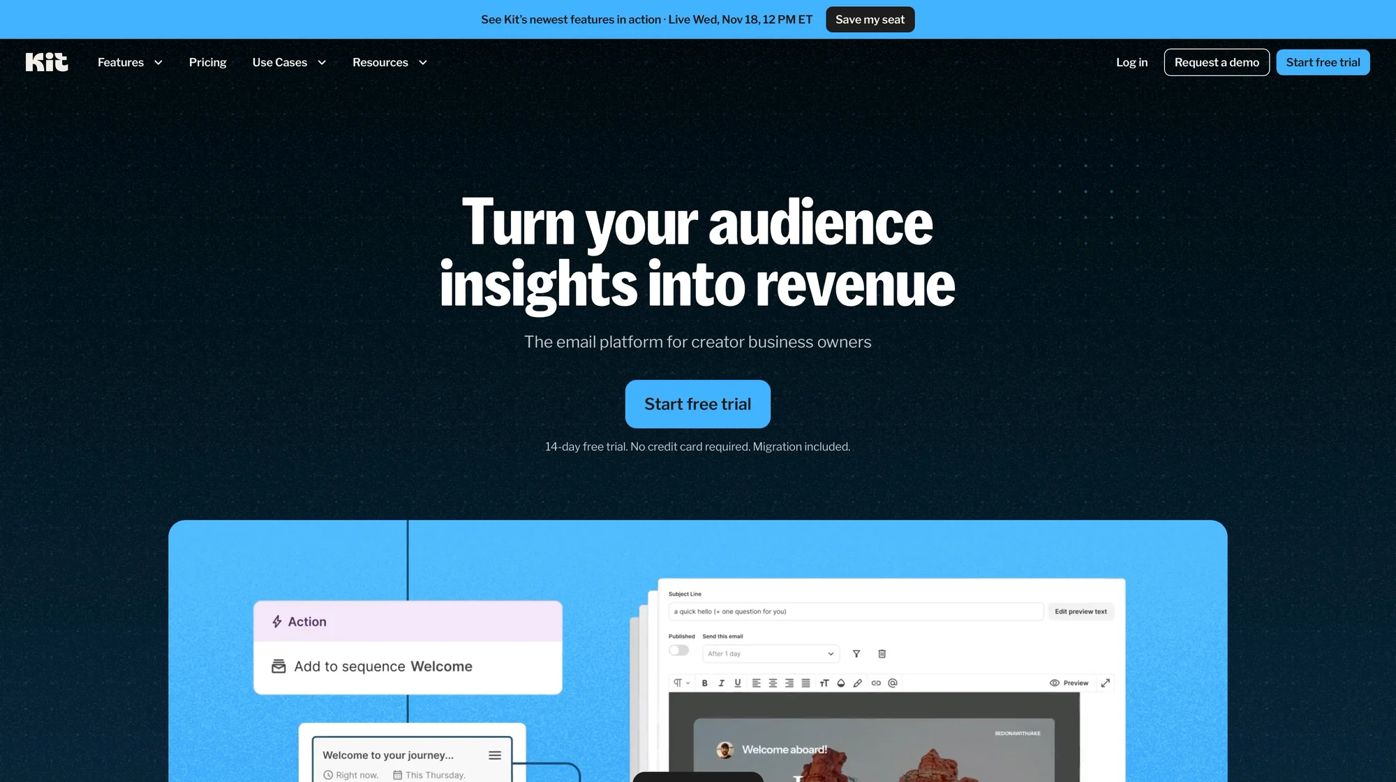
I open the Kit homepage. The big line:
"Turn your audience insights into revenue."
Under it: "The email platform for creator business owners." That's me.
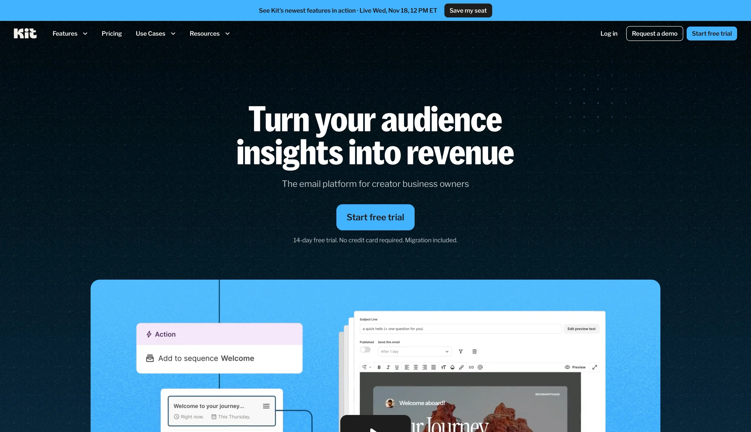
Here's a simple test for a homepage. If the big line were the only thing you read, would you know what the company sells?
"Turn your audience insights into revenue" fails it. "Audience insights" sounds like charts. It's the smaller line under it that says what Kit is: email for creators.
Under the headline, the page shows Kit working by itself. "Tag cold subscribers with 'Re-engagement Campaign'. Working…" Then "Complete." Emails that run themselves.
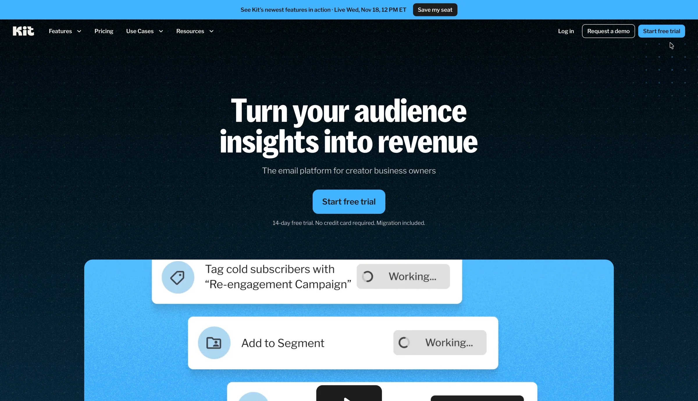
Then I notice the small print under the button:
"14-day free trial. No credit card required. Migration included."
No card, and help moving my list. That's what I came for.
For anyone with a list somewhere else, that's the biggest worry: what happens to my readers? Kit answers it, in the smallest text on the page.
And proof that other creators use Kit? Not up here. The "100,000 creators" line shows up later, on the card form.
❌ Say what you sell in the big line. Answer the biggest worry right next to it.
The pieces are all on Kit's homepage. They're just in the wrong sizes.
Keep "Migration included" in mind. It's the last time I see it.
2. Sign-up: twenty seconds
I click "Start free trial." A robot check runs for four seconds. Then a short form: name, email, password, and a box to tick for the terms.
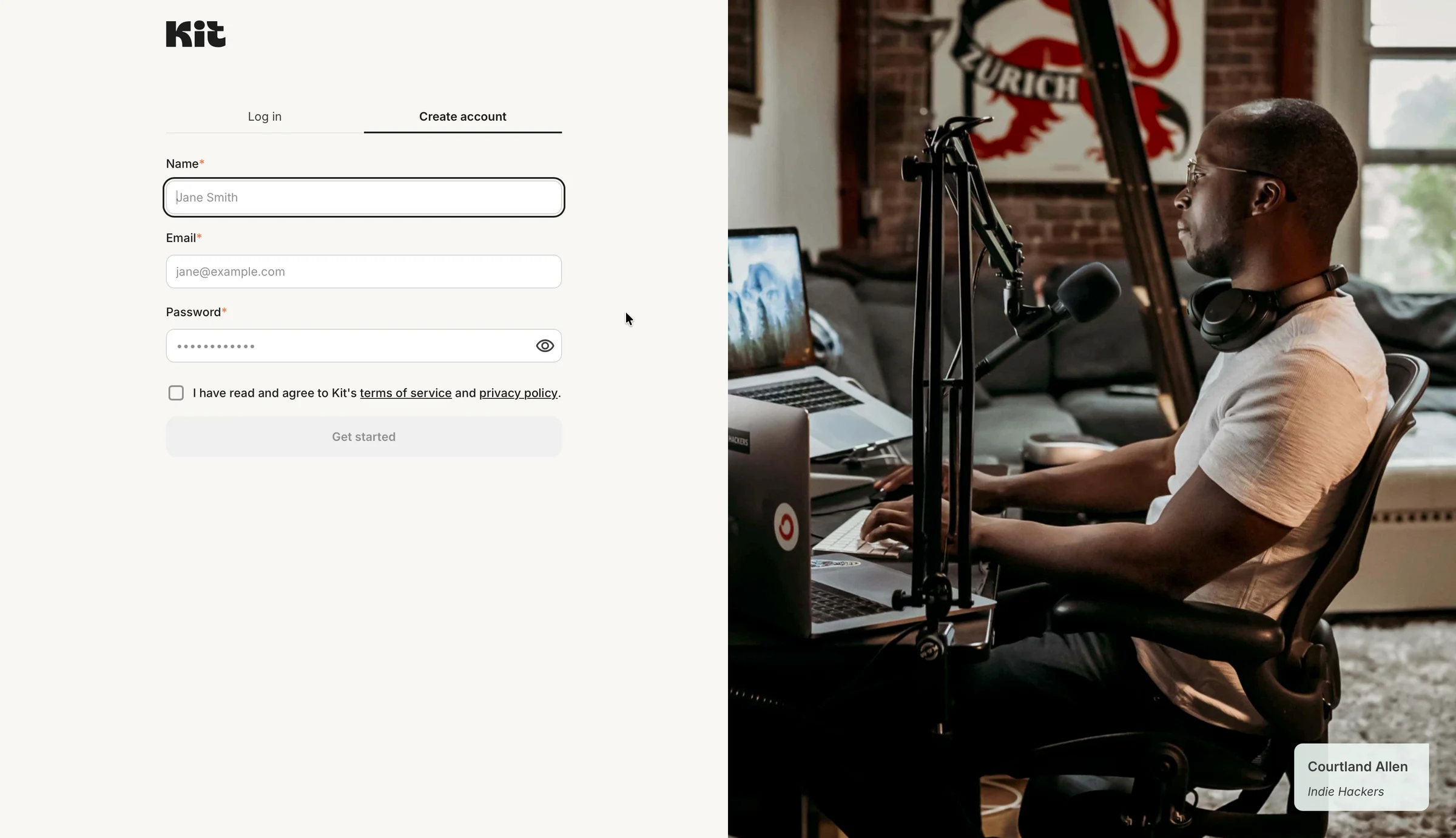
Next to the form is a big photo of Courtland Allen, who runs Indie Hackers. He's a creator I know. Showing someone like me is a good move. But it's only his name. One line from him on why he uses Kit would say more.
✅ Show who it's for.
Before I type a word, the photo tells me Kit is for people like me: one person, a microphone, and an audience.
Twenty seconds later, I'm in.
3. "Do you already use an email marketing tool?"
Kit asks five questions, one per screen. The first:
"Welcome! Tell us about yourself so we can customize Kit to match your needs. Do you already use an email marketing tool?"
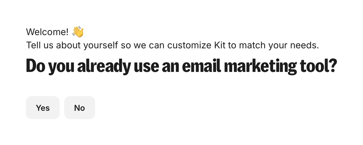
I write on Substack. Is that an email marketing tool?
To me, it isn't. It's where I write. My readers get my posts by email, but I never think of it as "email marketing." That sounds like Mailchimp, or a shop sending coupons.
So I click No.
The second question:
"How big is your audience? This includes subscribers on YouTube, followers on Instagram, etc."
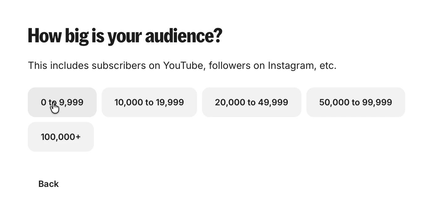
I pick "0 to 9,999." Kit now knows my audience is small. It doesn't know I have a list at all.
❌ Ask where people's readers are, by name.
Kit said it wanted to "customize Kit to match your needs." Then it asked a question that a Substack writer answers "no."
That one word sends me down the path for people with nothing to bring. And Kit never asks again.
The fix is one question with the right words: "Where do your readers get your emails today?" With Substack, beehiiv and Mailchimp on the list, and "Nowhere yet" at the end.
The lesson: Don't make people guess which box they belong in. Name the tools they use. People pick the answer that sounds like them.
4. Every question says why
The next three questions are good ones.
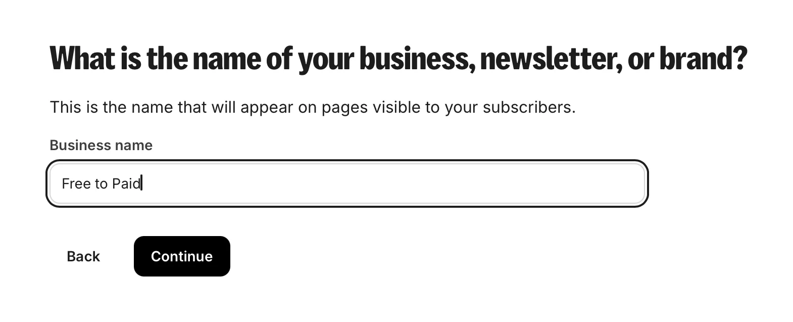
"What is the name of your business, newsletter, or brand?" Under it: "This is the name that will appear on pages visible to your subscribers." Kit filled in my first name for me. I type "Free to Paid."
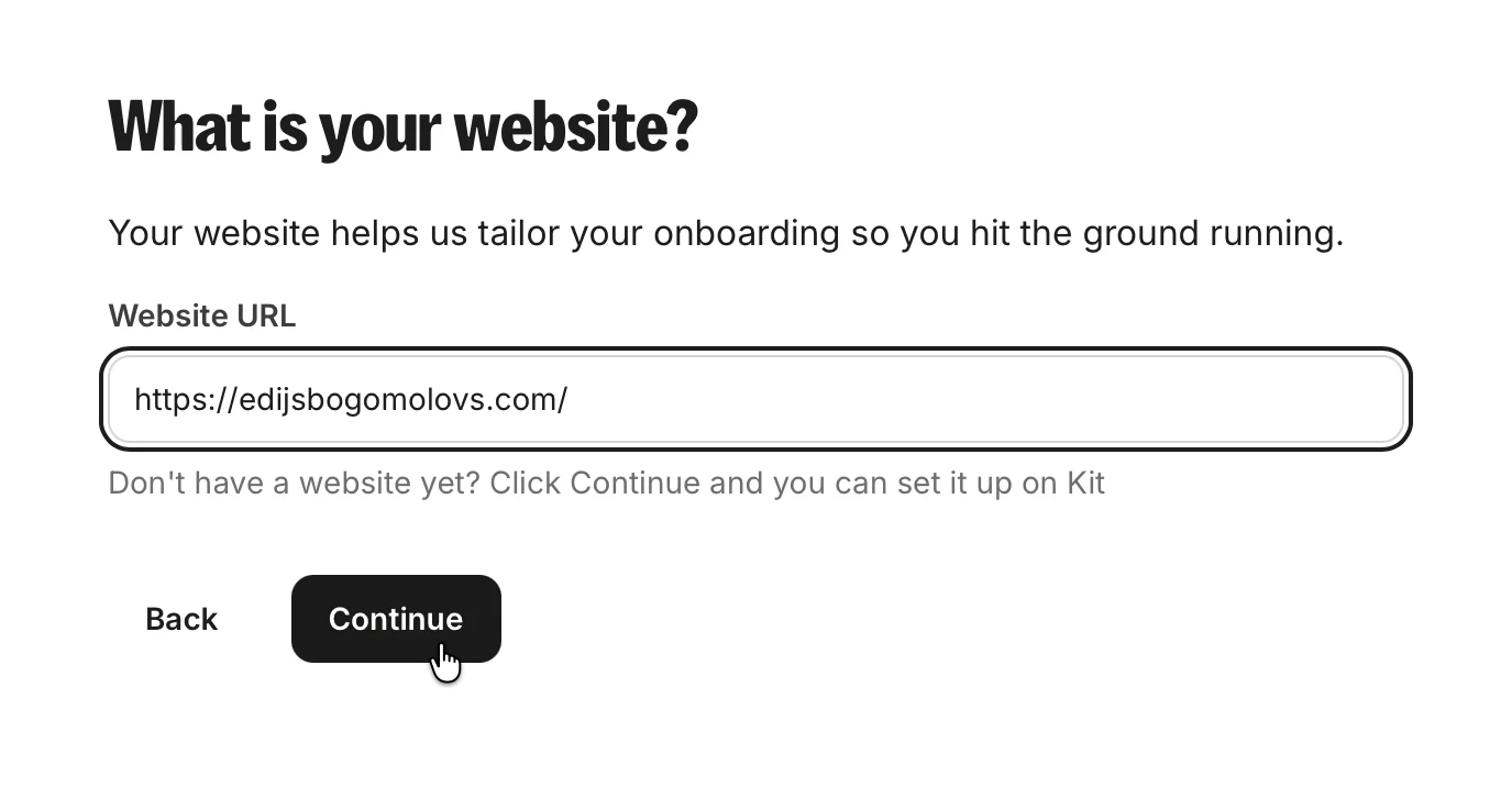
"What is your website?" Under it: "Your website helps us tailor your onboarding so you hit the ground running."
"What kind of creator are you?" I pick Entrepreneur.
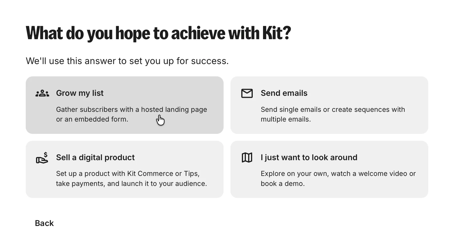
"What do you hope to achieve with Kit?" Under it: "We'll use this answer to set you up for success." I pick "Grow my list."
✅ Say why you ask.
Every question has a reason under it. I praised the same thing in my Bitpanda teardown, where one line made six legal questions feel fair. Here the reasons make five short questions feel useful.
Kit asked for my newsletter's name and my website. It still didn't ask where the newsletter lives.
5. The first screen: a card form
I click Continue. The first screen inside Kit:
"Welcome to Kit! Join the 100,000 creators using Kit to automate and grow their business."
And on the right, a card form.
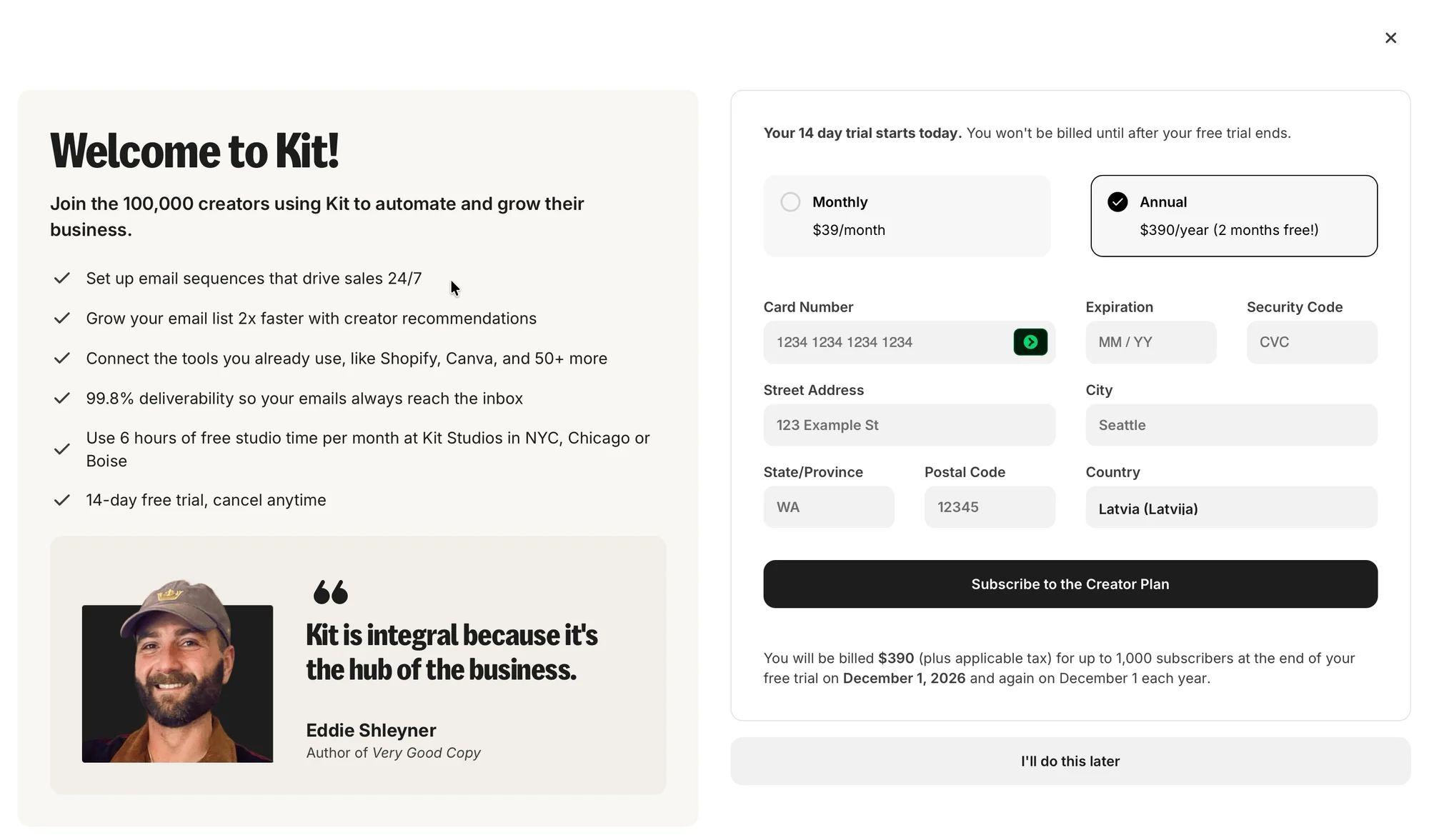
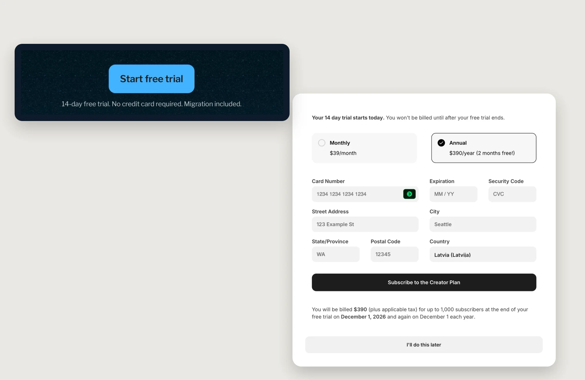
"Your 14 day trial starts today. You won't be billed until after your free trial ends."
A minute ago, the homepage said "No credit card required." Now the first thing I see inside is a form asking for one.

I didn't even see that first line at first. "You won't be billed until after your free trial ends" is the most reassuring sentence on the form, and it's in small grey text at the very top, where my eyes skip.
The big black button, where my eyes go, says "Subscribe to the Creator Plan." That sounds like paying today. Trial buttons usually say something else, like "Start free trial."
The yearly plan is already ticked: "$390/year (2 months free!)." Card number, expiry date, address. A big black button: "Subscribe to the Creator Plan." Under it:
"You will be billed $390 (plus applicable tax) for up to 1,000 subscribers at the end of your free trial on December 1, 2026 and again on December 1 each year."
At the very bottom, in a grey button: "I'll do this later."
Up to 1,000 subscribers. Do my Substack readers count? How many of them would come over? That's confusing, and the page doesn't say. It doesn't know they exist.
To be fair, Kit kept its word on "No credit card required." I can skip the form, and I do. And it says exactly when the first bill comes, which Fyxer did well too. The yearly plan ticked for me is a repeat of my Attio teardown, so I won't go over it again.
Here's one checkout button from each of my teardowns. The free trials say "free," "trial" or "€0" right on the button. Kit's trial button sounds like the ones where you pay today.
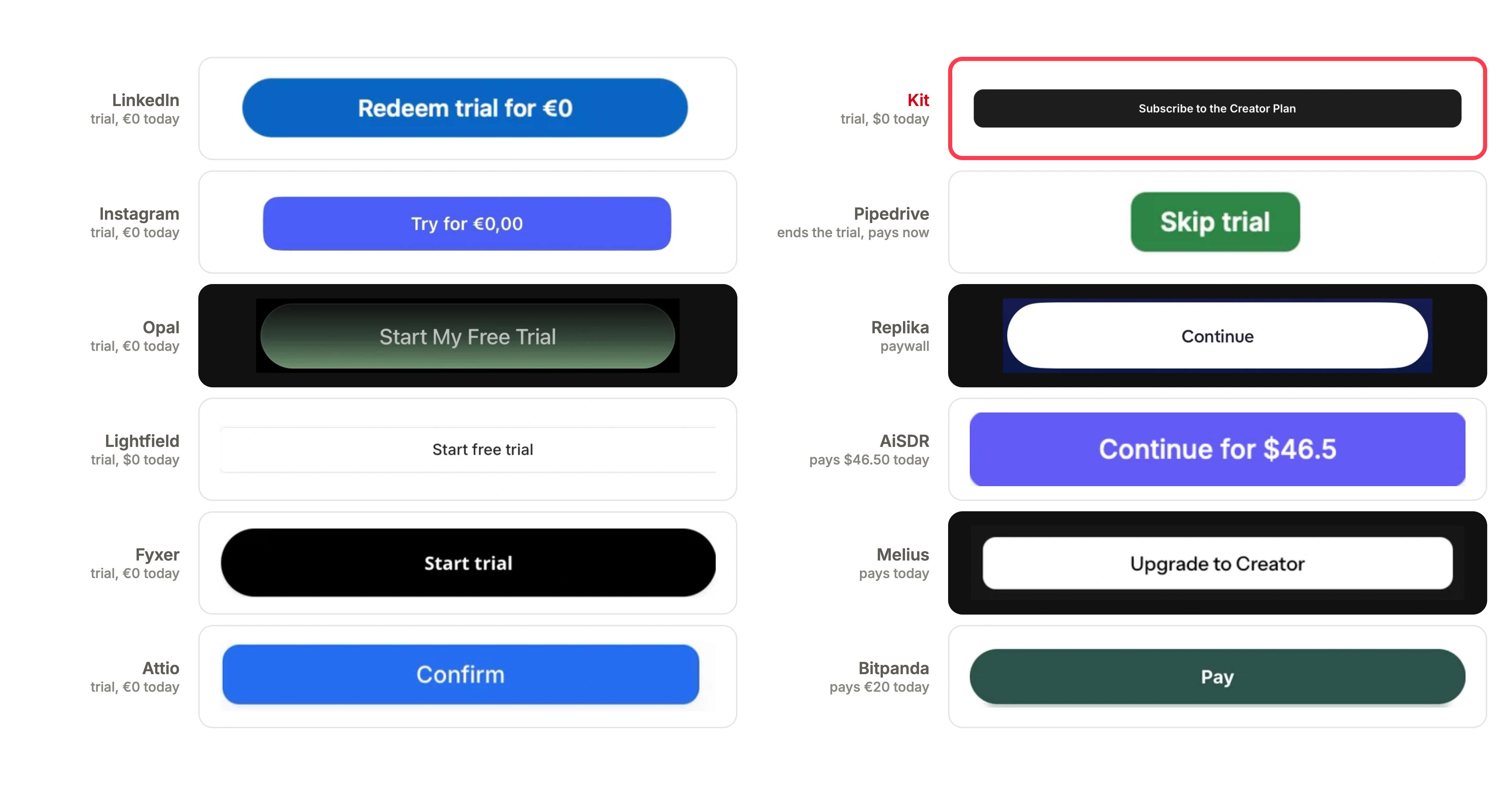
And the form felt unfamiliar. My attention spread across every box at once, with nothing telling me where to start. Other trials asked for a card too, but theirs felt simple.
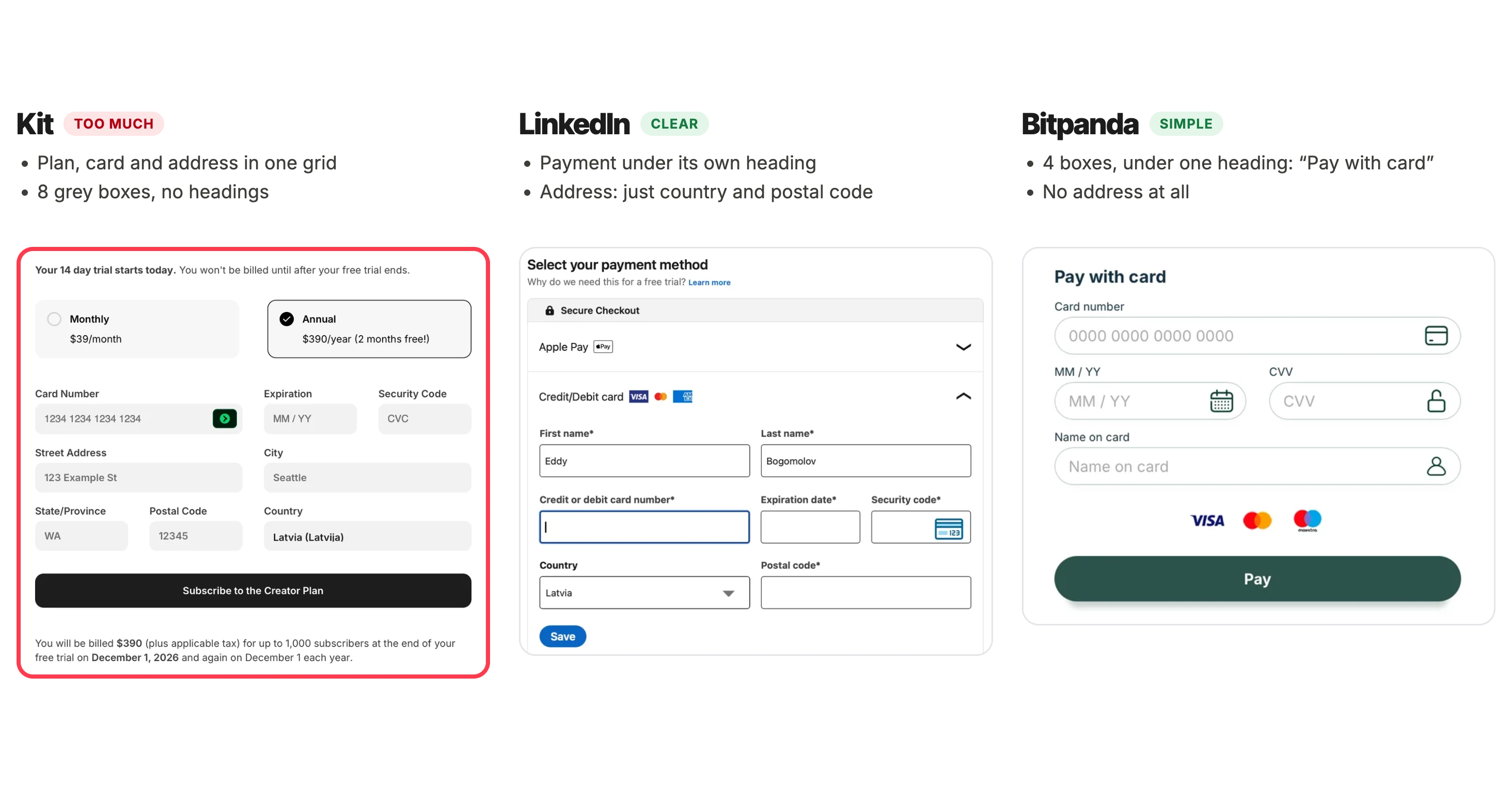
So what's not working in Kit's form?
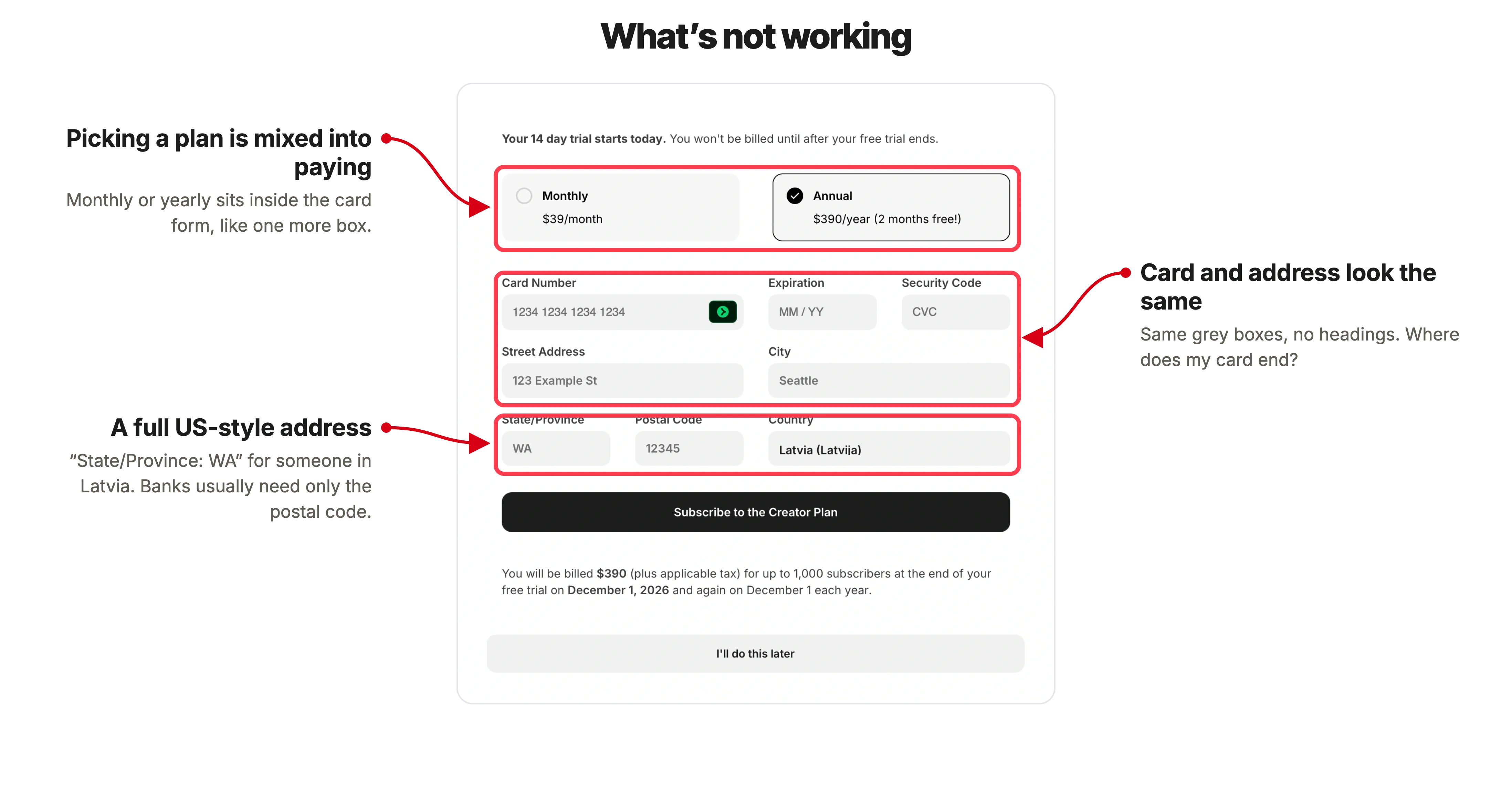
Kit puts the plan, the card and my address in one grey grid, with no headings. Where does my card end and my address begin? It even wants "State/Province: WA" for someone in Latvia. LinkedIn asks only for my country and postal code. Bitpanda asks for four boxes and no address at all.
❌ Give the card its own box.
Put the plan on top as a short summary: "Yearly, $390, change." Put the card number, expiry date and security code together, in the order they're printed on the card, in a box that looks different from the rest. Then ask only for the address details the bank really needs.
Is a payment pop-up a good first screen? Not when people came to look around. I wanted to play with Kit first. Kit's own founder has written that Kit switched to a trial with no card, years ago, to cut friction at sign-up. Here the card is optional, and I can skip it. But as the very first screen, it still asks me to think about paying before I've tried anything.
❌ Don't price a list you haven't asked about.
A plan for "up to 1,000 subscribers" only means something once I know how many of my readers are coming. Kit asks me to choose before it knows where they are.
The lesson: For people bringing a list, the price depends on the move. Help them move first. Then show the plan that fits what arrived.
6. "Grow your list," starting from nobody
I click "I'll do this later," and the dashboard opens.
"Welcome to Kit, Eddy."
A checklist called "Grow your list": "Set up the essentials to start growing your audience. We'll help you launch and build momentum."
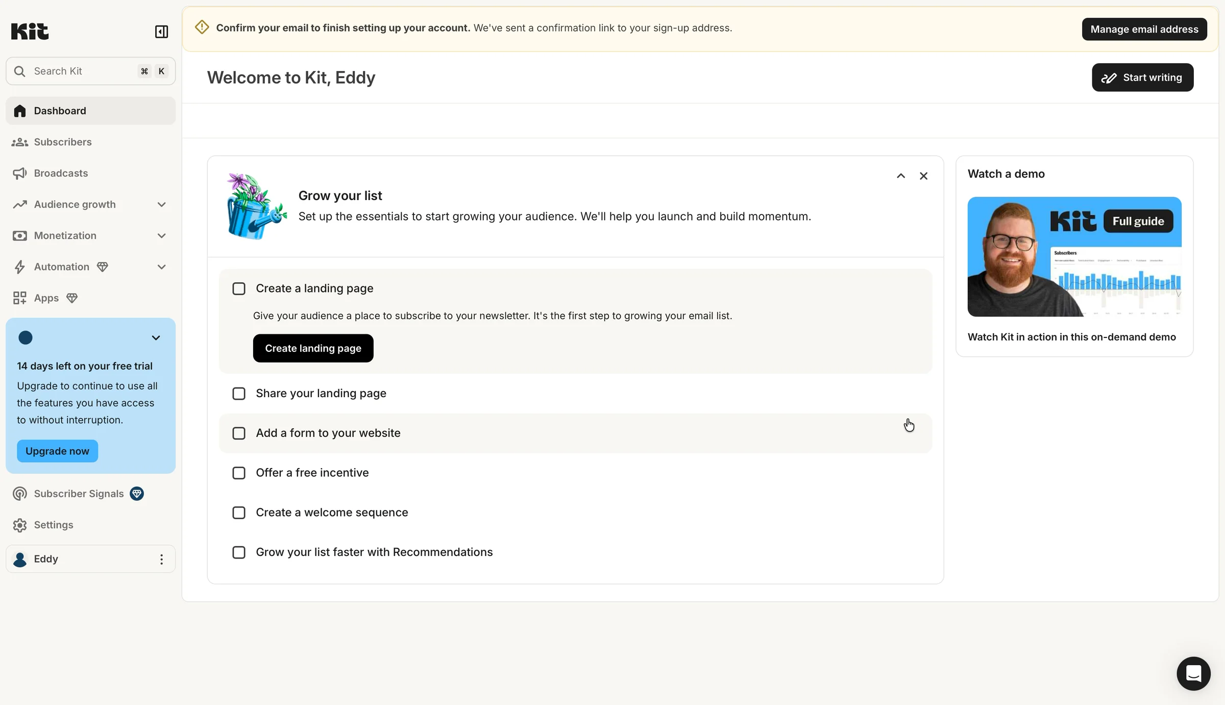
That's my answer from the last question: "Grow my list." Kit followed through, and that's nice.
Finally, I'm in the product. This feels like my aha moment, the moment it clicks. But…
In the sidebar, a blue box:
"14 days left on your free trial. Upgrade to continue to use all the features you have access to without interruption."
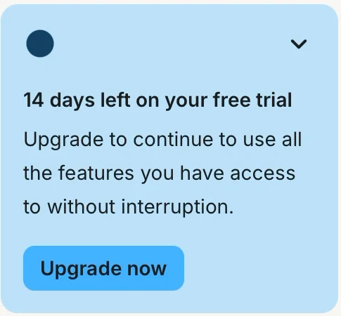
With an "Upgrade now" button.
Showing the days left is good: no surprise bill later. But asking me to upgrade before I've sent a single email is too early. I haven't seen what I'd be paying for yet.
Now read the list:
- Create a landing page
- Share your landing page
- Add a form to your website
- Offer a free incentive
- Create a welcome sequence
- Grow your list faster with Recommendations
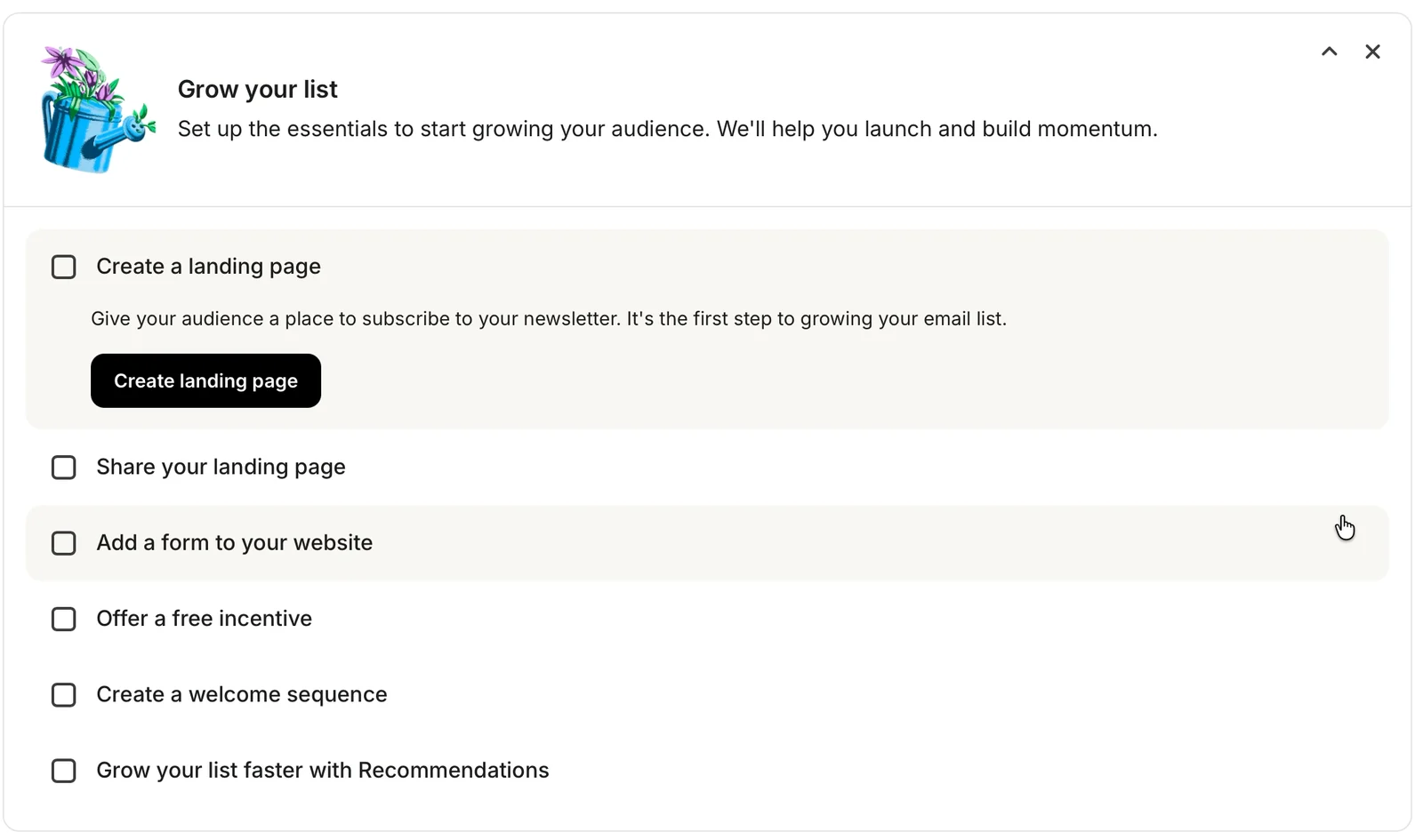
A landing page is a one-page website where people sign up. Every step here is about finding new readers.
Not one is about the readers I already have. Or about how Substack and Kit fit together.
As far as I can tell, they don't connect by themselves. To get my readers into Kit, I'd move the list by hand, or set up another tool to do it. That's fine. But the trial is the place to tell me, and it never does.
❌ If migration is included, make it step one.
The homepage promised "Migration included." Inside, there's no "Bring your readers" step. No "Import." Nothing that says Substack.
For someone starting from nothing, this checklist is right. For me, it skips the most important step: my Substack readers, in Kit, so the first email Kit sends actually reaches someone.
The lesson: If your homepage promises to move people's stuff, the first step inside should be the move. Everything else is easier once it's done.
I click "Create landing page" anyway.
A new page opens: "Landing Pages & Forms."
"Turn readers into subscribers with customizable landing pages and forms."
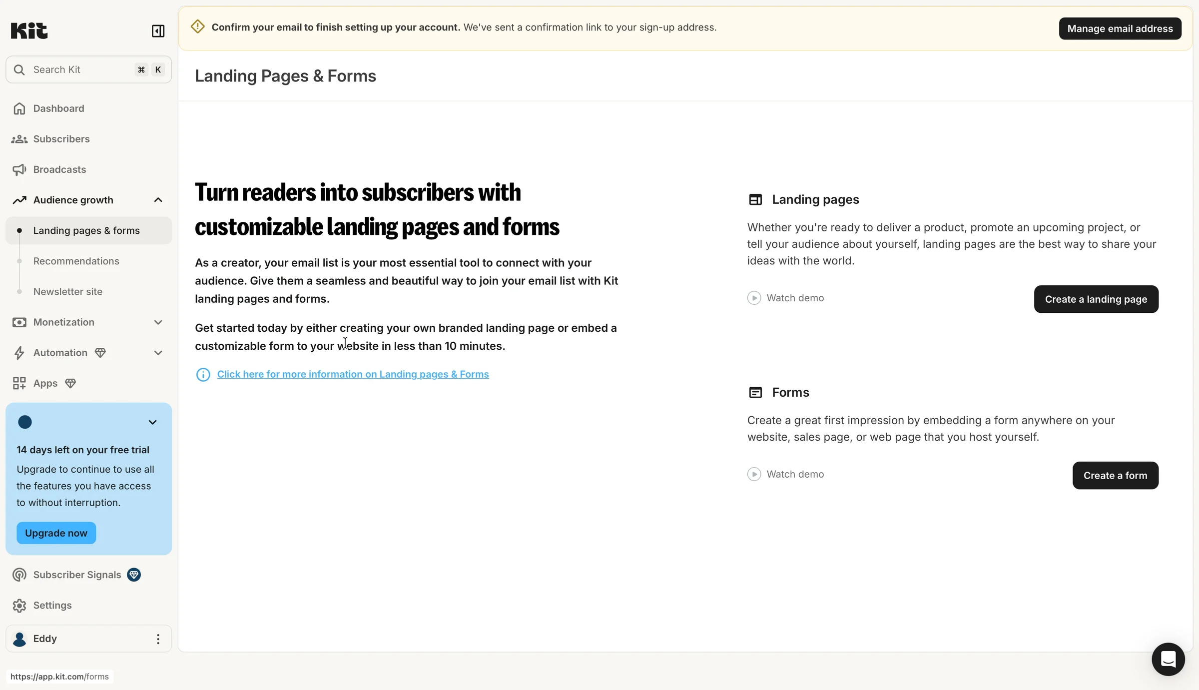
Two paragraphs about why an email list matters, and how landing pages help. "As a creator, your email list is your most essential tool to connect with your audience."
And on the right, another button: "Create a landing page."
And do I even need a landing page? I already have a website. Kit never says how the two fit together. I think I'm in the wrong place, so I go back to the checklist.
I open the other tasks to see what they do. "Offer a free incentive" opens a tip: "Give people a reason to subscribe now. A relevant freebie can meaningfully boost your signup rate." No button at all.
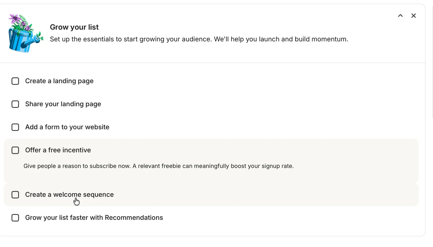
❌ A button should open what it says.
The checklist already told me why I need a landing page. The button said "Create." So I expected to create.
Instead, I got a page selling me the thing I'd just picked. Two pages, two buttons with the same words, one trip back to the checklist.
The lesson: Inside the product, stop selling. If a button says "Create landing page," it should open the page builder.
8. A gallery of strangers
The second button opens "Choose a template." A template is a ready-made page design.
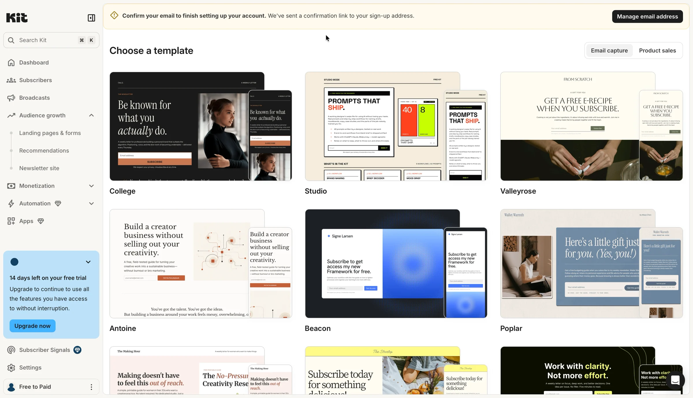
There are more than twenty. They look great. Each one has someone else's name on it: "Be known for what you actually do." "Signe Larsen." "Wallet Warmth."
Kit knows my newsletter's name. It's in the corner of the sidebar now: "Free to Paid." It has my website too.
Not one template shows them.
In my Fyxer and Zero teardowns, the examples belonged to strangers too. Same idea here, so I'll keep it short: put my name in the picture.
Then a chat note pops up in the corner:
"Hey Eddy, welcome to Kit. We're so glad you're here. As you're getting settled, we're here to answer any questions you have."
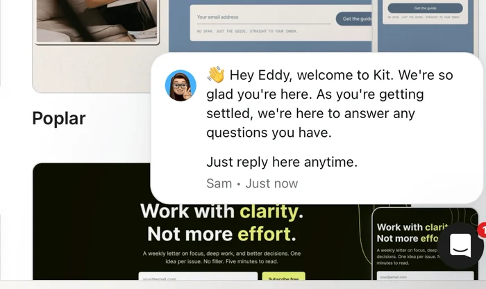
My recording ends here, 2 minutes and 40 seconds after the homepage. No readers moved. No page made. And I still don't know how my Substack list and Kit fit together.
So no aha moment for me. Kit left me with more questions than answers. Do my Substack readers count toward the 1,000? Do I need a landing page if I already have a website? How do Substack and Kit fit together?

9. What the other trials did with what I already had
Kit isn't the first trial I've tried with something to bring. Here's how the others handled it.
- Pipedrive · Deals in my inbox · Opened on an empty pipeline
- Lightfield · Clients in my inbox · Asked for my inbox last, after the card
- Attio · Clients in my inbox · Read my inbox, newsletters and all
- Fyxer · Years of emails · Read my inbox before asking for the card
- Zero · Clients in my inbox · Found 24 people and skipped 290 others
- Kit · Readers on Substack · Promised to move them, never asked where they were
The best trials started with what I already had. Zero and Fyxer read it in the first minutes, before asking for anything.
Kit is the only one that promised to move my stuff on its homepage. It's also the only one that never asked where it was.
10. How I'd redesign it
So what would I change? Not much. Kit asks good questions and says why. It names the first screen after my goal. Its homepage even offers to move my list.
What's missing is one question, and what it unlocks. Kit never learns my readers are on Substack. So it shows me a card form, a checklist for finding new readers, and a gallery of strangers.
So I'd change two screens: the first question, and the first screen after setup.
The first question: ask where readers are
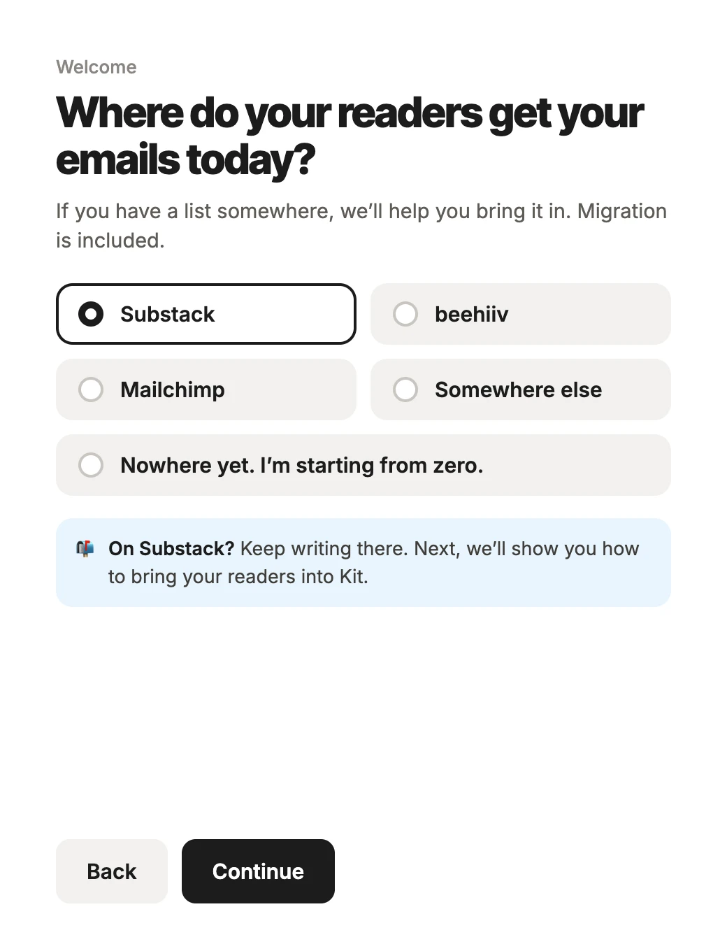
"Where do your readers get your emails today?" Under it: "If you have a list somewhere, we'll help you bring it in. Migration is included."
The answers: Substack, beehiiv, Mailchimp, somewhere else, or "Nowhere yet. I'm starting from zero."
Under them: "On Substack? Keep writing there. Next, we'll show you how to bring your readers into Kit."
Why: A Substack writer answers "no" to "an email marketing tool." Naming Substack gets the true answer. And the line under it tells me what my answer will change, before I click.
The first screen: bring the readers over
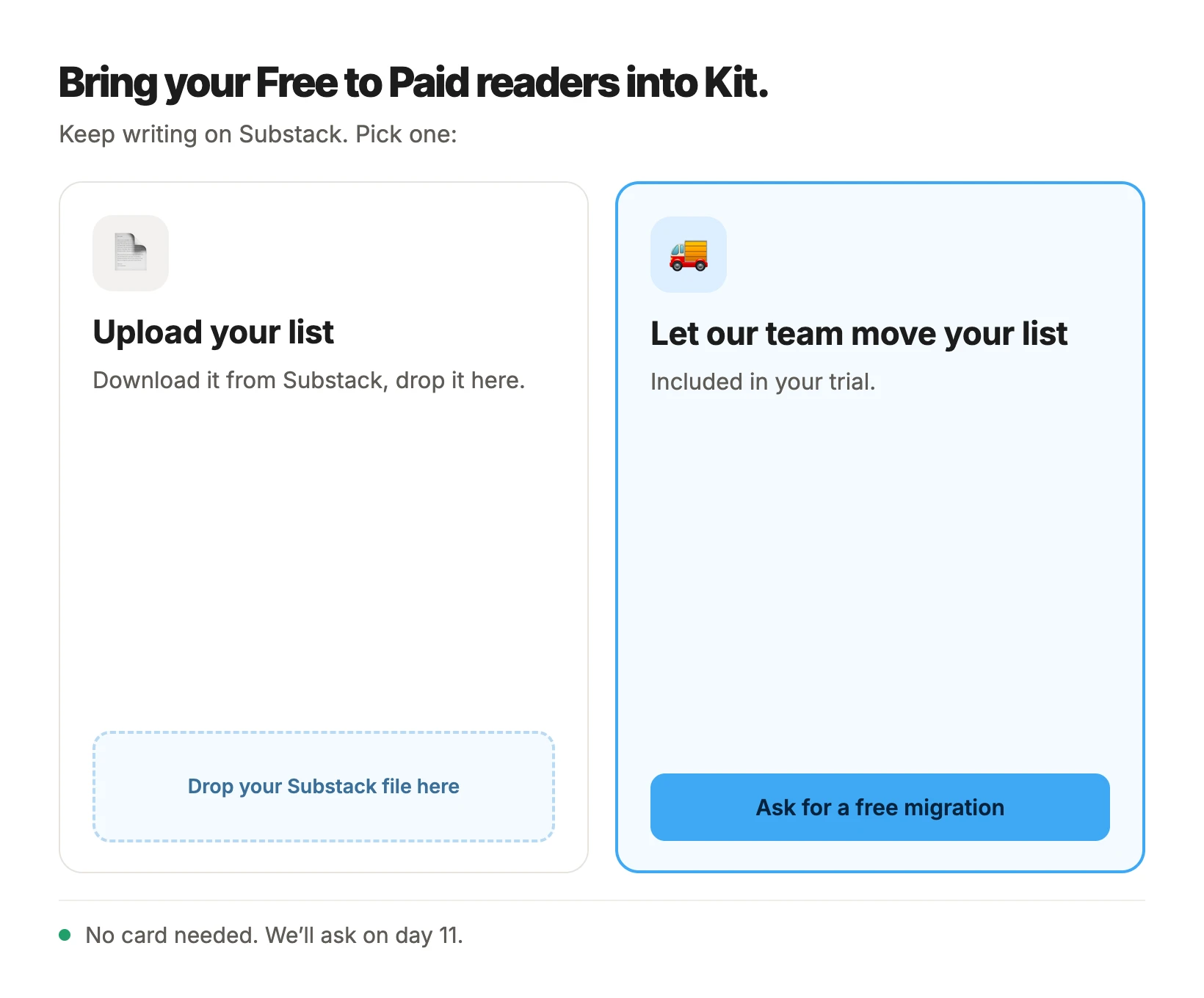
"Bring your Free to Paid readers into Kit. Keep writing on Substack."
Then two choices. On the left, upload your list: download it from Substack and drop it in. On the right, the homepage promise: "Let our team move your list," included in the trial.
At the bottom, one line: "No card needed. We'll ask on day 11."
Why: Kit is only useful to me once my Substack readers are in it. Every other step, the landing page, the welcome email, the emails that send themselves, works better once they're there.
Day 11: the card form, rebuilt
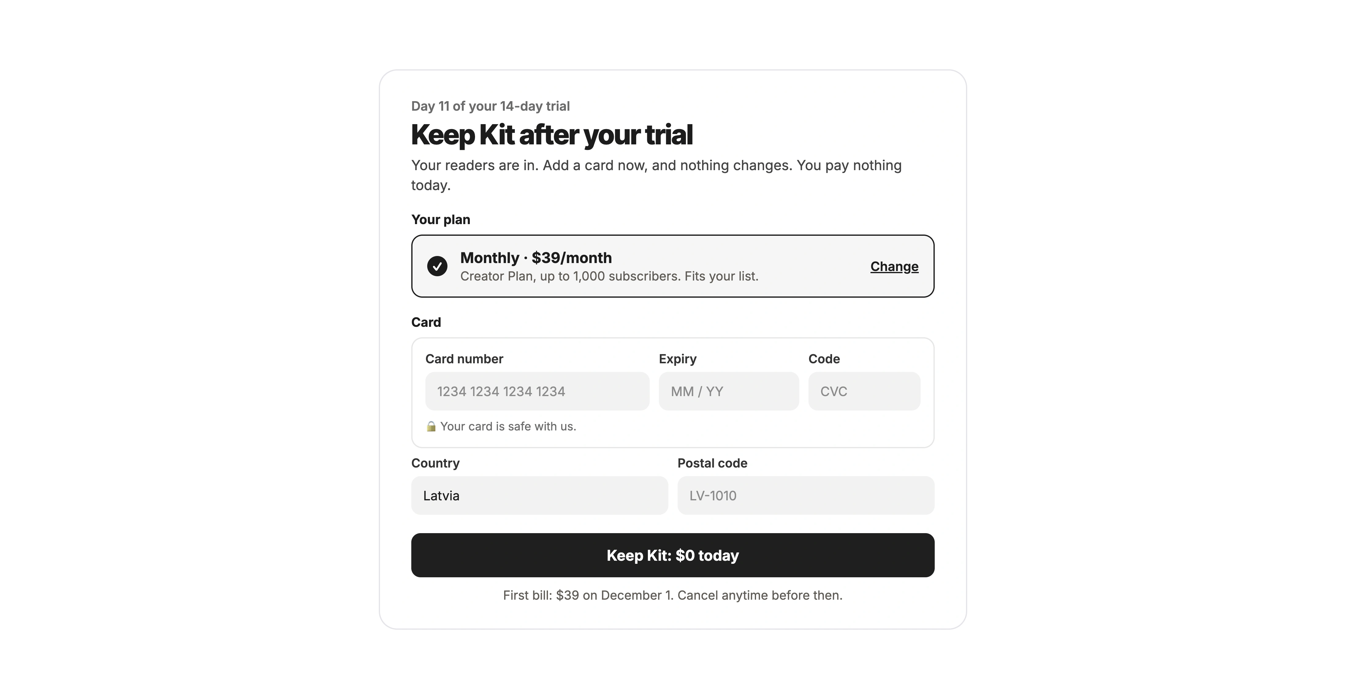
"Keep Kit after your trial. Your readers are in. Add a card now, and nothing changes. You pay nothing today."
My plan sits on top, as one short line: "Monthly, $39/month. Creator Plan, up to 1,000 subscribers. Fits your list." The card gets its own box with a heading. The address is just country and postal code. The button says "Keep Kit: $0 today," and the first bill date sits right under it.
Why: By day 11, I know what Kit does for me, and Kit knows how big my list is. That's the moment to ask.

11. Three tests I'd try first
If I worked on getting more Kit trials to turn into paying customers, I'd start with these three.
Test 1: Ask where readers are, by name
Problem: "Do you already use an email marketing tool?" Writers on Substack and similar platforms may answer "no," and get the path for people with nothing to bring.
Change: Ask "Where do your readers get your emails today?" with Substack, beehiiv, Mailchimp and "Nowhere yet" as answers.
What I think will happen: More people will say they have a list somewhere, and more of them will start a move in the first session.
What to count: How many people pick each answer, and how many of those with a list start moving it on day one.
Test 2: Open on the move
Problem: The homepage says "Migration included." Inside, the first screen is a card form, and the checklist has no step for bringing a list.
Change: For anyone with a list, open on "Bring your readers over," with an upload and a "let our team do it" option.
What I think will happen: More people will have their readers in Kit in the first week, and more will send a first email to them.
What to count: How many people finish a move during the trial, how many send a first email to their moved readers, and how many pay after the trial.
Test 3: Ask for the card after the move
Problem: The card form asks me to pick a plan "for up to 1,000 subscribers" before Kit knows how many readers I have.
Change: No card form on the first screen. Ask on day 11, with monthly ticked and a plan that fits the list that arrived.
What I think will happen: Fewer people will leave in the first session, and the people who add a card will pick a plan that fits.
What to count: How many people come back on day two, how many add a card by the end of the trial, and how many change plans in the first month.
Before any of these, I'd make "Create landing page" open the page builder. That's not a test. It's just a button doing what it says.
These are ideas to test, not promises. Some of them might not work.
12. It offered to move my list
Kit gets a lot right.
The homepage shows the product working by itself, and promises help moving your list.
The sign-up takes twenty seconds, and the photo next to it says who Kit is for.
Every setup question says why it's asked.
And the first screen is named after my goal.
But it never asks the one thing it needs to know: where my readers are. So the help it promised never shows up. Instead: a card form for 1,000 subscribers, a checklist for people starting from nothing, a page about landing pages, and a gallery of strangers.
What Kit gets right
- The homepage: "No credit card required. Migration included." Both are exactly what someone switching wants to read.
- The sign-up: Twenty seconds, and a photo of a creator I know.
- The reasons: Every question says what my answer is for.
- The date of the first bill: Clear, even on a screen that came too early.
What I'd improve
- The homepage: Say what Kit does in the big line, and put "Migration included" next to it.
- The first question: Ask where my readers are, and name Substack.
- The first screen: Bring my readers over, not a card form.
- The checklist: Make "Bring your readers" step one.
- The card: Ask on day 11, with monthly ticked.
- The button: "Create landing page" opens the builder.
The bigger lesson
The people most likely to switch to your product already have their stuff somewhere else. Their readers, their customers, their files.
They don't call it what you call it. A Substack writer doesn't say "email marketing tool." So a question in your words gets a wrong answer, and the rest of the trial is built on it.
If your product promises to move people's stuff, ask three questions:
Do you ask where their stuff is today, in their words?
Is the move the first thing they see inside?
And does every button open the thing it names?
For Kit, the fix could be as simple as one question: "Where do your readers get your emails today?"
Same trial. Same 14 days. Still no card.
But this time, Substack and Kit would work together from day one.
Where is your future customers' stuff today? Does your trial ask? I'd love to hear how your product handles it.
I break down real sign-ups and free trials to show where they lose potential paying customers and how to improve the experience.
Want me to review your trial? DM me "teardown" on LinkedIn.
Eddy
Bitpanda let me do everything (except invest)
Bitpanda, Nov 12, 2026